5.6.1. Widget Gallery
The dashboard ships with the widgets shown below. Open the type picker
from any card’s three-dot menu (Change Widget Type) and pick the
one you want — every widget here is grouped under one of the picker
tabs. Widgets respect the dashboard filter bar, so the same card can
be re-scoped to a single account, facility, unit, and time period.
5.6.1.1. Compliance
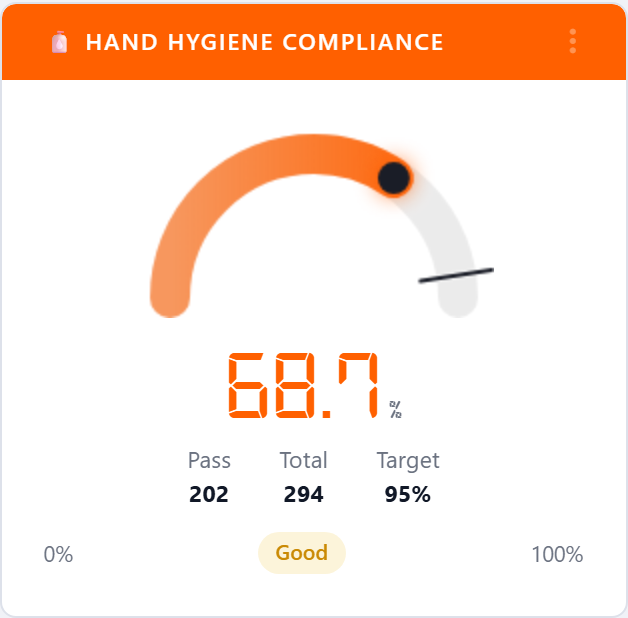
5.6.1.1.1. Hand Hygiene Compliance
The flagship gauge. Plots the percentage of hand-hygiene moments that
were performed against the total opportunities recorded in the
selected period, with the target marker pulled from the targets table.
The status pill (Excellent, Good, Fair, Poor) is driven
by the account’s color ranges.
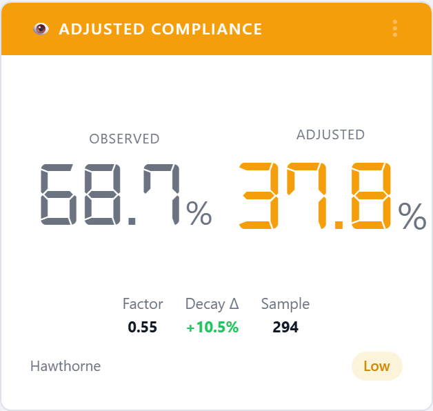
5.6.1.1.2. Adjusted Compliance (Hawthorne)
Same input as Hand Hygiene Compliance but with a Hawthorne
correction applied to discount the artificial lift that comes from
healthcare workers knowing they’re being observed. Use this widget
when you need the more conservative number for executive reporting.
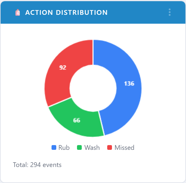
5.6.1.1.3. Action Distribution
Pie chart of how observed moments resolved: rub, wash, or missed. Quickly shows whether non-compliance is dominated by misses or by wrong-product choices.
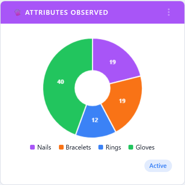
5.6.1.1.4. Attributes Observed
Pie of the contextual attributes auditors recorded alongside each moment (gloves, gown, mask, eye protection, and so on). Useful for PPE-focused initiatives.
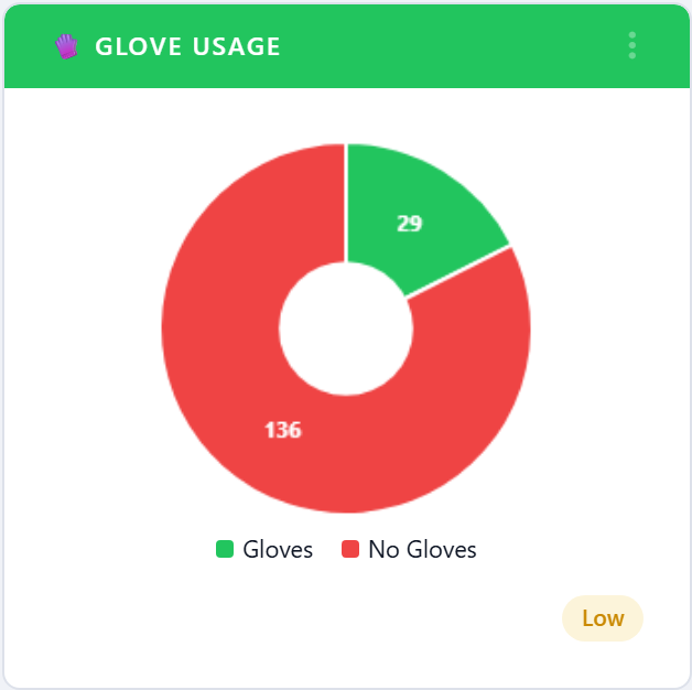
5.6.1.1.5. Glove Usage
Compliance gauge restricted to glove-use observations. Pairs with
Hand Hygiene Compliance when an account is running a glove-use
campaign.
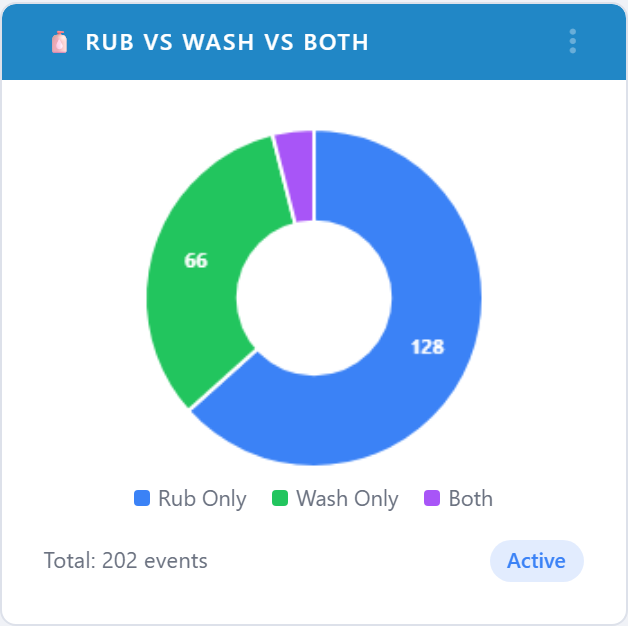
5.6.1.1.6. Rub vs Wash vs Both
Breaks performed moments down by sanitizer (rub), soap-and-water (wash), and both. Helps spot facilities that are under-using rub stations or over-using wash stations during outbreaks.
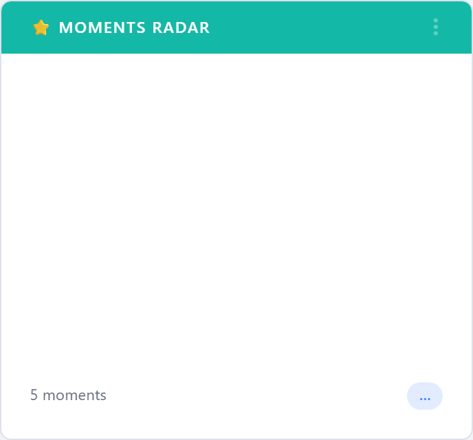
5.6.1.1.7. Moments Radar
Radar chart that plots compliance for each of the five moments of
hand hygiene at once. The shaded area immediately shows uneven
performance — for example, strong Before Patient but weak
After Body Fluid.
5.6.1.2. Performance by Unit and Facility
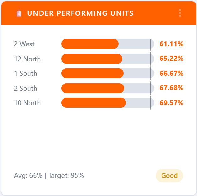
5.6.1.2.1. Under Performing Units
Horizontal bar chart of the bottom-N units by compliance, with the account average drawn as a reference line. Use it to pick targets for coaching or extra audits.
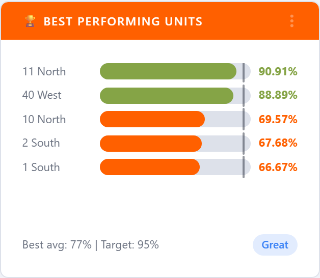
5.6.1.2.2. Best Performing Units
The mirror of Under Performing Units — top-N units by compliance.
Useful for recognition programs and for finding internal best
practices to copy across the network.
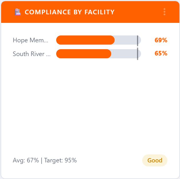
5.6.1.2.3. Compliance by Facility
Bar chart of compliance for every facility on the account. Each bar is colored by the facility’s current range, so a multi-site organization can see at a glance which facilities are off-target.
5.6.1.3. HCP Type
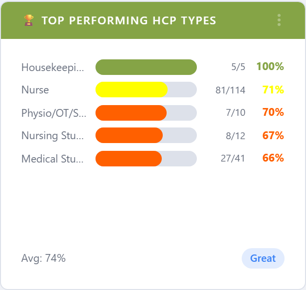
5.6.1.3.1. Top Performing HCP Types
Best healthcare-provider categories (RN, MD, RT, EVS, …) by compliance. Helps with role-specific recognition and targeted education plans.
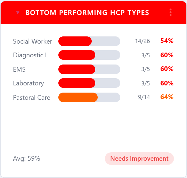
5.6.1.3.2. Bottom Performing HCP Types
The same view restricted to the lowest-performing HCP types. Use it to pick the categories that need an intervention this period.
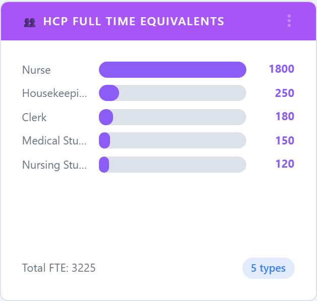
5.6.1.3.3. HCP Full Time Equivalents
Reports the number of full-time-equivalent observations per HCP category. Useful for sample-adequacy conversations: are you observing each role in proportion to its head count?
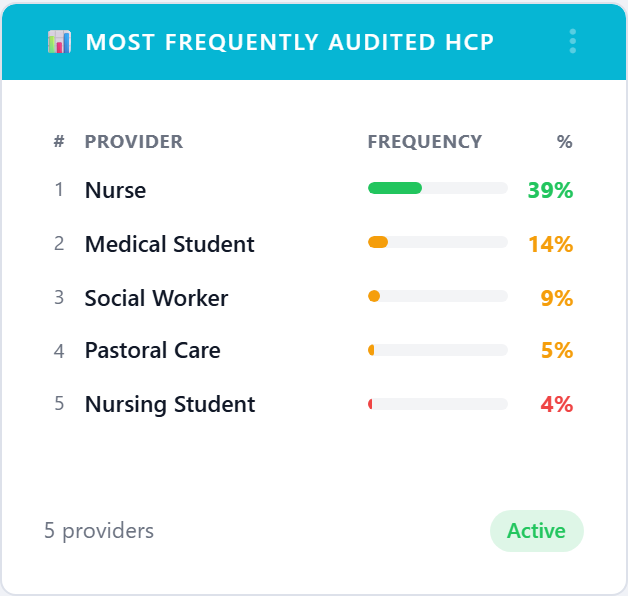
5.6.1.3.4. Most Frequently Audited HCP
Counts observations per HCP category, sorted high-to-low. Pairs with
HCP Full Time Equivalents to spot bias in the sampling plan.
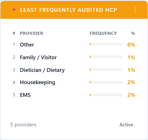
5.6.1.3.5. Least Frequently Audited HCP
The inverse view — categories that are barely showing up in the audit data. Often the first place to look when Joint Commission asks about sample coverage.
5.6.1.3.6. Overview
Hierarchical org tree that summarizes compliance from corporation down to facility, unit, and (optionally) HCP. Click any node to drill deeper without leaving the dashboard.

5.6.1.3.7. Compliance Distribution
Histogram that bins units (or facilities, depending on filter scope) into 10-percent compliance buckets. The shape tells you whether the network is bunched at the top, bunched at the bottom, or genuinely spread out.
5.6.1.4. People and Programs
5.6.1.4.1. Compliance by User
Top-N healthcare workers by personal compliance. Use only with care — some sites prefer to keep this anonymous and roll it up to HCP type or unit instead.
5.6.1.4.2. Compliance by Group
Compliance by user group (typically a unit-and-shift cohort or a named team). Lets infection-control coordinators compare like-for-like groups across the organization.
5.6.1.4.3. Compliance by Program
Rolls compliance up to the program level — e.g. Sepsis Bundle,
CAUTI Prevention, Antibiotic Stewardship — for organizations
that tag observations by initiative.
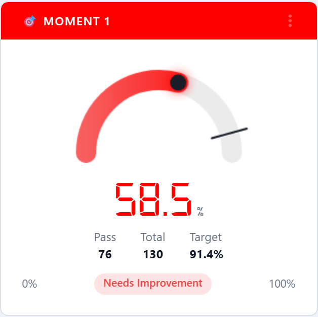
5.6.1.5. Moments
Each of the five moments of hand hygiene is available as its own gauge so you can pin the moment that matters most for the current campaign next to the overall compliance gauge.
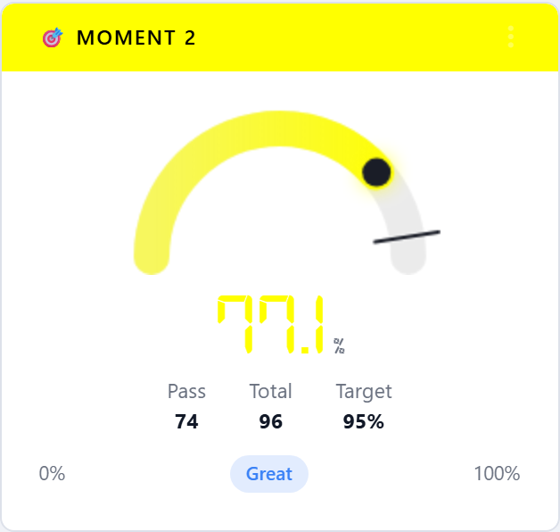
5.6.1.5.1. Moment 1 — Before Patient Contact
Compliance restricted to the Before Patient moment.
5.6.1.5.2. Moment 2 — After Patient Contact
Compliance restricted to the After Patient moment.
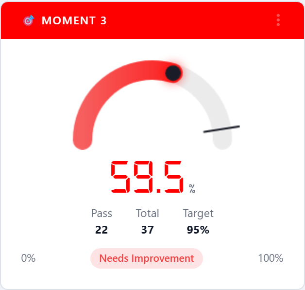
5.6.1.5.3. Moment 3 — Before Aseptic Procedure
Compliance restricted to the Before Aseptic Procedure moment.
Often the most clinically meaningful moment and the one Joint
Commission scrutinizes most closely.
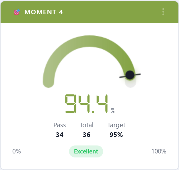
5.6.1.5.4. Moment 4 — After Body Fluid Exposure
Compliance restricted to the After Body Fluid moment.
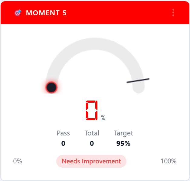
5.6.1.5.5. Moment 5 — After Touching Patient Surroundings
Compliance restricted to the After Touching Patient Surroundings
moment. Only relevant when the account has selected the five-moment
WHO methodology.
5.6.1.6. Audit Activity
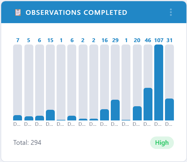
5.6.1.6.1. Observations Completed
Bar chart of observations performed per unit (or facility, depending
on filter scope) for the period. Answers where is the audit work
actually happening.
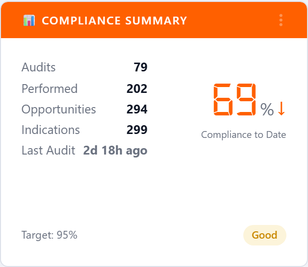
5.6.1.6.2. Compliance Summary
Fiscal-year-to-date scorecard: current compliance, prior-period compliance, audits completed, opportunities, and last-audit timestamp. The big-number card style is designed for executive huddles and lobby displays.
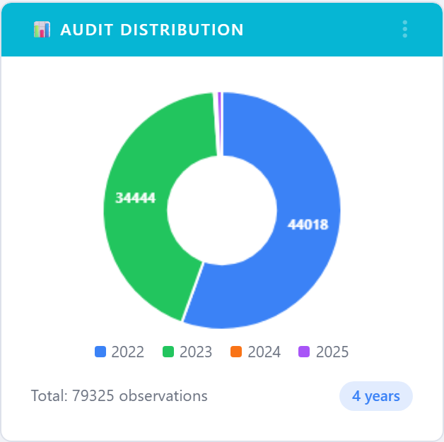
5.6.1.6.3. Audit Distribution
Pie chart that splits audit activity by audit method (Standard, Live, Custom Audit, etc.). Helps confirm the program is not over- reliant on a single observation channel.
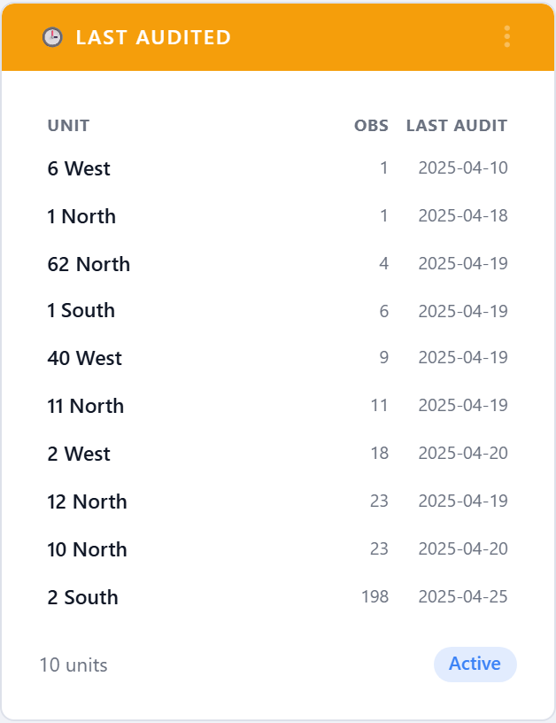
5.6.1.6.4. Last Audited
Lists the units that have gone the longest without an observation, oldest first. The action item is built in: anything at the top of this list is overdue for a visit.
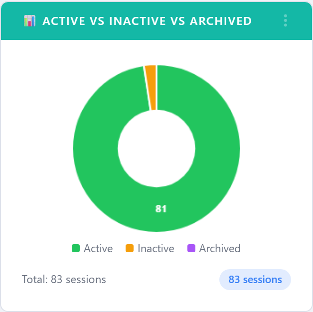
5.6.1.6.5. Active vs Inactive vs Archived
Pie chart of session lifecycle status. Used to confirm housekeeping
is working — large Inactive slices generally mean stale sessions
need to be archived.
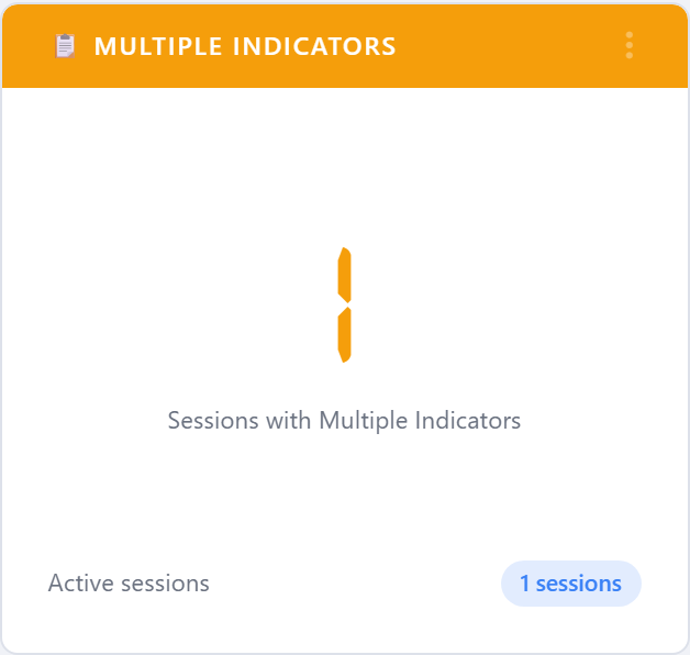
5.6.1.6.6. Multiple Indicators
Counts sessions that recorded multiple indicators (e.g. moment + PPE + glove). Higher values mean your auditors are capturing richer context per observation.
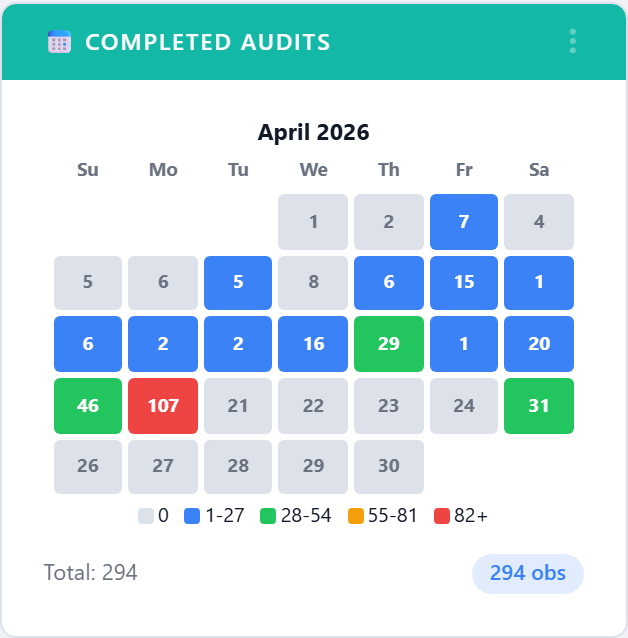
5.6.1.6.7. Completed Audits
Calendar heat map of custom-audit completion across the month, with
target lines. Click More to open the full-page detail view.
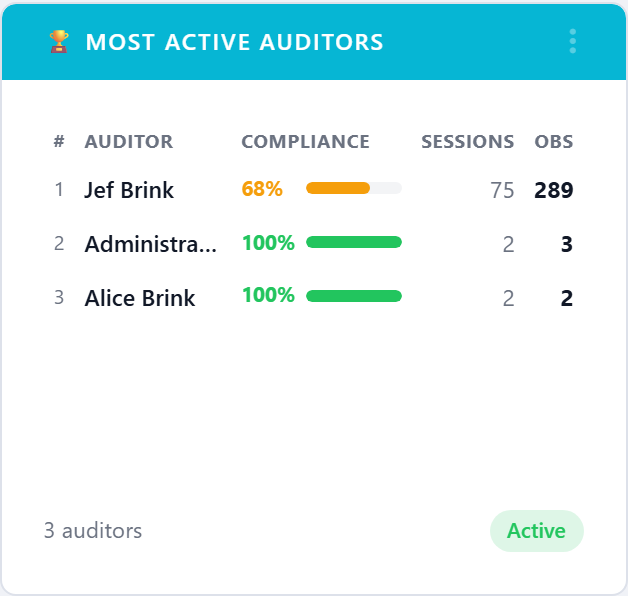
5.6.1.6.8. Most Active Auditors
Leaderboard of users by audits performed in the period. Useful for recognition and for spotting an account that depends on a single power user.
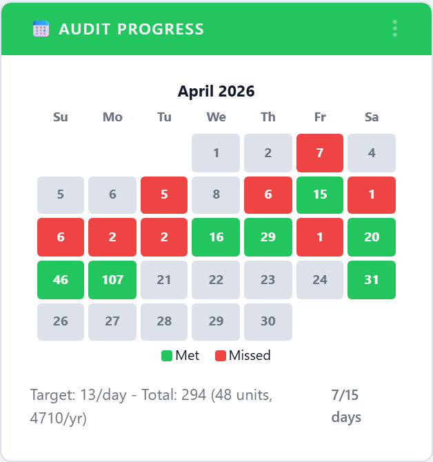
5.6.1.6.9. Audit Progress
Calendar view of where you are against the period’s audit-volume
target. The detail page (More) shows the full month with the
target line drawn through.
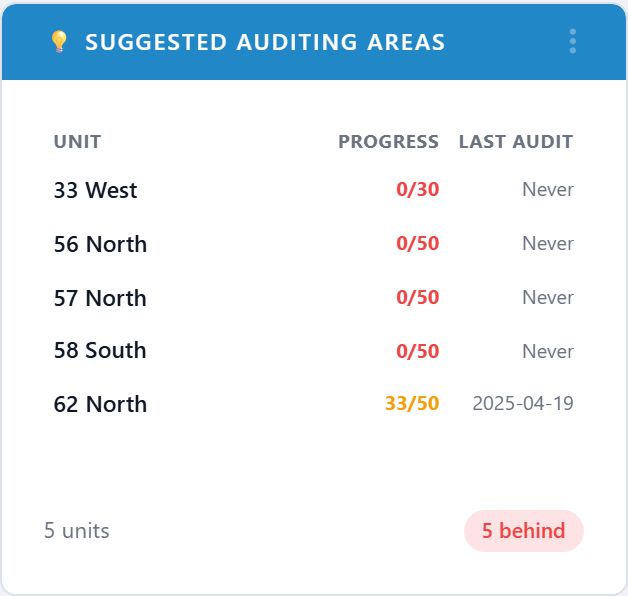
5.6.1.6.10. Suggested Auditing Areas
Recommends units that should be visited next based on coverage gaps, last-audit age, and recent compliance. Acts as a worklist for the infection-control team.
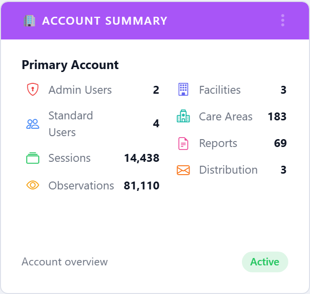
5.6.1.6.11. Account Summary
A compact card listing the key counts on the account: facilities, units, users, devices, and audits this period. Designed for the top-of-dashboard slot.
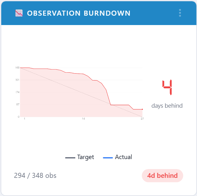
5.6.1.6.12. Observation Burndown
Plots cumulative observations against the daily target line for the current period. The slope of the actual line tells you whether you will land on target without doing the math.
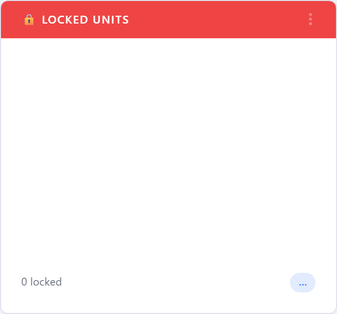
5.6.1.6.13. Locked Units
Lists units that have been administratively locked (closed for renovation, marked off-limits, etc.) along with who locked them and why, so they are not counted as missed audits.
5.6.1.6.14. Notes Frequency
Most-used observation notes, ranked by occurrence. A surge in
Hand sanitizer empty or Sink out of service is an early
warning before compliance starts to drop.

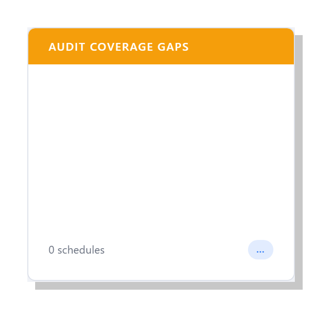
5.6.1.6.15. Audit Coverage Gaps
Lists scheduled audit slots that produced no observations during the reporting period. A “gap” is a unit-month (or unit-week, depending on the unit’s cadence) where the schedule expected work but none was recorded. Useful as a worklist when chasing missing audits before a compliance review.
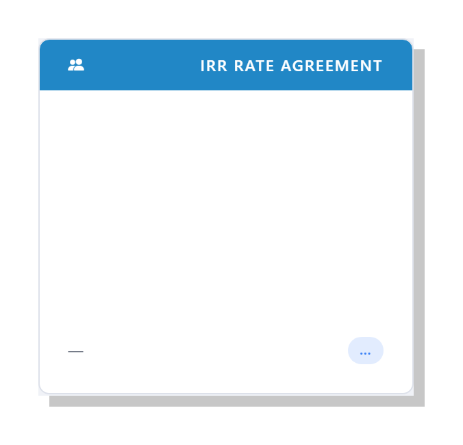
5.6.1.6.16. IRR: Rate Agreement Trend
Twelve-month trend of the inter-rater reliability (IRR) agreement
rate across all observers who have completed a paired session in
the period. Drops below the 80 % agreement line are a hint that
fresh observer training is overdue. Open the widget’s
More action to drill into per-observer breakdowns.
5.6.1.7. Statistical Charts
The charts below answer the question is this real or just noise?.
They all open into a full-page detail view via the card’s
More action.
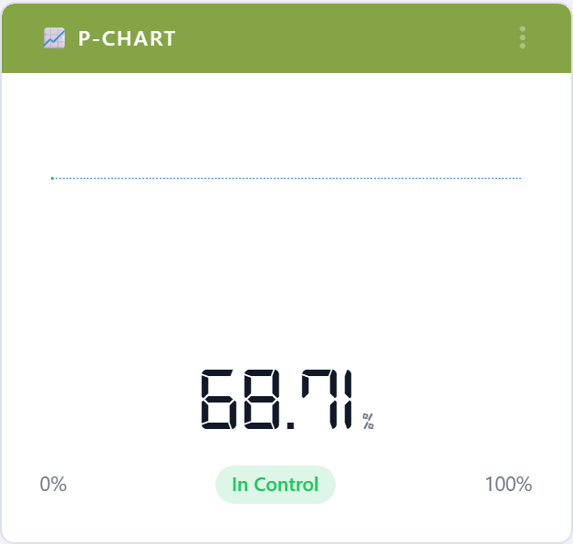
5.6.1.7.1. P-Chart
Statistical-process-control p-chart with mean and 3-sigma control limits. Points outside the limits are flagged as special-cause variation worth investigating.
5.6.1.7.2. HCP Compliance Trend
Run chart of monthly compliance for healthcare-provider categories with the median drawn in. The eight-points-on-one-side rule lights up when there is a sustained shift.
5.6.1.7.3. Compliance Confidence
Monthly compliance plotted with a statistical confidence band. A wide band means the underlying sample is small, so the apparent month-to-month change should not be over-interpreted.
5.6.1.7.4. Standard Deviation
How much month-to-month compliance varies. Programs that have stabilized show a falling line; programs in transition show volatility.
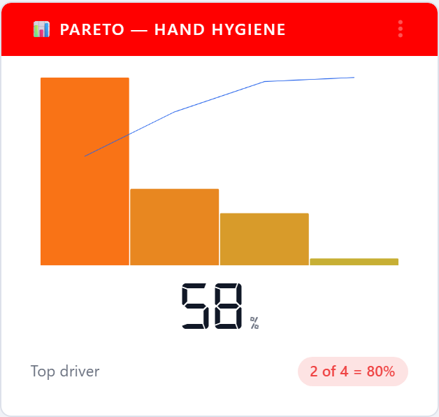
5.6.1.7.5. Pareto — Hand Hygiene
The 80/20 view: a small number of units (or HCP types, or moments) typically drive most of the non-compliance. The Pareto chart finds them.
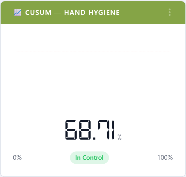
5.6.1.7.6. CUSUM — Hand Hygiene
Cumulative sum chart that highlights persistent drift away from the target — much faster than waiting for a moving average to follow.
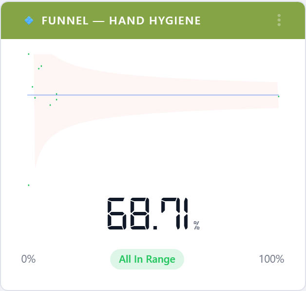
5.6.1.7.7. Funnel Plot — Hand Hygiene
Plots compliance against sample size. Units that fall outside the funnel are statistically off-target rather than just unlucky in a small sample.
5.6.1.8. Custom Audits
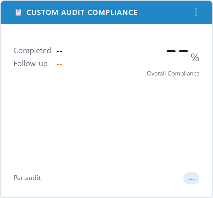
5.6.1.8.1. Custom Audit Compliance
Compliance gauge for the top custom audits on the account. A custom audit is anything beyond hand hygiene: PPE, central line bundles, discharge education, surveys, and so on.
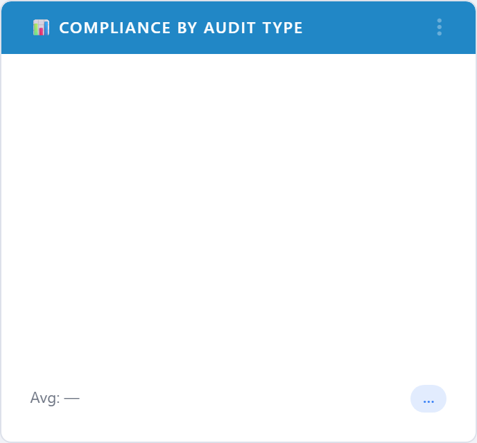
5.6.1.8.2. Compliance by Audit Type
Bar chart that ranks every active custom audit by current compliance. Helps Quality teams pick which audit deserves a re-write.
5.6.1.8.3. Pareto — Custom Audits
Pareto chart over custom-audit failure reasons rather than hand- hygiene moments. Shows which questions on which audits are driving most of the misses.
5.6.1.8.4. CUSUM — Custom Audits
CUSUM chart restricted to custom-audit results.
5.6.1.8.5. Funnel Plot — Custom Audits
Funnel plot restricted to custom audits.
5.6.1.8.6. Net Promoter Score
Tracks the Net Promoter Score for any custom audit configured as a public survey. Promoters, passives, and detractors are summarized into the standard NPS number.
5.6.1.9. Challenges
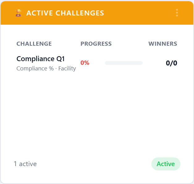
5.6.1.9.1. Active Challenges
Lists the challenges that are currently running on the account, with participant counts and time remaining. See Challenges.
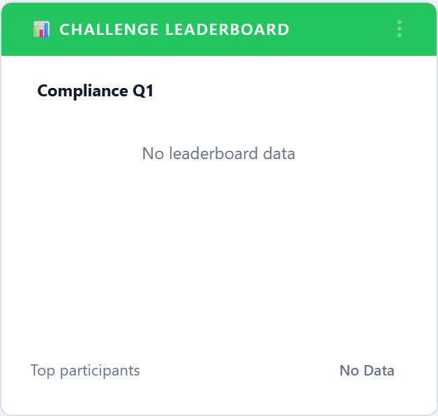
5.6.1.9.2. Challenge Leaderboard
Top participants on the currently active challenges, ranked by challenge points.
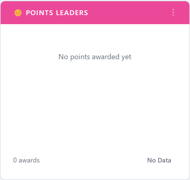
5.6.1.9.3. Points Leaders
All-time points leaderboard. Different from the challenge leaderboard in that it sums points across every challenge a user has completed.
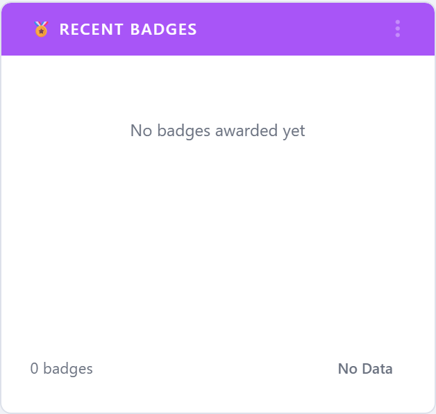
5.6.1.9.4. Recent Badges
The most recent badges awarded on the account, with the recipient, badge name, and award date. Doubles as a recognition feed for break- room displays.
5.6.1.10. Devices
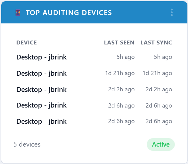
5.6.1.10.1. Top Auditing Devices
Most-used auditing devices (typically tablets or phones) in the period, with last-seen and last-sync timestamps. Useful for spotting devices that have stopped syncing.
5.6.1.11. Joint Commission
The Joint Commission widgets surface the indicators most often requested in a TJC infection-prevention tracer.
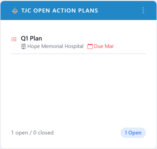
5.6.1.11.1. TJC Open Action Plans
Counts of Joint Commission action plans by status. Used by Quality leaders to prove follow-through on findings.
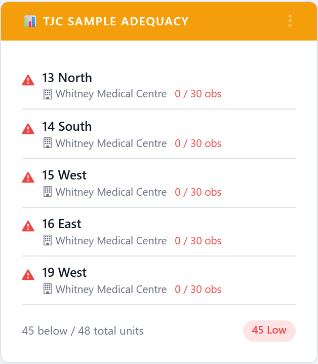
5.6.1.11.2. TJC Sample Adequacy
Flags units whose observation sample for the period is below the minimum count Joint Commission expects. Bars the units that need a visit before the cycle closes.
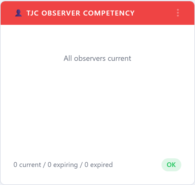
5.6.1.11.3. TJC Observer Competency
Lists observers whose inter-rater reliability (IRR) competency is expiring or already expired. Acts as a worklist for re-validation.
5.6.1.12. Accreditation Canada
The Accreditation Canada widgets are shown on accounts licensed for the Accreditation Canada module. They surface the indicators Accreditation Canada surveyors most often ask for during a Qmentum on-site visit.
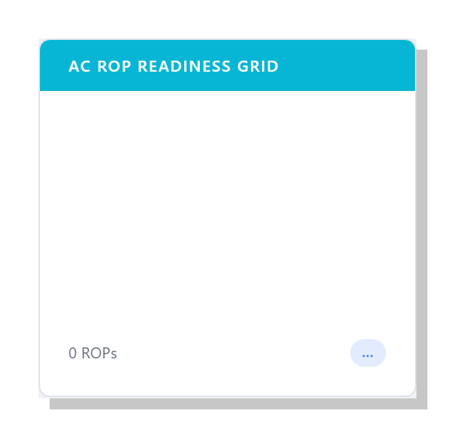
5.6.1.12.1. AC ROP Readiness Grid
Heat-map of the ten Required Organizational Practices (ROPs) showing
each one’s current readiness status — Met, Partially Met,
or Unmet — at a glance. Click the card’s More action to
open the full ROP catalog with drill-down to the underlying
evidence for each cell.
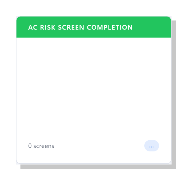
5.6.1.12.2. AC Risk Screen Completion
Rolling 90-day completion rate for the five Accreditation Canada risk screens (Falls, Skin Integrity, VTE, Suicide, At-home). Surveyors expect each screen to be completed within defined timeframes — this widget flags units that are falling behind.
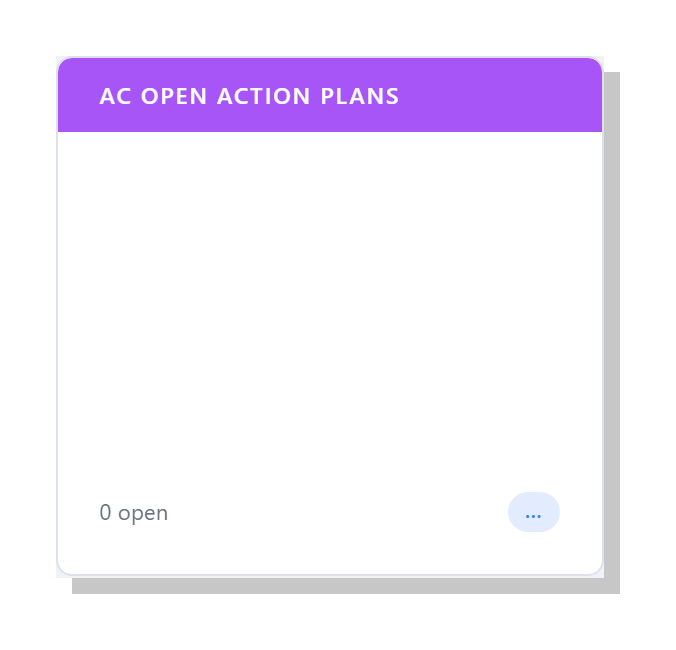
5.6.1.12.3. AC Open Action Plans
Live count of open ROP-targeted PDSA action plans, broken down by the ROP they support. A non-zero number on submission day is usually something the team wants to talk about with the surveyor; this widget keeps the worklist visible.
5.6.1.13. Leapfrog
The Leapfrog widgets map onto the line items of the annual Leapfrog Hospital Survey. Each domain widget shows the current attestation score for that line item; the volume / coverage / window / followup widgets prove the underlying sample is real.
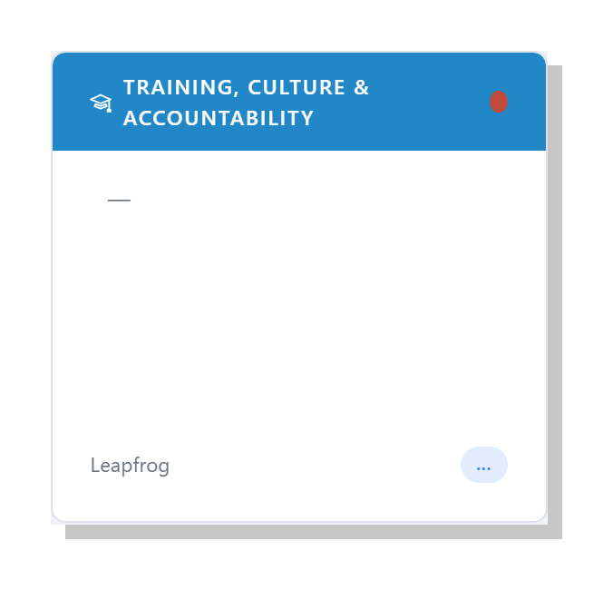
5.6.1.13.1. Leapfrog: Training, Culture & Accountability
Combined score for the Leapfrog Training and Education, Culture, and Knowledge and Accountability attestations. Three of the original Leapfrog domains have been collapsed into a single widget so the dashboard reflects how the survey is actually scored — these three lines stand or fall together. The widget shows the rolled-up status with the supporting evidence drawn from training records, culture-of-safety custom-audit responses, and accountability attestations.
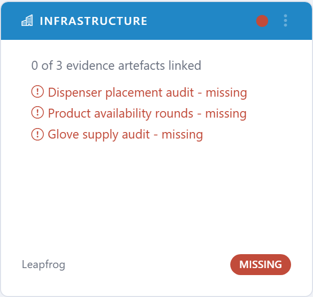
5.6.1.13.2. Leapfrog: Infrastructure
Score for the Leapfrog Infrastructure attestation — sinks, sanitizer placement, signage.
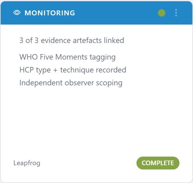
5.6.1.13.3. Leapfrog: Monitoring
Score for the Monitoring attestation — does the program actually observe and record hand hygiene?
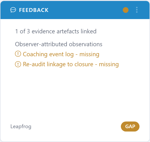
5.6.1.13.4. Leapfrog: Feedback
Score for the Feedback attestation — does the program close the loop with healthcare workers about their results?
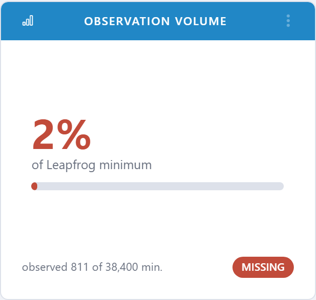
5.6.1.13.5. Leapfrog: Observation Volume
Total observations for the survey period against the Leapfrog minimum. Acts as the headline volume widget for the Leapfrog block.
5.6.1.13.6. Leapfrog: Unit Coverage
Percentage of qualifying units that hit the minimum observation
count. The unit-side companion to Observation Volume.
5.6.1.13.7. Leapfrog: Submission Window
Calendar countdown to the Leapfrog submission deadline, with a quick status: on-track, at-risk, or overdue.

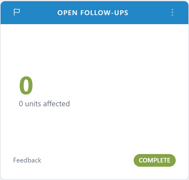
5.6.1.13.8. Leapfrog: Open Follow-ups
Open follow-up actions tied to Leapfrog findings. A non-zero number on submission day is usually a finding.
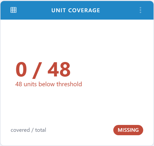
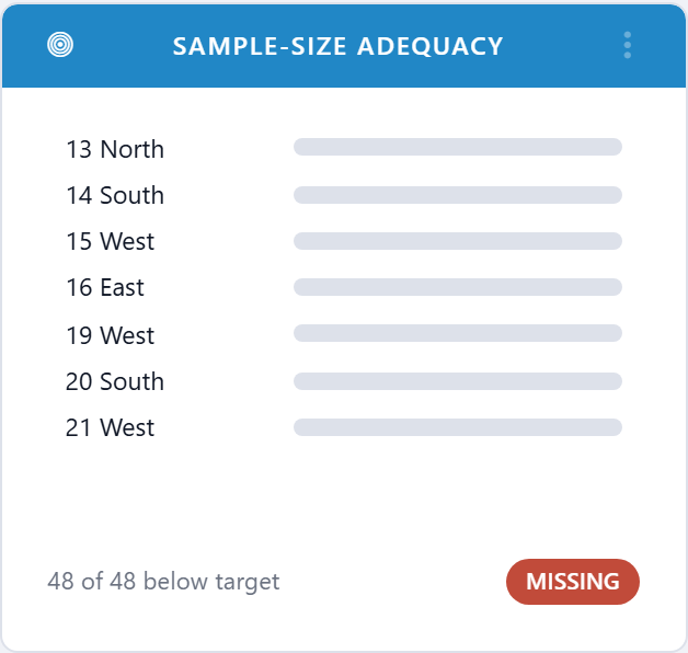
5.6.1.13.9. Leapfrog: Sample-Size Adequacy
Counts the units / HCP categories that fall below Leapfrog’s minimum sample size. Shows you exactly which samples need to be topped up.
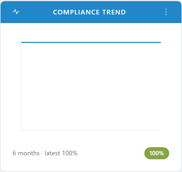
5.6.1.13.10. Leapfrog: Compliance Trend
Twelve-month compliance trend rolled up to the Leapfrog reporting boundary, with the prior-year line for context.
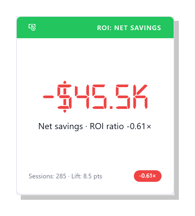
5.6.1.13.11. ROI: Net Savings
Headline executive number — the dollar value of healthcare-associated infections (HAIs) avoided in the period, minus the prorated cost of running clearPath. The accompanying status pill shows the ROI ratio (net savings divided by program cost). Drives the same calculation as the HAI Cost-Avoidance / ROI report.
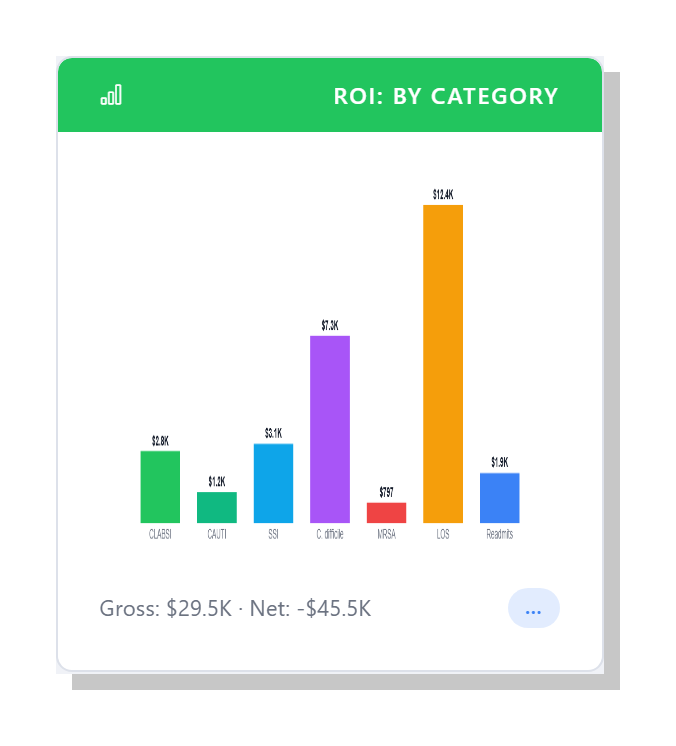
5.6.1.13.12. ROI: Cost Avoided by Category
Bar chart of avoided dollars broken out by HAI category — CLABSI, CAUTI, SSI, C. difficile, and MRSA — plus length-of-stay and readmission savings. Use this widget to see which infection types contribute the most to the total cost-avoidance figure.
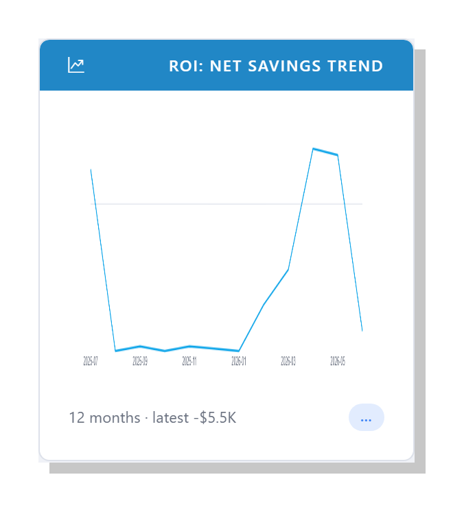
5.6.1.13.13. ROI: Net Savings Trend
Twelve-month rolling line chart of net savings, computed independently each month against the same assumption set. Shows whether the program is improving its own cost-avoidance over time.
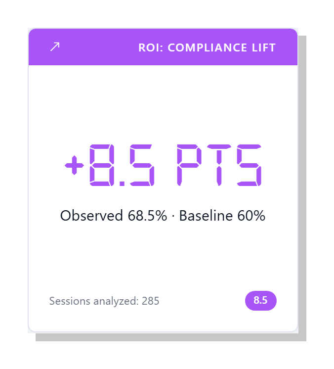
5.6.1.13.14. ROI: Compliance Lift
Compares observed hand hygiene compliance against the baseline that ROI is measured from. The bigger the lift in compliance, the more infections the model assumes were prevented and the larger the savings figure on the other ROI widgets.
5.6.1.14. Layout
5.6.1.14.1. Blank
A blank-tile placeholder used when you want to leave a gap on the
dashboard grid — for example, to set apart a row of executive
widgets from the operational ones below. Pick Blank from a
tile’s type picker to convert it into an empty placeholder; pick a
real widget from the same picker to fill it back in. Blank tiles
are saved in your dashboard layout exactly like any other tile.