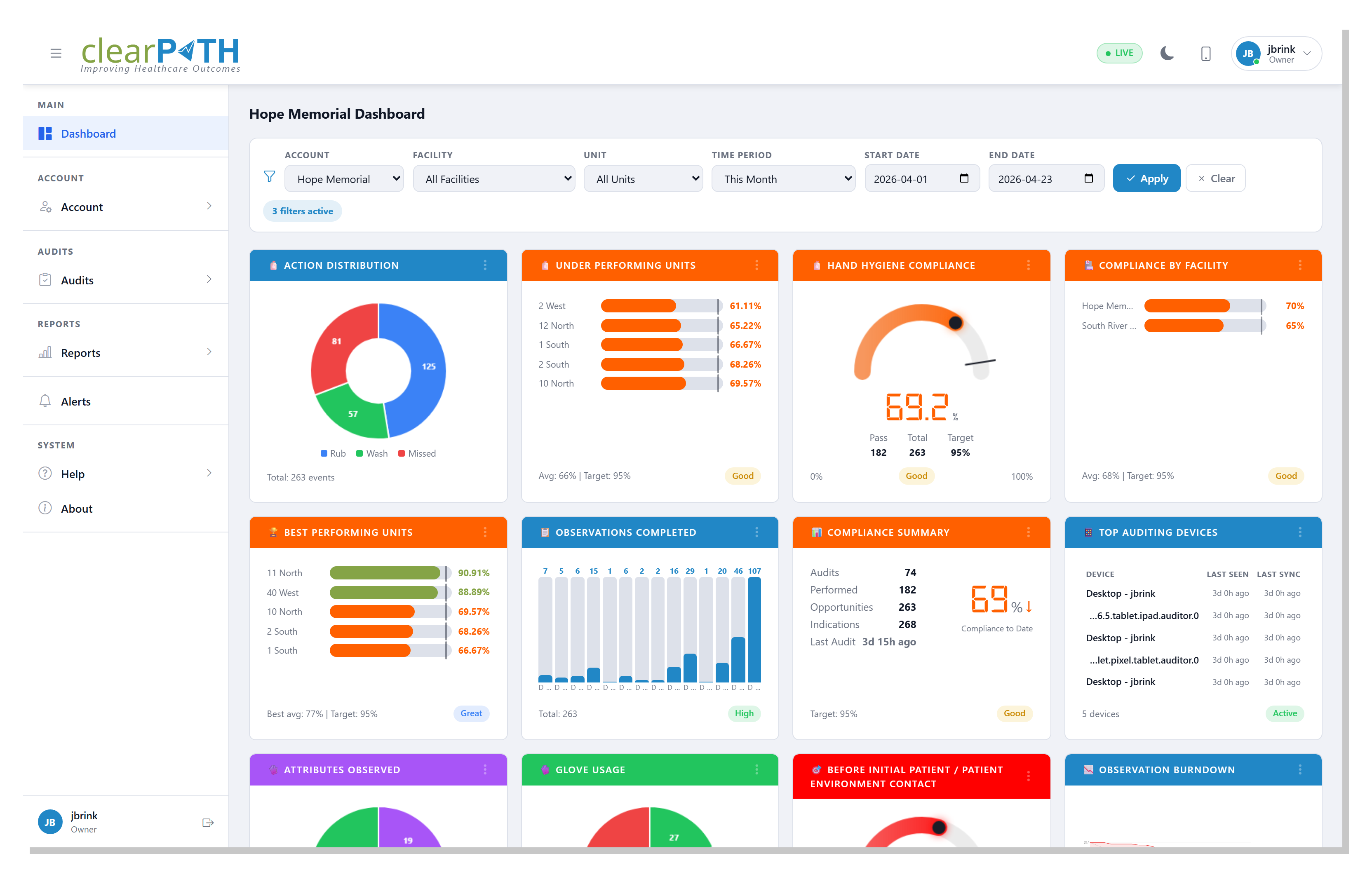
5. Dashboard
The dashboard is the landing page after you sign in to clearPath. It gives you a live, at-a-glance picture of hand hygiene compliance and custom audit activity across your organization.
Every widget refreshes automatically when new observations come in, so
the numbers you see always reflect the current state of your data. The
status pill on each widget shows whether the widget is Live,
Today, Month, 12 mo, or All — see Status Badges.
The dashboard is designed for:
Infection Prevention and Control teams tracking compliance by facility, unit, program, or healthcare-provider type.
Quality leaders who need a rolled-up view of the current fiscal year, calendar year, or quarter.
Managers comparing the current period against the previous one to spot trends quickly.
Any changes you make — filter selections, added or removed widgets, widget layout — are saved automatically to your profile, so the dashboard looks the same the next time you sign in.
5.1. Filter Bar
The filter bar at the top of the dashboard scopes every widget at once.
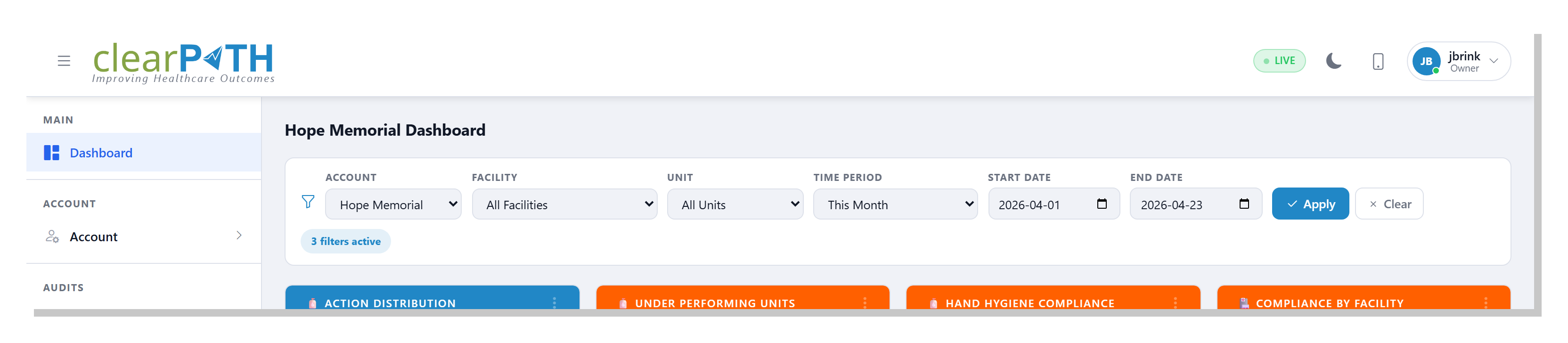
Account— pick a single account, or leave onAll Accountsto see every account you have access to.Facility— narrow the dashboard to one facility. The list updates based on the account you chose.Unit— narrow further to a single unit. The list updates based on the facility you chose.Time Period— pick a preset range (Today,This Week,This Month,Fiscal Year,Year to Date,Last 30 Days,Last 90 Days,All Time, and more). Most widgets default toToday.Start DateandEnd Date— pick a custom range. Setting these overrides the time period preset.
Click Apply to update every widget. A badge below the filter bar
shows how many filters are currently active; click Clear to reset
all filters back to the defaults.
5.2. Widgets
Each widget is a self-contained card. The bar at the top of the card shows its title; the pill in the bottom right shows its current status.
5.2.1. Status Badges
The small badge in the top-right corner of each widget shows the time window the widget is currently looking at:
Live— updates continuously as observations are recorded.Today— data from the current day.Month— data from the current month.12 mo— the trailing twelve months.All— all data available to your account.Active,Current,Recent— used by challenge and badge widgets to show the relevant contextual window.
The status pill next to each value (Good, High, Low,
Behind, and others) compares the current result to the target set
for that widget.
5.2.2. Adding or Changing a Widget
To swap the widget in any card, click the three-dot menu in the widget’s
header and choose Change Widget Type. The picker shows every widget
available on your edition, grouped into tabs.
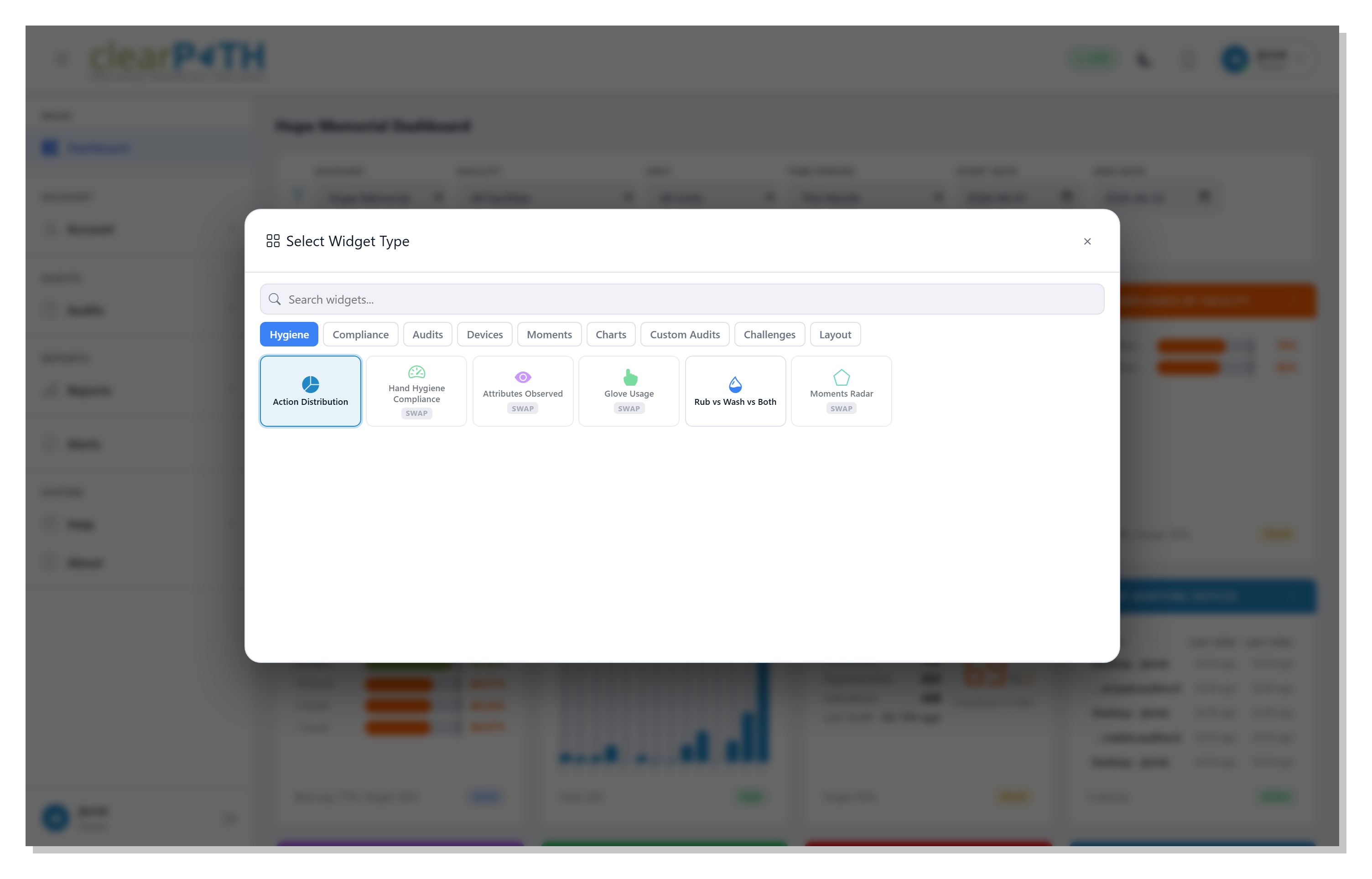
The tabs group widgets by topic:
Hygiene— hand-hygiene gauges, pie charts, and bars.Compliance— overall compliance summaries and distributions.Audits— audit progress, completed audits, session status.Devices— auditing-device activity and MQTT-backed live feeds.Moments— per-moment gauges (Moments 1 through 5).Charts— advanced visualizations: P-chart, CUSUM, Pareto, Funnel, Standard Deviation, Run chart, Compliance Histogram.Custom Audits— results and trends from custom audits.Challenges— active challenges, leaderboards, points, badges.Layout— blank placeholders and spacers to shape the grid.
Type the first few letters of a widget name in the search box to filter across every tab. Click a tile to place that widget into the card you started from.
Widgets already in the grid are dimmed in the picker so you don’t add the same one twice.
For a screenshot and short description of every available widget, see the Widget Gallery.
5.3. Drill-Down Detail Pages
Most chart widgets open into a full-screen detail view when you click
the three-dot menu and choose More. The detail page keeps the same
filter bar (Account, Facility, Unit, Time Period, Start Date, End
Date) so you can refine the view without losing context, and it adds
an Export button. Depending on the page, Export either saves
the chart as an image or opens a print-ready report you can save as a
PDF or share.
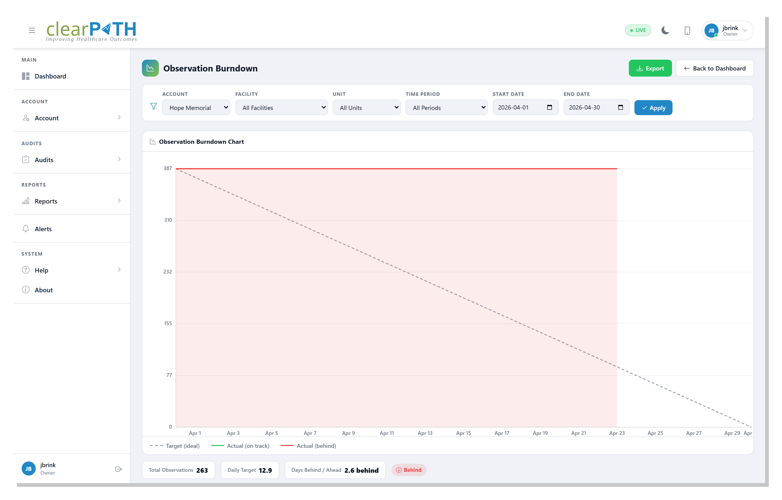
5.3.1. Observation Burndown
Tracks how close you are to the target number of observations for the current period. The dashed line is the ideal trajectory; the solid line is what has actually been recorded. The bottom bar shows the total observations, the daily target, and whether you are ahead or behind.
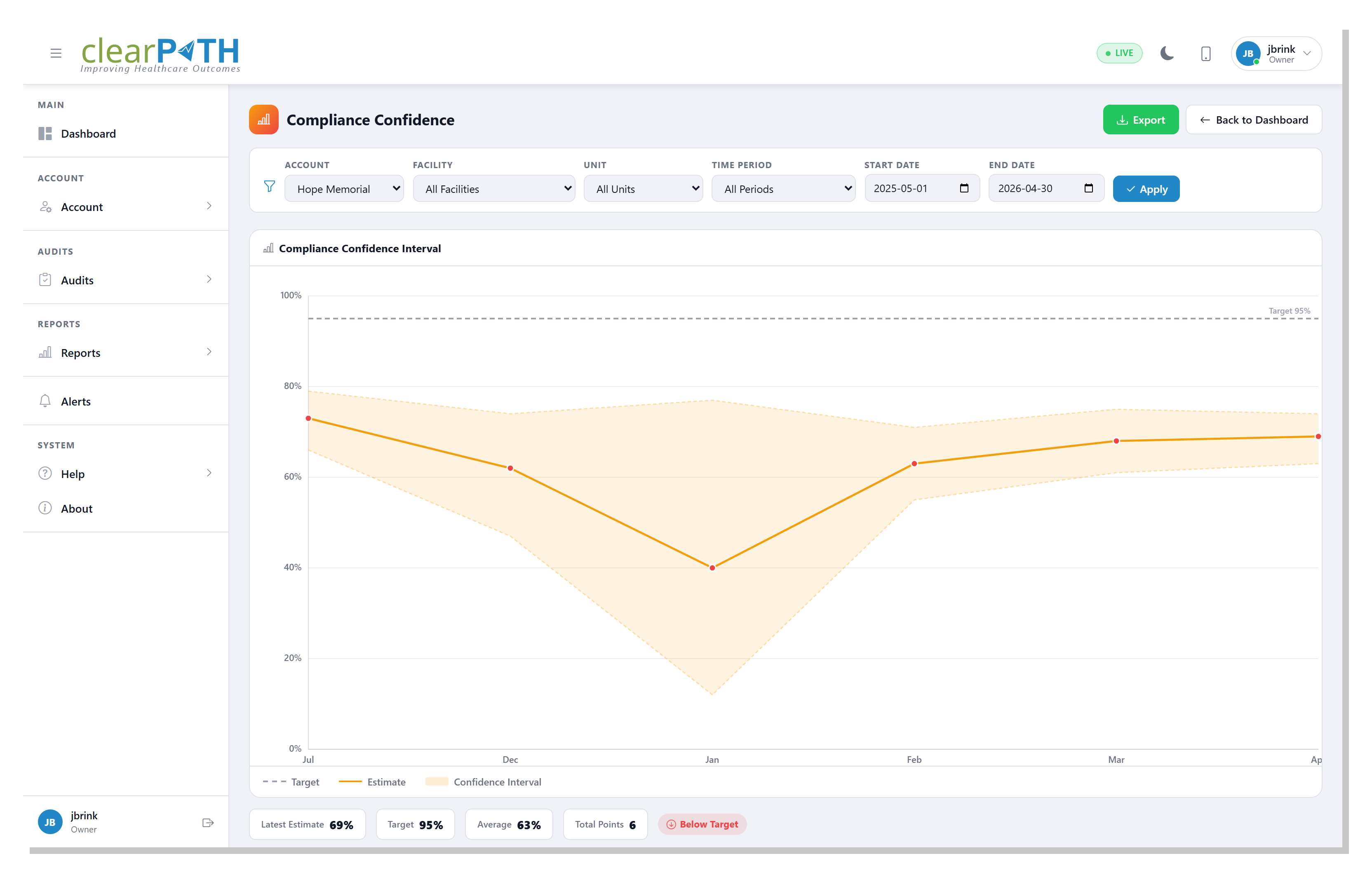
5.3.2. Compliance Confidence
Shows monthly compliance with a statistical confidence-interval band. The wider the band, the less certain the monthly result. Use this view to judge whether a drop or spike is meaningful or just noise in a small sample.
5.3.3. Moments Radar
Plots compliance against all five moments of hand hygiene on a single radar chart, so uneven performance across moments is immediately visible.
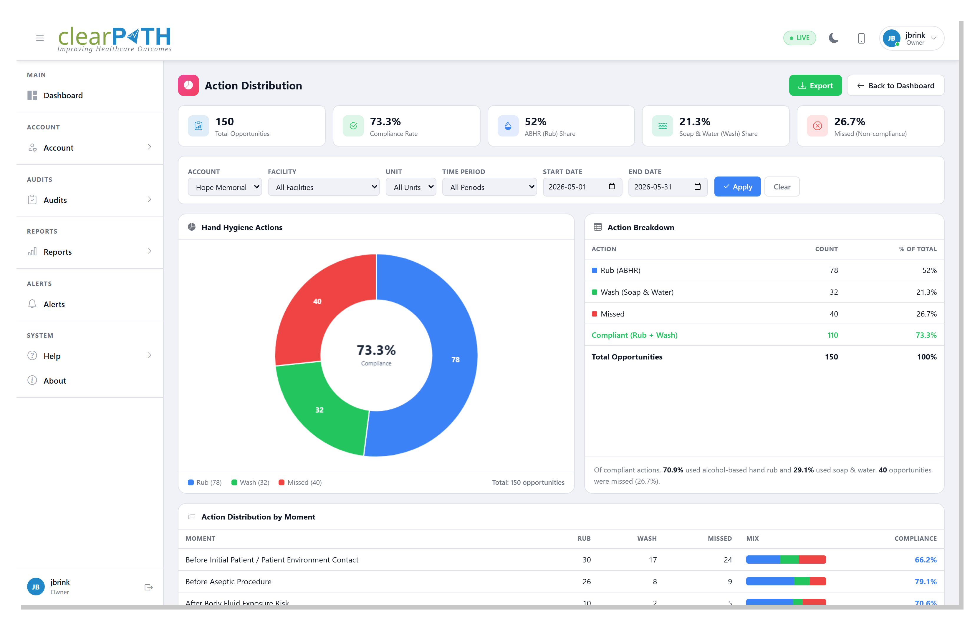
5.3.4. Action Distribution
Breaks every observed opportunity into Rub, Wash, or
Missed as a doughnut, with the overall compliance rate shown in
the centre. Stat cards summarize the total opportunities, the
compliance rate, and the share of each action. A table lists the exact
counts, and a By Moment table shows which of the five moments is
driving the missed opportunities — the highest-value place to focus an
intervention.
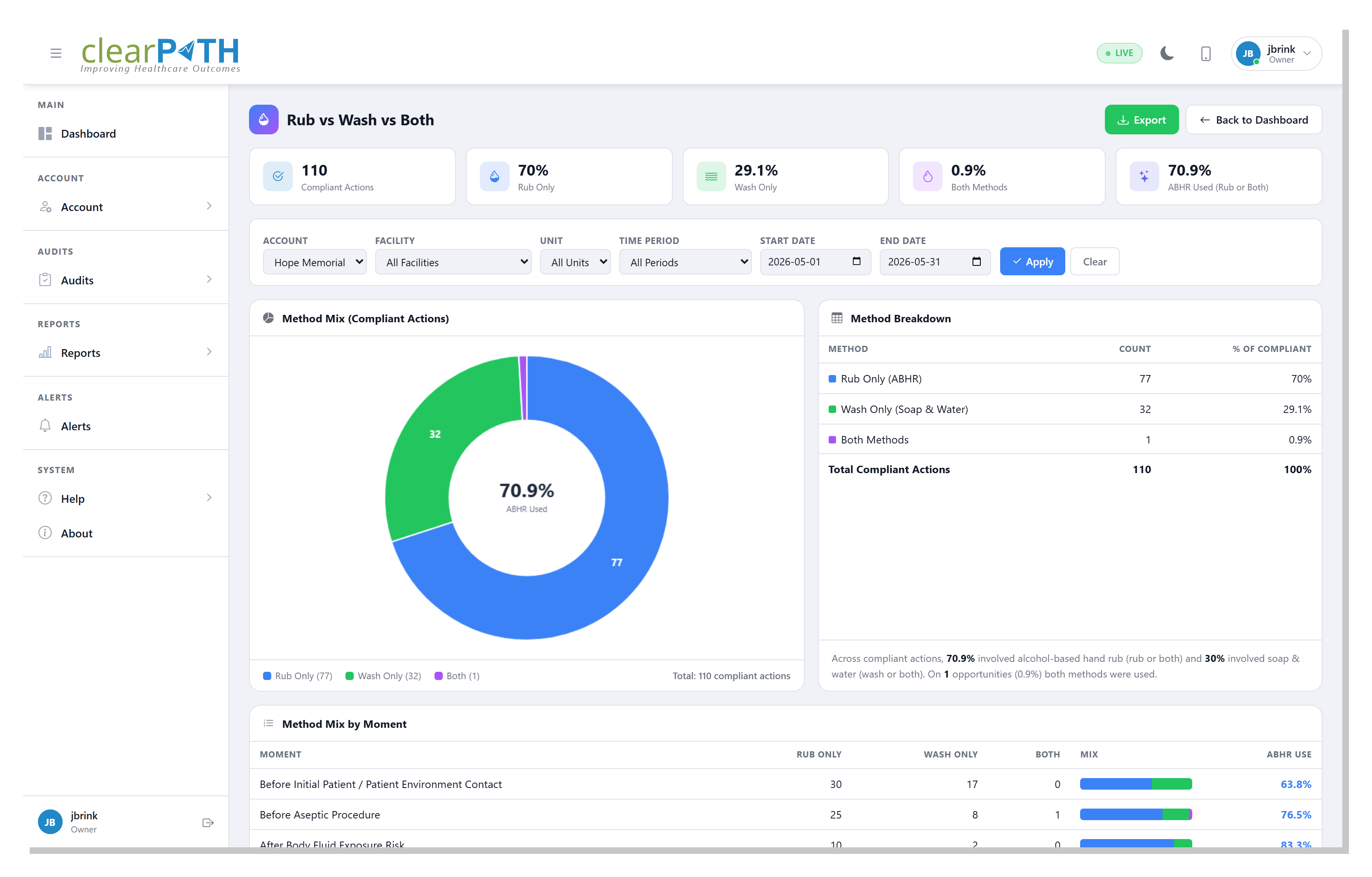
5.3.5. Rub vs Wash vs Both
Looks only at compliant actions and splits them by method: alcohol-based
hand rub, soap and water, or both. The centre of the doughnut shows how
often hand rub was used. The By Moment table shows the method mix at
each moment. This is useful when soap and water is the expected choice —
for example on a unit caring for patients with C. difficile, where
alcohol-based rub is not effective.
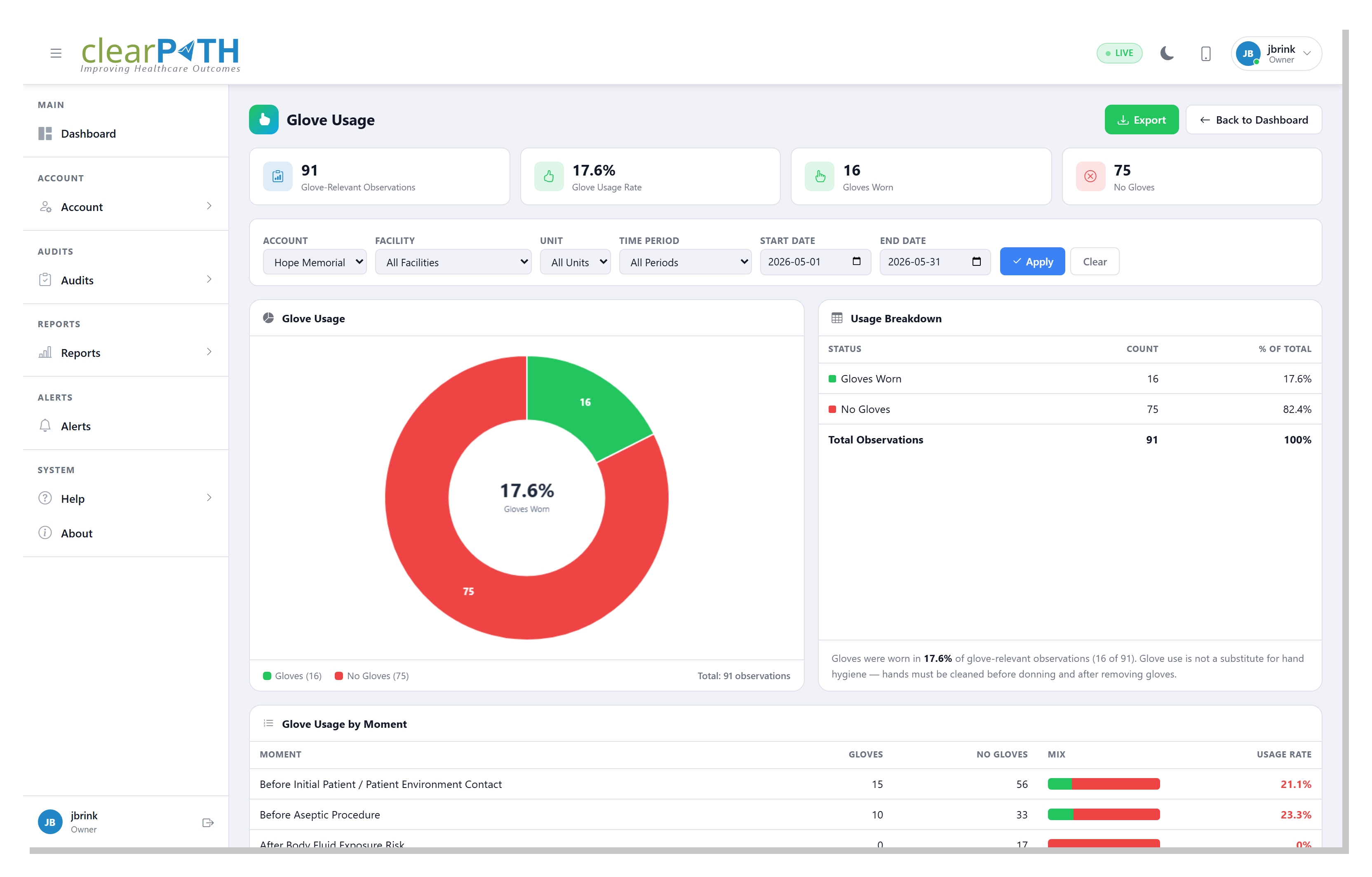
5.3.6. Glove Usage
Shows how often gloves were worn during the glove-relevant moments
(before patient contact and after body-fluid exposure) as a doughnut,
with the glove usage rate in the centre. The By Moment table breaks
glove use out across every moment. Wearing gloves does not replace hand
hygiene — hands must still be cleaned before putting gloves on and after
taking them off.
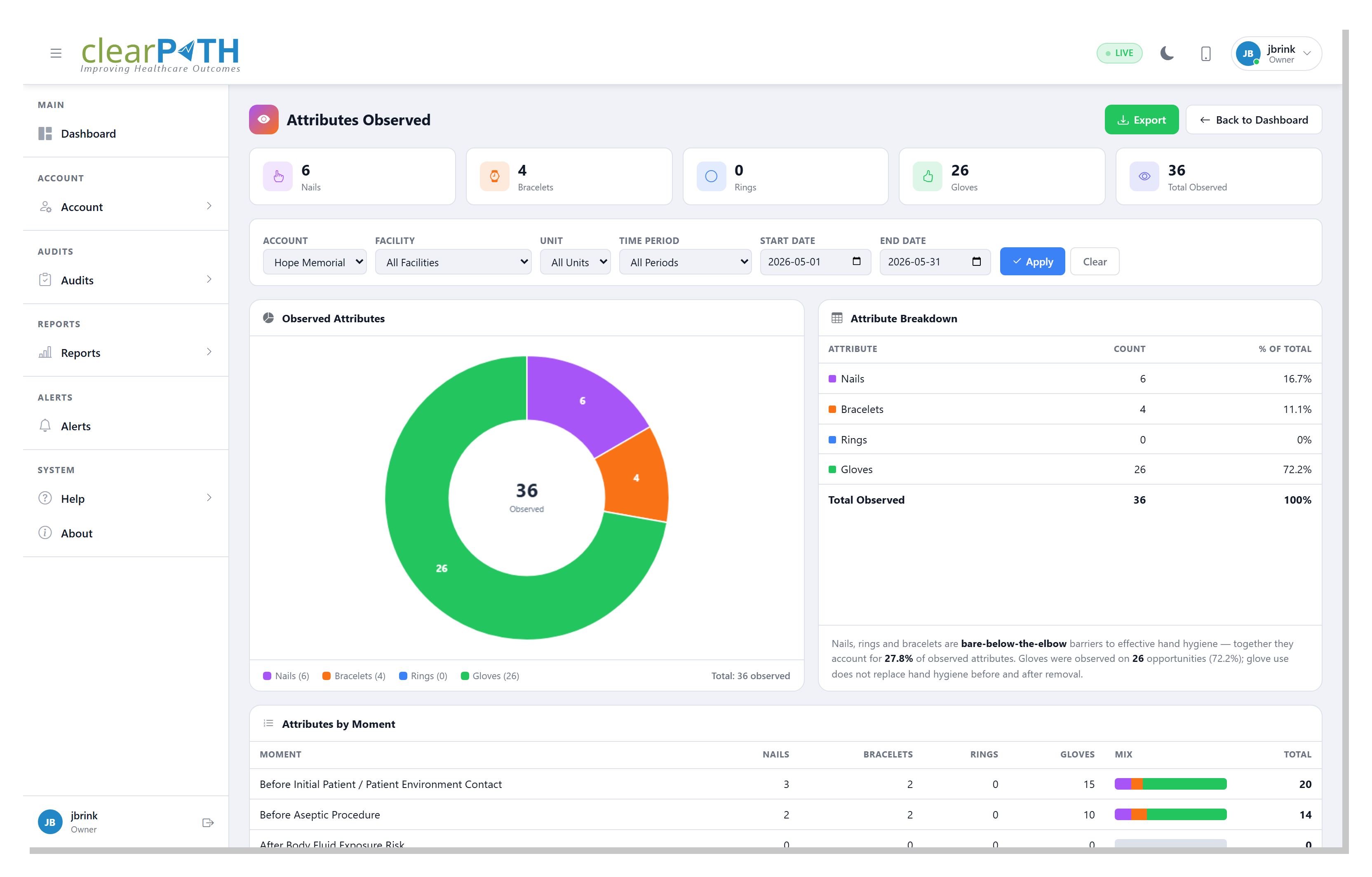
5.3.7. Attributes Observed
Shows the contextual attributes auditors recorded — nails, bracelets,
rings, and gloves — as a doughnut, with stat cards and a breakdown
table. A By Moment table shows how the attributes break down across
each moment. Nails, rings, and bracelets are bare-below-the-elbow
barriers to effective hand hygiene, so a high share is worth following
up.
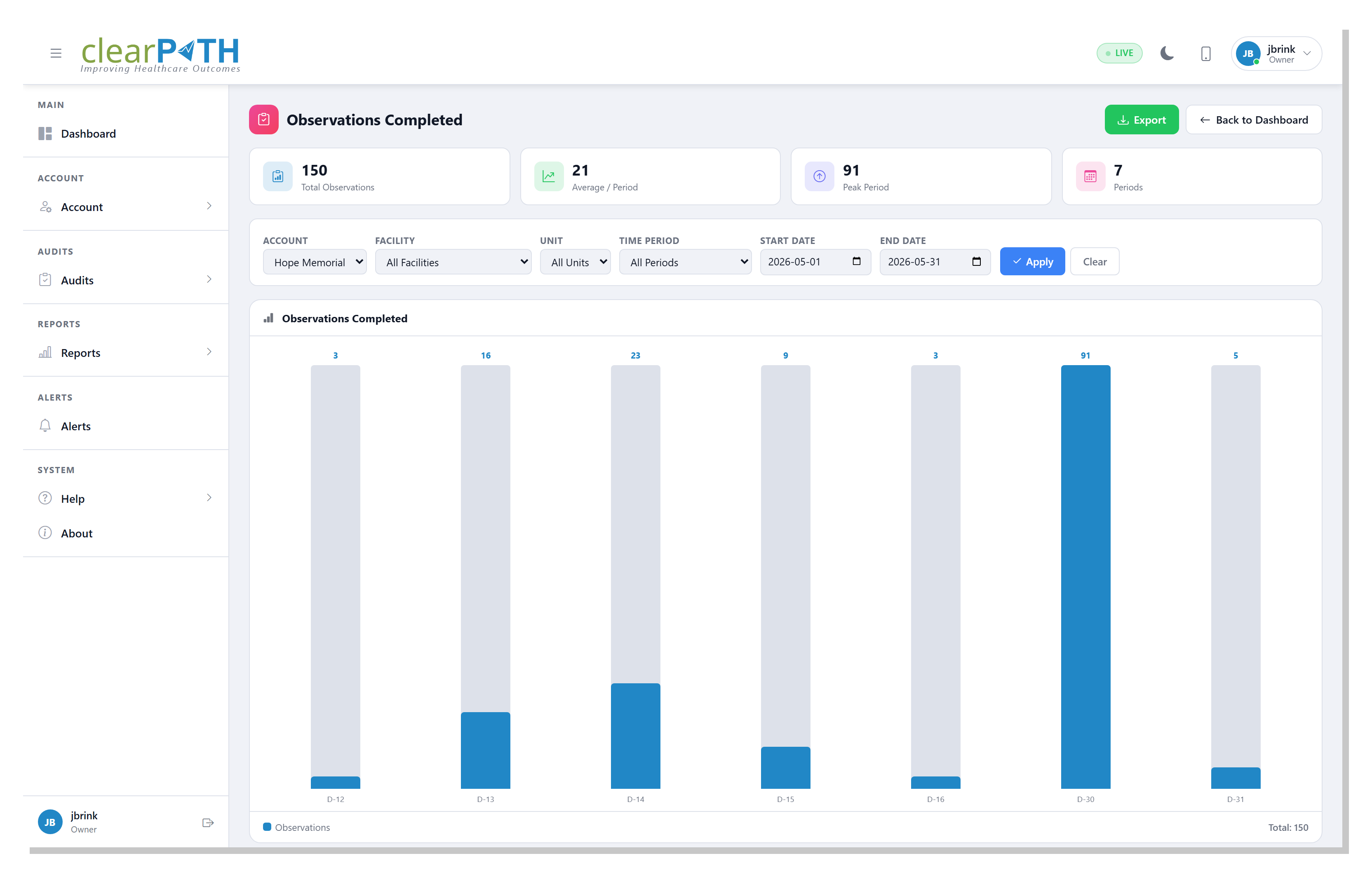
5.3.8. Observations Completed
A bar chart of how many observations were recorded in each period, with stat cards for the total observations, the average per period, the busiest period, and the number of periods. Use it to confirm where — and when — the audit work is actually happening.
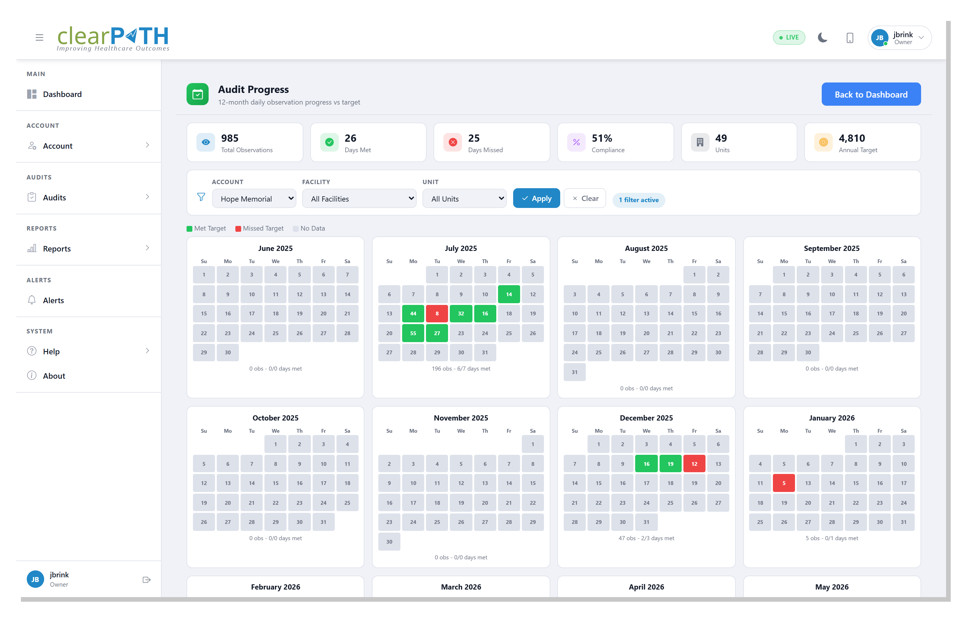
5.3.9. Audit Progress
A month-by-month calendar showing audit activity against the period’s goal. Stat cards summarize the total observations, days hit, days missed, completion rate, and the annual target. Coloured days show where you met or missed the daily goal at a glance.
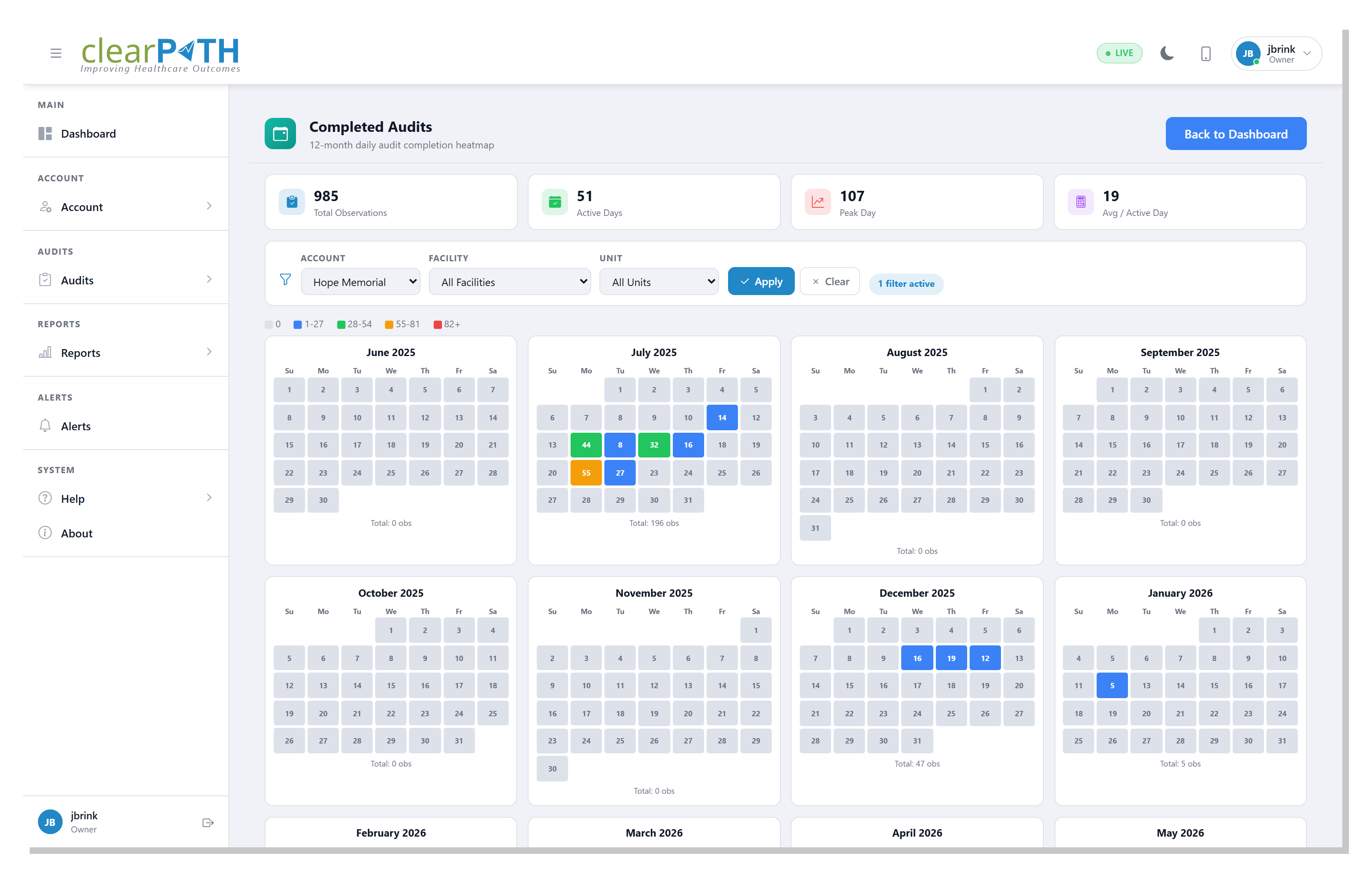
5.3.10. Completed Audits
A calendar heat map of custom-audit completion across the selected months, with target markers, so gaps in coverage stand out at a glance.
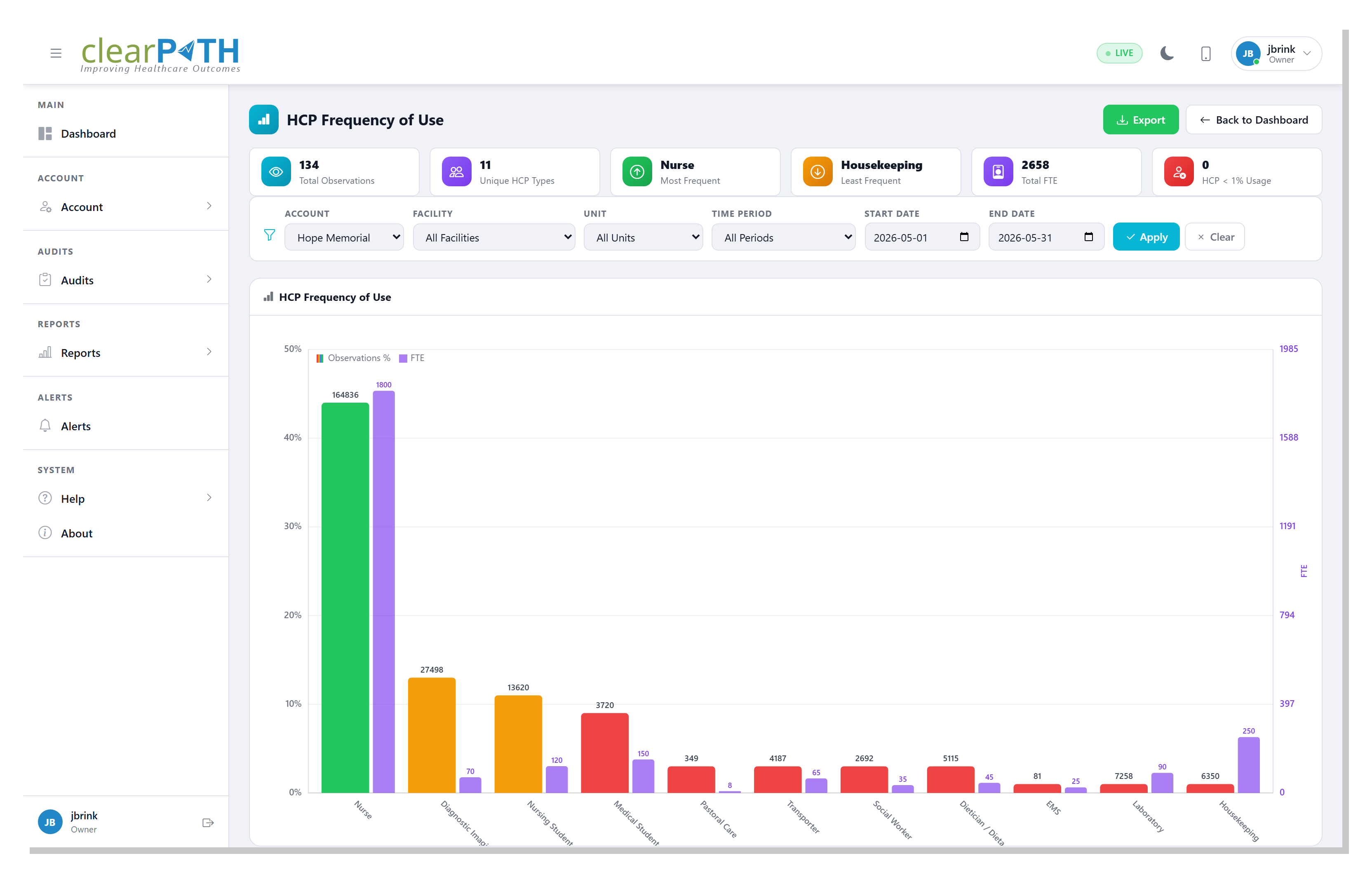
5.3.11. HCP Frequency
Ranks healthcare-provider types by how often they were observed.
Opened from either the Most Frequently Audited HCP or Least
Frequently Audited HCP widget, it helps you confirm the sample is
balanced across roles rather than concentrated on a few.
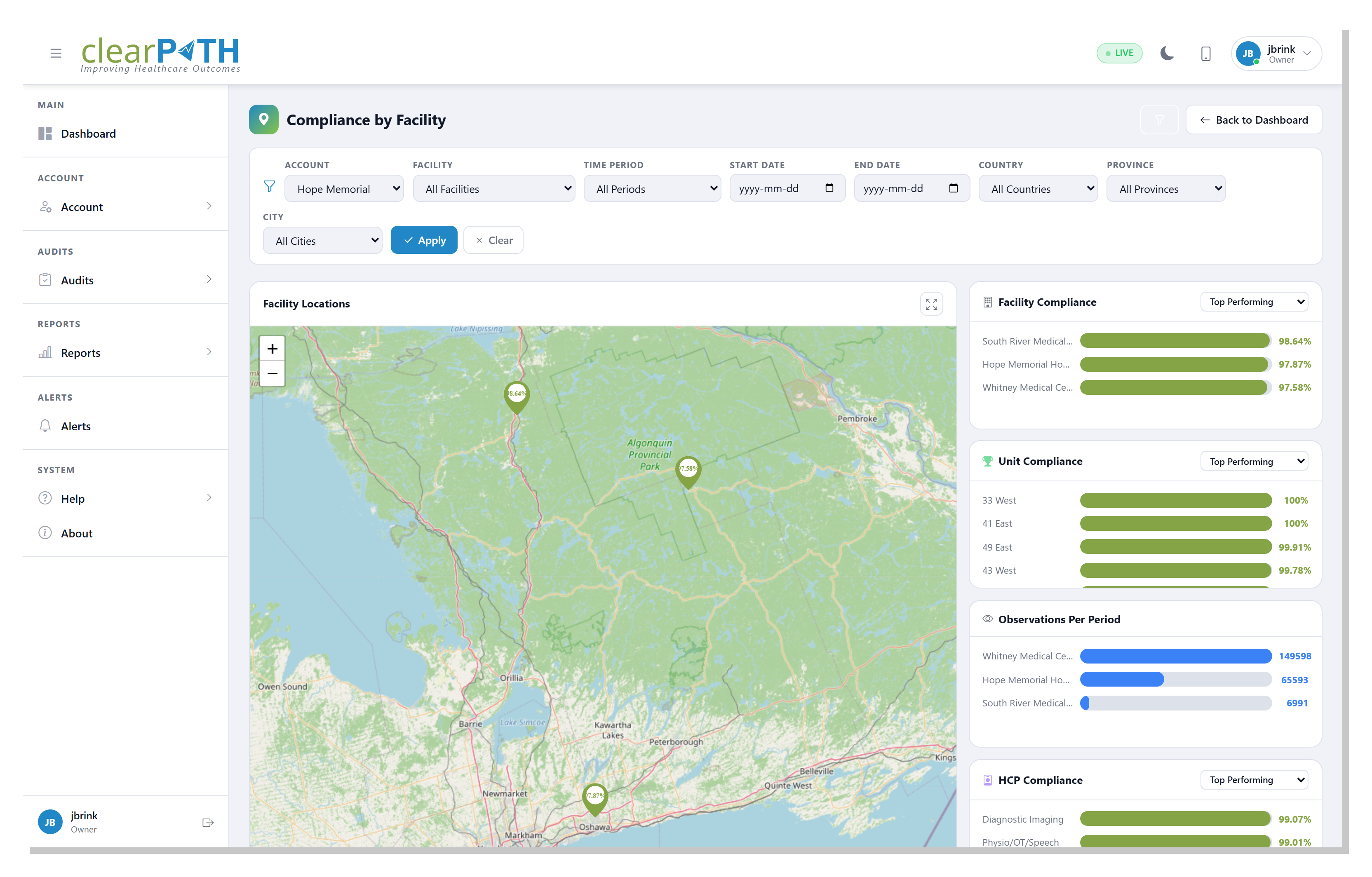
5.3.12. Facility Map
A geographic map of every facility on the account, each pinned to its
address and coloured by its current compliance. Opened from the
Compliance by Facility widget, it makes regional and multi-site
patterns easy to spot. See also the Visual
Map.
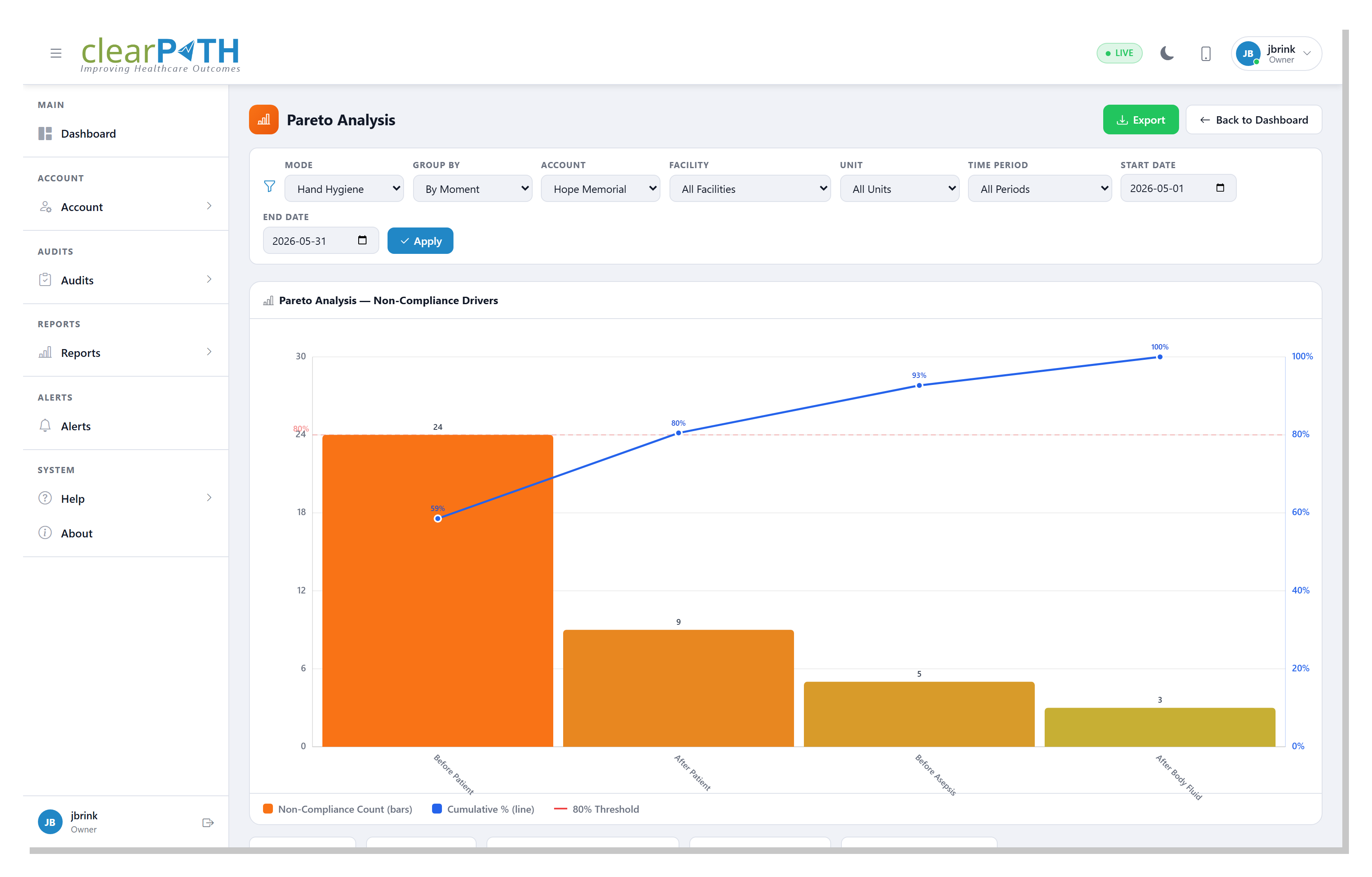
5.3.13. Pareto
The 80/20 view: sorts non-compliance by moment, HCP type, or unit and overlays a cumulative-percentage line with an 80 % reference, so you can focus on the few categories that drive most of the misses.
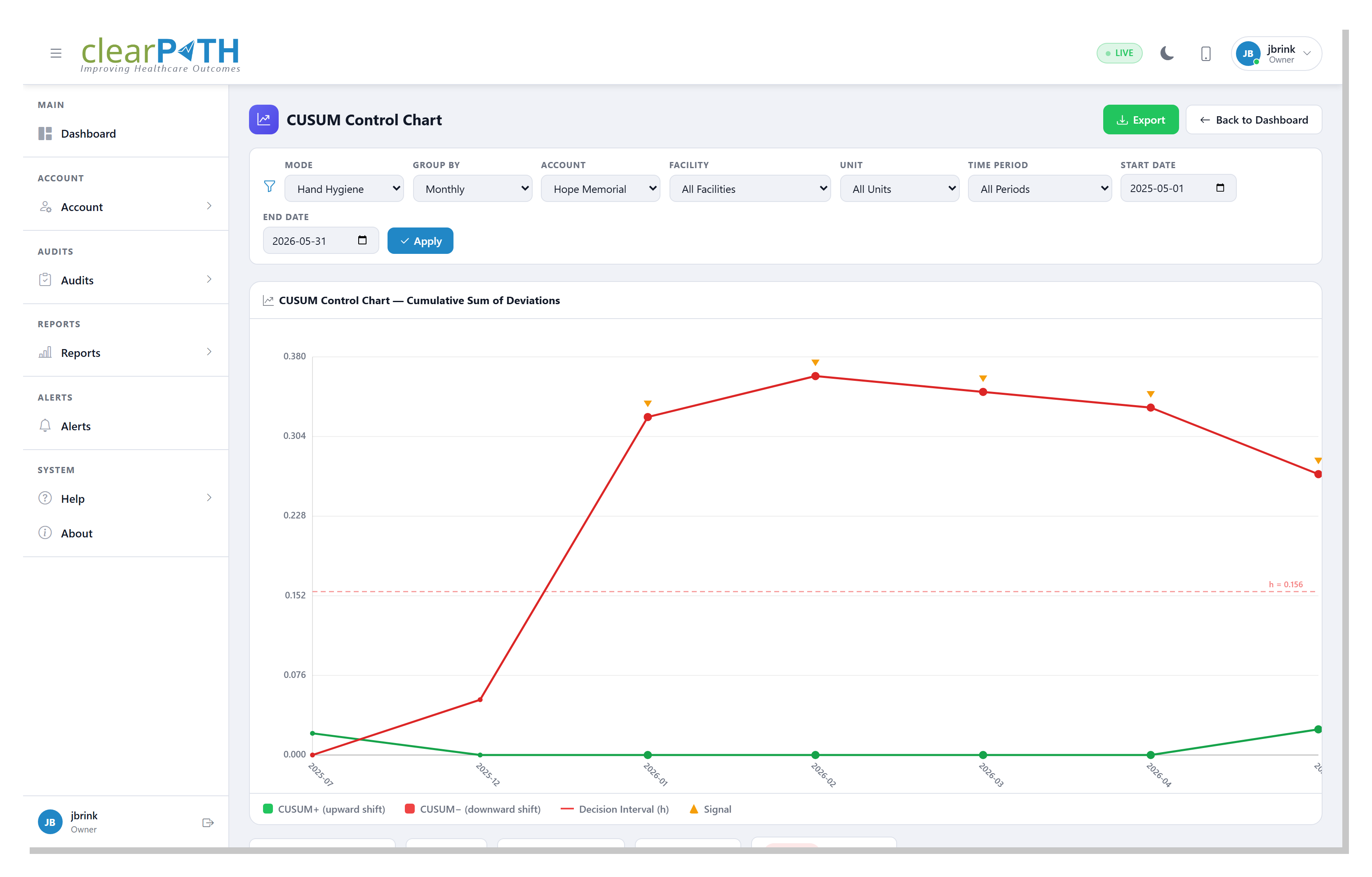
5.3.14. CUSUM
A cumulative-sum control chart that highlights a persistent drift away from target sooner than a simple average would. Points that cross the decision interval are flagged as a signal worth investigating.
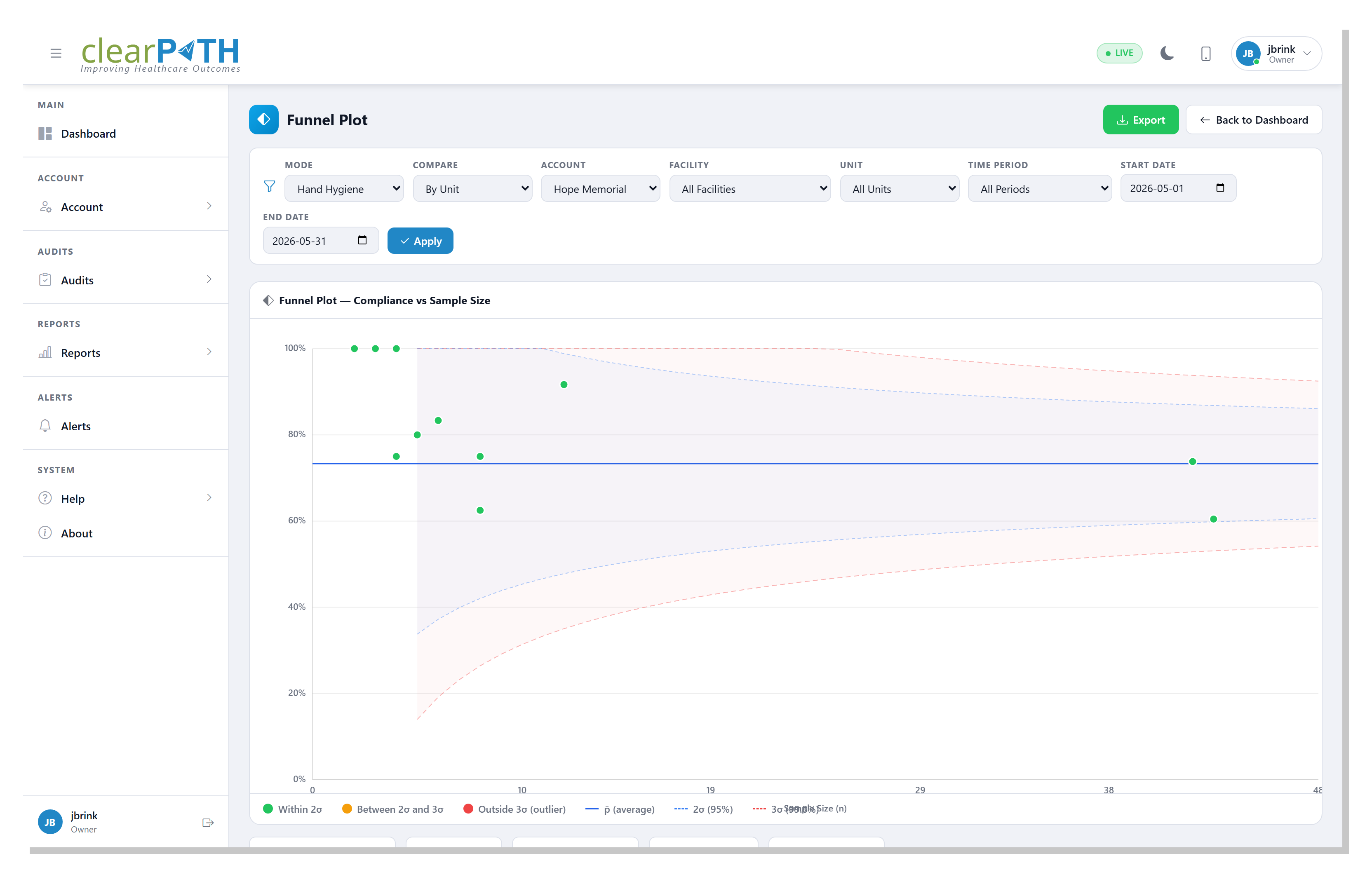
5.3.15. Funnel
Plots each unit’s compliance against its sample size inside control limits shaped like a funnel. Units that fall outside the funnel are genuinely off-target rather than just unlucky in a small sample.
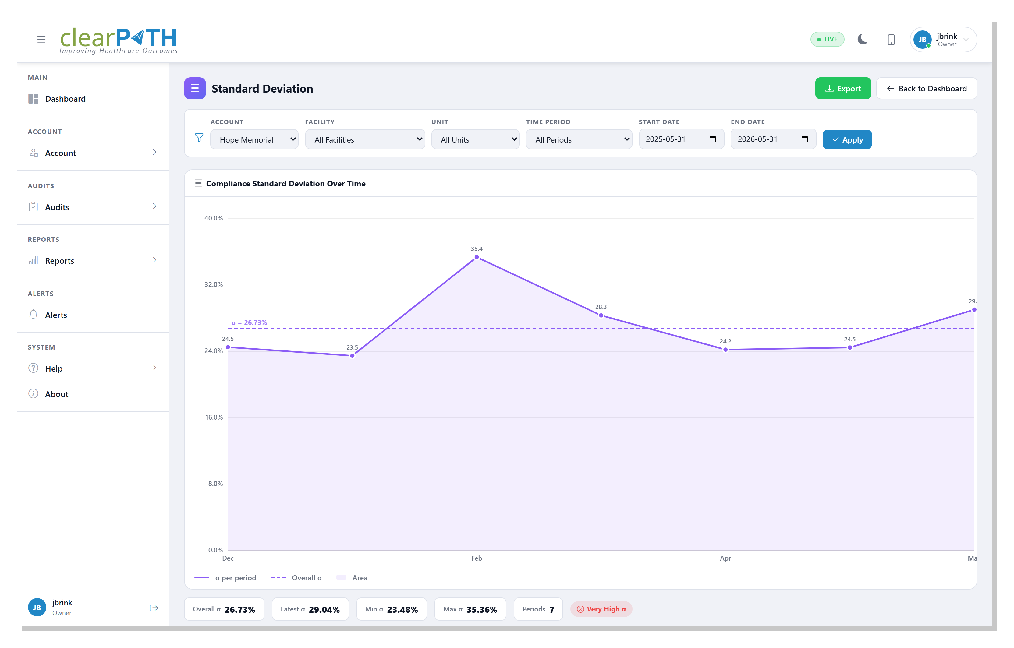
5.3.16. Standard Deviation
Shows how much compliance varies from one period to the next. A falling line means the program has stabilized; a rising line means results are becoming less predictable.
Pareto, CUSUM, and Funnel each have a Custom Audits variant,
opened from the matching custom-audit widget, that runs the same
analysis over custom-audit results instead of hand hygiene.
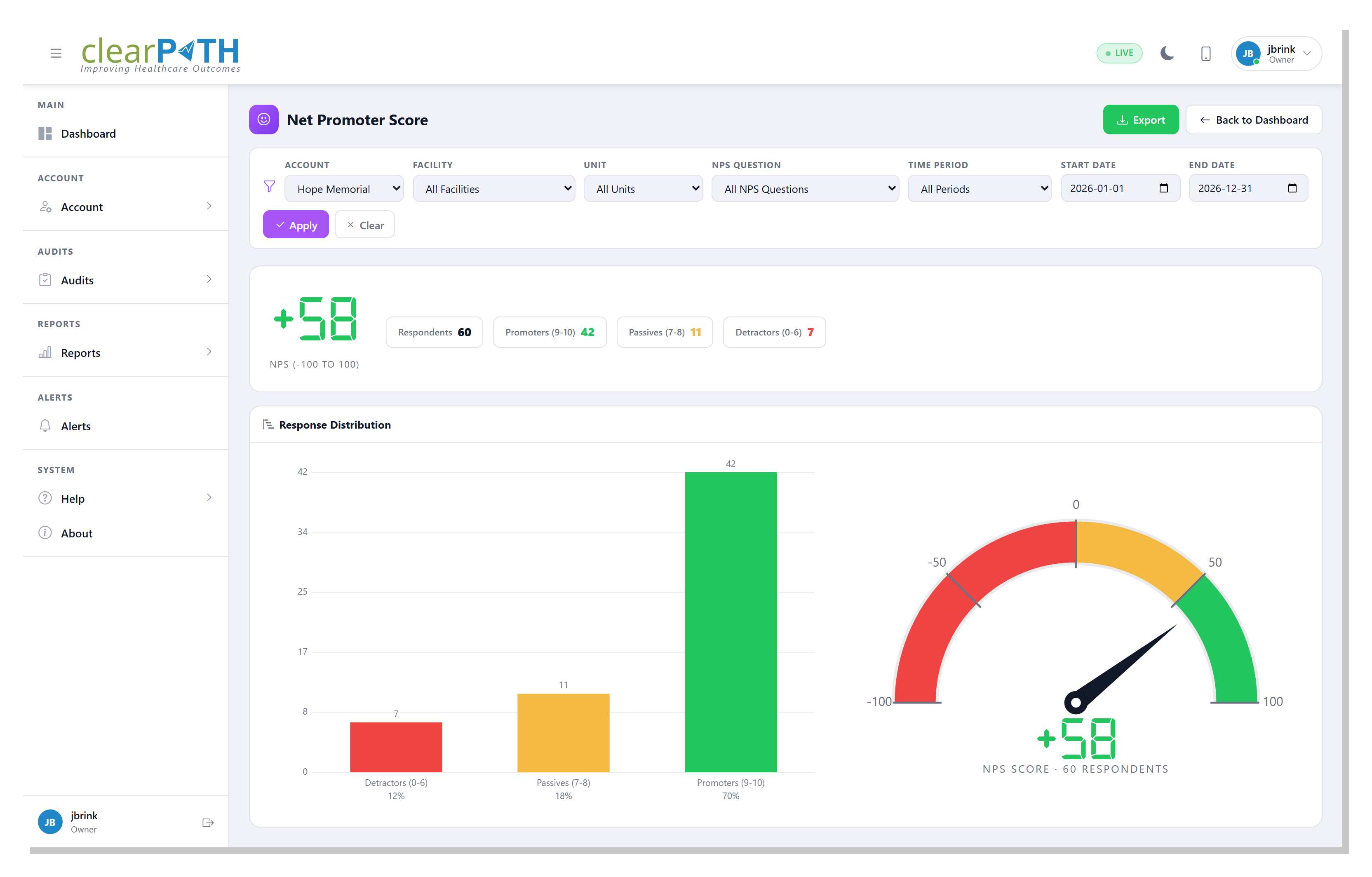
5.3.17. Net Promoter Score
Tracks the Net Promoter Score for any custom audit configured as a
public survey. Each response is grouped into promoters (9–10), passives
(7–8), or detractors (0–6), and the headline score is the percentage of
promoters minus the percentage of detractors, on a −100 to +100 scale.
The gauge shows the current score and the bar chart shows how responses
are distributed. Use the NPS Question filter to compare individual
survey questions.
One more detail page opens from the More action:
P-Chart— a statistical process-control chart with a centre line and upper / lower control limits. This is the same view as the P-Chart report.
5.4. Visual Map
The Visual Map is a geographic view of every facility on the account. Each facility is pinned to its address and colored by its current compliance result, making regional and multi-site trends easy to spot.
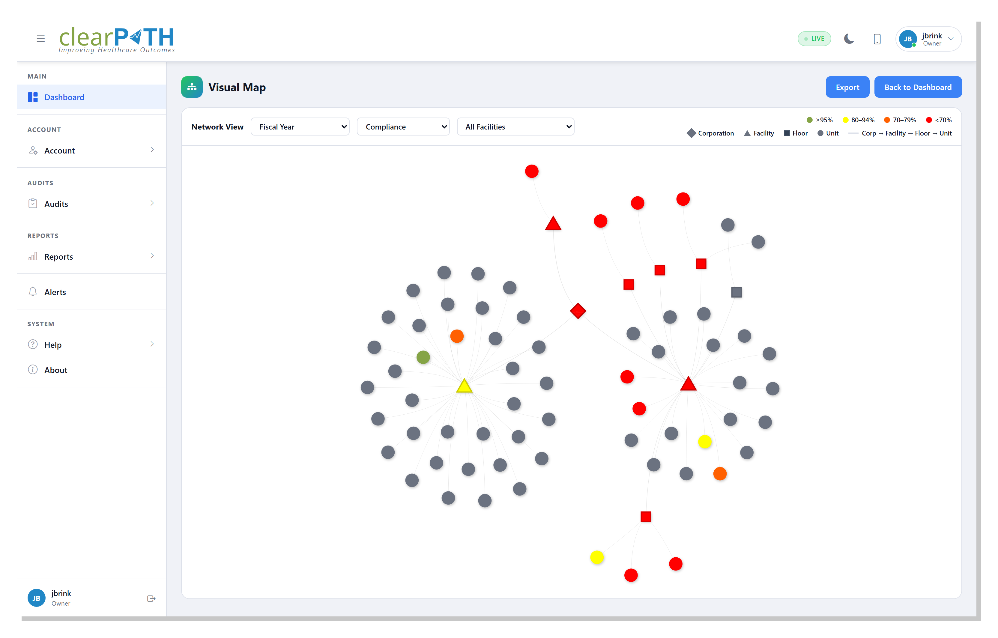
Open the Visual Map from Dashboard | Visual Map in the sidebar. When Regions have GeoJSON boundaries defined, the map shades each region in the color you assigned it and rolls up the compliance of every facility inside.
5.5. Live (Kiosk) Mode
The Live pill in the header shows that the dashboard is connected
and refreshing in real time. For unattended displays — lobby screens,
staff-room monitors, huddle boards — use Digital
Signage to broadcast the dashboard without requiring
anyone to be signed in.
5.6. Widget Gallery
A screenshot and short description of every widget available in the type picker is in the Widget Gallery.