A Report in clearPath is a saved definition that tells the system
what to produce, how often, and in what format. Once you set a
report up, clearPath runs it on a schedule (generally just after
midnight) so the latest version is always waiting for you. You can
also run a report by hand at any time to get a fresh copy
immediately.
Every report definition carries:
A name — how the report is shown everywhere in clearPath.
A report type — what the report is actually measuring (for
example, a compliance trend, an anatomy breakdown, or a facility
summary).
A format — PDF, CSV, XML, HTML, PNG, or
Excel.
A period — a dynamic time range such as LastMonth,
ThisQuarter, FiscalYear, or Last90Days.
A scope — the facility, patient care area, program, or unit
the report covers.
An owner — the clearPath user responsible for the definition.
Because the period is dynamic, a report defined once keeps producing
meaningful output month after month without anyone having to edit
it.
CloneSelectedReports — makes a copy of each ticked
report, ready to be renamed and tweaked.
Export — opens a menu with ExporttoHTML,
ExporttoCSV, and ExporttoExcel. The export contains
whatever rows are currently visible after searching and
filtering.
Reports — opens a menu for creating a report:
NewReport — opens the report editor with a blank form so you
can define a new report from a built-in report type.
NewBuilderReport — opens the Report Builder, where you design your own report layout.
(Available on the Ultimate edition.)
ReportName — the name of the definition. Click the heading
to sort.
Owner — the user who owns the report.
ReportType — the kind of report being produced.
ReportFormat — the output format.
Period — the time range the report covers.
Lang — the language the report is rendered in.
Age — how long ago the report was last refreshed.
Size — the size of the most recent generated file.
Tick the checkbox at the left of a row to select it; tick the
header checkbox to select every row on the page. Selecting rows
lights up the Actions and Export buttons.
Click the three-dot button at the end of a row to open the row
menu:
Refresh — re-runs just this report so the latest numbers are
ready.
ViewReport — opens the most recent copy of the report.
Edit — opens the report definition in the editor. Reports you
built with the Report Builder re-open in the
Report Builder instead.
CloneReport — makes a copy of the definition you can
rename and tweak.
Delete — removes the report definition after a confirmation
prompt.
The rest of this chapter covers the pieces that make up a report
definition — the logo, the definition fields, dynamic report-name
tags, the anatomy of a report, legends, how to handle empty
periods, the report request policy, report styles, the Keyword
Manager, distribution lists, the archive, and report groups.
A report definition is the recipe clearPath follows to produce a
report. Every row on the Reports page is one definition, and the
editor for a definition is organised as a dialog with a strip of
tabs along the top. Each tab covers one aspect of the report.
The list itself is described on the Reports page
at the top of this chapter — including the stat chips, the search
and filter toolbar, every table column, and the page header
buttons.
Click the three-dot button at the end of a row to open the row menu:
Refresh — re-runs this report so the latest copy is ready.
ViewReport — opens the most recent generated copy in a new
tab.
Edit — opens the definition in the editor (see the tabs
below).
CloneReport — makes a copy of the definition so you can
rename it and tweak anything without losing the original.
Delete — removes the definition after a confirmation prompt.
If the report belongs to one or more distribution lists, the menu
also shows a MemberofNDistributionList(s) entry. Clicking
it jumps to the Distribution Lists page with a filter pre-applied
so you can see exactly which lists are involved.
When you click NewReport at the top of the page or Edit on
a row’s menu, clearPath opens the report editor. The editor is a
dialog with a strip of tabs along the top; the sections below
describe each tab.
The General tab collects the basics: the report’s name, a short
description, the owner (a clearPath user), and the
high-level settings that control which kind of report this is and
what language it comes out in.
The Scope tab decides which data the report covers. Pick the
facility, patient care area, program, and unit the report should
draw from. Leaving a level blank includes every child beneath it,
so an empty facility list means “every facility on the account”.
The HCP tab chooses which healthcare provider types the report
covers. You have two options:
Leave every checkbox unselected — clearPath treats this as
“include every active HCP type”.
Tick a subset of HCP types — only those types are included.
Tip
Leaving the HCP list empty is usually what you want. It means
the report keeps including every HCP type as new ones are added
to the system, with no manual editing.
Note
If the list has any HCP types ticked, adding a new HCP to the
system does not automatically add it to the report. You need to
edit each affected report and tick the new type by hand.
The Period tab sets the time range the report covers. clearPath
periods are dynamic — a report defined with LastMonth
keeps producing a fresh “last month” view automatically each time
it runs, without anyone having to edit the definition.
What the Period tab looks like depends on the Report Type you
picked on the General tab. There are five layouts you may
encounter:
Most reports use the standard PeriodType dropdown. The list of
choices is filtered by report type — for example a Last 90 Days
report only offers windows that make sense for a trailing-90-day
chart — so you may see fewer or more entries than another report
type offers.
Rolling windows: Last30Days, Last60Days,
Last90Days, Last120Days, Last180Days,
LastThreeMonths, LastNinetyDays.
Custom — described in the next sub-section.
If the report type itself defines the period (for example a report
that always shows the last five fiscal years), the dropdown is
replaced by a read-only DefinedbyReport label and there is
nothing to change on this tab.
Picking Custom from the PeriodType dropdown reveals a
StartDate and EndDate pair. The report covers every
observation between those two dates inclusive. This is the only
period choice that is not dynamic — every run uses exactly the
dates you typed in, so a custom-period report is best for a one-off
review rather than a recurring distribution.
A handful of reports cover one fiscal year at a time — for example
the QIP Indicators Twelve Months and QIP HCP Twelve Months
reports. For these report types the Period tab replaces the usual
dropdown with a single FiscalYear picker. Pick the fiscal year
you want the report to cover (FY2025, FY2026, and so on)
and the start and end dates are filled in for you from your
account’s fiscal calendar.
The Observations Per Day report covers a single calendar year
at a time. Its Period tab shows a CalendarYear picker instead
of the regular dropdown. Pick the year (2025, 2026, and so
on) and clearPath sets the date range to January 1 through
December 31 of that year.
25.3.8.5. Static period (Audit Form and Last Five Years)
Two report types use a fixed period that you cannot change from
this tab.
Audit Form reports show a blank audit-form layout for staff to
fill in by hand on paper. The form does not change with the date
range, so the Period tab simply shows a read-only StaticForm
label:
By Type Indicator Trend — Last Five Years reports always cover
the most recent five years counted back from today’s date. The
Period tab shows the computed date range as a read-only label and
updates automatically each time the report runs:
Tip
If the Period tab looks different from what you expected, the
most likely reason is that you changed the Report Type on
the General tab. Switching back to a standard report type
restores the regular PeriodType dropdown.
The Legend tab controls the small printed panel that appears with
each generated report explaining how the report was built — the
period it covers, which filters were applied, who owns it, and so
on. It also covers a handful of display options for the body of the
report itself.
Use these toggles to decide what appears in the legend panel:
IncludeLegendinReport — master switch. When off, the
remaining toggles in this section have no effect because the
legend panel is not printed at all.
ShowReportPeriod — print the time range the report covers
(for example Last Month, Fiscal Year, or a custom date range).
ShowFilterOptions — list any filters applied to the report
(facility, patient care area, group, unit type, reportable /
non-reportable, and so on).
ShowCreationDate — stamp the date the report was generated.
ShowRoles — show which observer roles were included.
ShowIndicators — list the indicators that rolled into the
report.
ShowHealthCareProviders — list the HCP types covered.
ShowUnitTypes — list the unit types covered (Acute Care,
Long Term Care, Post Acute Care).
ShowFilename — print the generated filename at the bottom of
the legend so a printed copy can be matched back to the digital
file.
ShowOwnerName — print the name of the clearPath user who
owns the report definition.
The toggles in the Options section affect the body of the
report rather than the legend panel:
HideReportDetails — collapse fine-grained breakdown rows so
the report shows only summary totals. Useful for executive-level
copies.
ShowNumerator/Denominator — print both the count of
compliant observations and the total count alongside each
percentage.
ShowPercentage — print compliance figures as percentages.
ShowUp/DownIndicatorIcon — add a small arrow next to each
figure showing whether it improved or regressed against the
previous period.
IncludeProgram/GroupNameinHeader — repeat the program
or group name at the top of each page.
ShowBlankLines — pick Yes or No. Yes keeps
empty rows visible in tables (useful for printed paper copies
someone can write on); No collapses them for a tighter
digital view.
Tip
For a board or executive distribution, turn on
HideReportDetails and ShowPercentage and leave the
numerator / denominator off. For an audit-team working copy,
turn everything on so the legend records exactly how the figures
were calculated.
The Output tab decides what the finished report looks like. It
covers the output format (PDF, CSV, XML, HTML,
PNG, Excel, or Word) and the styling options applied
during rendering.
Note
The list of formats reflects the report type you picked on the
General tab — only the formats that type supports are offered.
The Template tab appears only when the report type is
Word Template (Ultimate edition). It chooses the
Word (.docx) template the report is rendered into and manages your
account’s template library:
Template — the drop-down of templates available to your account,
including any you have uploaded and the shipped default. The selected
template is saved with the report, so different reports can use
different templates.
Download — downloads the selected template so you can edit it in
Word.
Upload.docx — adds a new .docx to your account’s library and
selects it.
Delete — removes the selected template from your library (the
shipped default cannot be deleted).
Inside the template you place {tag} and {chart:…} placeholders
where you want live figures and charts to appear. Type each tag as
plain, unformatted text and keep each {chart:…} on its own line.
The Scope and Period tabs control the data range, as they do for any
report.
Tip
See Word Template Reports for the complete list
of placeholder tags and a full walk-through of editing and uploading
your own template.
The Member tab lists every distribution list that currently includes
this report. It gives you a single-screen answer to the question
“who is getting this report?” without having to open each
distribution list one at a time.
Each row shows:
Name — the name of the distribution list.
Account — the account the distribution list belongs to.
Frequency — how often the distribution list is scheduled to
send (for example Daily, Weekly, Monthly, or
Annually).
Owner — the clearPath user who owns the distribution list.
A trashcan button at the right of each row removes this report from
that distribution list after a confirmation prompt. The list itself,
its other reports, and its recipients are not touched — only this
report’s membership in that one list is removed. The table refreshes
right away so the change is visible immediately.
If the report does not belong to any distribution list, the tab
shows a friendly empty-state message instead of an empty table.
Tip
Use the Member tab to retire a report from a recurring
distribution without having to navigate to the distribution list
editor and untick the report from a long tree of choices.
clearPath report names can be fixed, dynamic or a combination of both. If you would prefer a report name that never changes
enter the name in the Report Name field. If you like to have the report name actively update based on the settings, then use the
following tags in the report name field.
Tag
Description
%DOW%
Returns the day of the week (1 through 52).
%WOM%
Returns the week of the month (1 through 5).
%MOY%
Returns the month of the Year (1 through 12).
%MMMM%
Returns the month (January, February, March, etc.).
%MMM%
Returns the month (Jan, Feb, Mar, etc).
%MM%
Returns the month (01 through 12).
%M%
Returns the month (1,2,3,4, etc).
%DDDD%
Returns the day (Monday, Tuesday etc).
%DDD%
Returns the day (Mon, Tue, Wed etc).
%DD%
Returns the day (01 through 07).
%D%
Returns the day (1,2,3, etc).
%YYYY%
Returns the year (2025, 2026, etc).
%YY%
Returns the year (25, 26 etc).
%REV%
Returns the Report Style example : Style-xx
%STYLE%
Returns the Report Style example : Style-xx
%PRD%
Returns the Report period in ddd mmm dd, yyyy format
%FABR[X]%
Returns facility Abbreviation.
%USR[X]%
Returns the username/owner of the report.
%FAC[X]%
Returns the facility name of the report.
%PAC[X]%
Returns the patient care area name of the report.
%ACT[X]%
Returns the account name of the report.
%GRP[X]%
Returns the group name of the report.
%PGM[X]%
Returns the program name of the report.
%ROL[X]%
Returns the role name of the report.
%TYPE%
Returns the report type or style.
%OUTPUT%
Returns the report output format (PDF,HTML,CSV,XML,Excel).
%RID%
Returns the report id of the report. Each report has a unique ID to identify it
Tip
Square brackets are optional parameters.
Where [X] is an integer value and limits the result to a maximum
of x characters. For example ‘%FAC[4]%’ would expand to ‘HOPE’ vs ‘%FAC%’ would expand to
‘Hope Memorial’
Note
It is perfectly acceptable to use a combination of tags and static text. For example
‘HH %FAC%’ would expand to ‘HH Hope Memorial’ for example.
The numbered callouts in the image above correspond to the following elements, which appear on most
clearPath reports.
#
Description
1
Your corporate logo, uploaded under account preferences.
2
The report title — normally the report-type name (for example, “Hand Hygiene Moment
Compliance”). In the example above this line is blank because the title was not set on the report
definition.
3
The scope of the report. This can be Corporate, Facility, Patient Care Area, Program, or Unit, and
reflects the filter selected when the report was run.
4
Your corporate name. This is blank in the example image.
5
The report content area. This is where the tables, graphs, or other report-specific output appear.
6
The report footer, which shows the Period, Filter, and Created date. The Period includes the start and
end dates covered by the report. The Filter indicates whether the report is for All data or is scoped
to a specific Facility, Patient Care Area, Program, or Unit, and whether the Patient Care Areas are
Reportable or Non-Reportable.
By default all reports with the exception of Certificate of Excellence and Poster Reports contain a legend.
The default is to show the legend, but it can be disabled in the report definition.
Hint
It is recommended to include the legend with the report. It may be obvious what data is included in the report,
but it may lead to unnecessary questions from stakeholders if they cannot easily determine the period or the scope of the report.
Any report can display the This Report Contains No Data message. This can occur if the date range or any of the other filters have been set to exclude any results, or no data has been collected for the period.
We will always consider customer submissions for new reports. To set expectations, new reports can take weeks of development and testing and maybe
further be delayed due to other feature requests and plans already in the development backlog (schedule). This realistically means report requests can
take a minimum of six weeks or more to take a report from concept to deployment.
Before we accept a report submission, we need an example of the report which can be either a:
sketched version of report
or an existing clearPath report marked up with the requested changes, or a report your organization uses internally.
The report should be in one of the following formats:
Requests from accounts must have an active subscription. If your account is inactive your request will be held until the subscription is
renewed and then placed in the development queue.
Only accounts with Enterprise or Ultimate editions of clearPath can submit request for new reports.
clearPath currently supports 53 unique report styles. Some reports include multiple versions, and
most reports support PDF, CSV, and/or Excel output formats. If you don’t see what you’re looking for, please
contact us at support@clearpathhealthsolutions.com and we will see if there is something close. If not, we will work with you to add
a custom report.
Each section below ends with an indicator bar that summarises the available output formats and the editions
in which the report is included.
The Indicator By HCP report shows hand hygiene compliance for a single indicator (moment), broken down by
health care provider type. It is typically used by infection prevention staff and unit managers who want a
quick, at-a-glance view of how each HCP type is performing against a single moment of care. This report is
ideal for highlighting the best and worst performing provider groups in a compact format.
Tip
If you need a report where all indicators are broken out in a single report, or you need a version where
the data can be exported to CSV or Excel, check out Indicators by HCP.
The Moment Compliance report is one of the original six Ontario Ministry of Health reports. It displays the
distribution of hand hygiene techniques (rub, wash, or both) across a Facility, Patient Care Area, Unit, or
Program, expressed as a percentage. This report does not show overall hand hygiene compliance; rather, it
shows how hand hygiene is being performed when it is performed. Infection prevention teams use it to validate
that alcohol-based hand rub is the predominant technique in clinical areas.
Note
This report was previously known as Type by Indicator.
The Indicators By HCP report shows compliance for every indicator (moment) broken out by health care provider
type in a single report. It is used by quality leads, educators, and unit managers who need to identify which
moments a specific HCP group struggles with so that targeted education can be provided. Two layout styles are
available so the report can be consumed both on screen and in downstream spreadsheets.
Style A presents the data in the standard side-by-side layout for on-screen review and PDF distribution.
25.10.3.2. Style B - Grouped by Facility and Unit
Style B allows you to group HCP types by Facility and Patient Care Area, which is useful for organisations
that want to compare the same HCP type across multiple units.
The Week In Review report provides a one-page recap of auditing activity over the previous week. It highlights
the number of observations collected, compliance at a glance, and notable events. It is typically circulated
to front-line managers and infection prevention leads as a quick status update without the overhead of a full
monthly report.
We recognise that paper audits can still be useful, so clearPath includes a printable audit form. The form is
generated with your unique set of health care providers and indexes them based on your instance of clearPath,
so the paper form matches what auditors see in the mobile app. It is commonly used in settings where a mobile
device is not practical or as a training aid for new auditors.
Note
Out of the box clearPath supports English, Spanish, and French. Other languages can be added on request.
The Observation Note Frequency report lets you determine how often each canned and custom comment is used by
auditors across your organisation. It is most useful when predefined comments have been configured, because
all custom comments entered by auditors are rolled up into a single line on the report. Quality and education
leads use this report to surface recurring issues and to decide which canned comments are worth keeping. To
manage custom comments, from the main menu go to Accounts | Notes.
The Technique Distribution report is one of the original six Ontario Ministry of Health reports. It shows the
breakdown of hand hygiene technique (rub, wash, or both) for a Facility, Patient Care Area, Unit, or Program,
expressed as a percentage. This report does not show hand hygiene compliance; it shows how hand hygiene is
being performed when it is performed. Infection prevention programs use it to monitor adoption of
alcohol-based hand rub versus soap and water.
Note
One change in this version of the report compared to the previous version is that we now show the missed
technique as well. This breaks compatibility with the original Ontario Ministry of Health report; however,
that report always raised questions because the numbers did not add up.
The Observation Summary By Indicator report summarises observations for each observer, broken down by
indicator (moment). It is used by audit program leads to review how individual observers are distributing
their observations across the different moments of care, which helps detect bias or gaps in coverage.
The Indicators by Patient Care Area report shows compliance for every indicator (moment) broken out by
Patient Care Area. Unit managers and quality teams use it to compare moment-level performance across units and
to identify where to focus improvement efforts. Two layout styles are available to accommodate both on-screen
review and legacy CSV exports.
Style A
Style B
Style B maintains the older file format where the facility and patient care area share a single line. This
style was retained for clients that have existing downstream pipelines which consume the CSV export.
Note
Both Style A and Style B support CSV, Excel, and PDF file formats.
The Calendar report contains key contact information for the facility along with any key dates that have been
defined. It is often printed and posted in staff areas so that auditing milestones, hand hygiene week, and
other events are visible at a glance.
The Compliance Over Time Graph plots hand hygiene compliance across the report period so that trends can be
evaluated visually. Each data point represents a time slice (typically a month) and the shape of the line
makes it easy to see whether compliance is improving, flat, or regressing. Quality leaders typically pair this
graph with the Trend Line Graph when presenting to senior leadership.
The Compliance By Month by Indicators report breaks compliance down by calendar month and by indicator
(moment), so you can see which moments are driving overall performance in any given month. It is most often
used to support root-cause analysis when a dip in compliance is observed for a particular month.
The Summary of Audits report lists the audits completed by month and day, along with facility, unit, observer,
compliance, session state, and reportable unit status. It is typically used by audit program managers as an
operational log to confirm that auditing is happening as scheduled and that no sessions were left in an
incomplete state.
Legend:
A = Active Audit Session
R = Reportable Unit
Note
The observer column shows either the observer ID or the observer name, depending on report settings.
The Glove Compliance report shows compliance when glove usage is observed versus compliance when glove usage
is ignored. Infection prevention teams use it to confirm that glove use is not being substituted for hand
hygiene, particularly around moments 2 (Before Aseptic) and 3 (After Body Fluid).
Note
One would expect the totals for moments 2 and 3 (BEF-ASP and AFT-BFL) in the gloves column to closely
match the totals in the compliance column. Any large difference between those two columns indicates a lack
of glove compliance.
The Nails Compliance report shows hand hygiene compliance for observations where artificial or long nails were
observed, versus observations where they were not. It is used by infection prevention committees that enforce
a no-artificial-nails policy for clinical staff.
The Rings Compliance report shows hand hygiene compliance for observations where rings were observed, versus
observations where no rings were observed. It supports dress-code policies that restrict jewellery on hands in
clinical settings.
The Bracelet Compliance report shows hand hygiene compliance for observations where bracelets were observed,
versus observations where no bracelets were observed. Like the Rings and Nails reports, it supports
enforcement of hand and wrist dress-code policies.
The Audit Progress report tracks observation activity against each patient care area’s audit schedule.
It is offered in three styles that present the same underlying audit-coverage data in different
formats — pick the one that best fits the conversation you are having (committee packet, daily
standup, or coverage-gap deep dive).
Style A — Summary — month-by-month grid of observations per patient care area with monthly /
annual goal columns. Best for monthly committee packets.
Style B — Burndown — daily burndown chart of remaining observations against the ideal pace
line. Best for partway-through-the-period status checks.
Style C — Coverage Heatmap — facility / unit × period heatmap colour-coded by compliance
percentage. Best for spotting coverage gaps across many units at once.
The Summary breaks activity down by month and displays the number of observations collected for the
patient care area in each month. Months in which no observations were collected are shown with
----. Months where the number of observations falls below the schedule plan target are shown
in red; months where the total meets or exceeds the target are shown in green. The total column on
the far right shows the overall status of the patient care area.
Note
The Goal (M/A) column displays the (M)onthly and (A)nnual targets for the patient care area.
Warning
The monthly/annual targets column may appear to be slightly off depending on the patient care area
settings. For example, if the annual target for a patient care area is set to 400 observations, clearPath
calculates a monthly target of 33.3 (400 divided by 12), which is then rounded to 33.
The Burndown plots remaining observations against the daily target line for the selected period,
counting down from the period’s total to zero. It is used by audit coordinators and program leads
who need to know — partway through a month or quarter — whether the team is on pace to meet its
observation target, without having to do the math. The slope of the actual line, compared against
the straight-line target, makes the answer obvious at a glance: below the line means ahead of pace
(work is being burned down faster than required), above the line means catching up is required.
Three series are plotted:
Remaining — the filled area showing observations still needed to hit the period goal. Drawn
green when at or ahead of ideal at the end of the range, red when behind.
Ideal — a dashed straight-line burndown from the period goal to zero across the report range.
This is the daily target pace.
Period Goal — a horizontal reference line marking the unit-schedule expected observations for
the range, scaled by the targets-table compliance percentage. Treat this as the bar the team is
aiming to clear.
Beneath the daily table the report prints a summary panel: Total Observations is the cumulative
count of observations actually completed during the period (the running total of Daily Actual),
and is what Remaining counts down from. Compare it against Period Goal to see how far over or
under the target the team finished, with Daily Target, Days Ahead, and Compliance Target
providing the per-day pace, the buffer earned, and the compliance threshold the goal was scaled
against.
Tip
This style is the printable, shareable companion to the Observation Burndown dashboard widget.
Use the dashboard widget for live monitoring and Style B when you need a dated snapshot to
attach to a status update or committee packet.
Note
The goal of the burndown is to keep the actual line as close to the ideal line as possible —
in other words, Days Ahead (or Days Behind) should stay near zero. That tracks healthy
auditing cadence: observations gathered consistently throughout the period, rather than
front-loaded at the start or back-loaded at the end.
Style C is a horizontal bar chart, one bar per unit, scoped to active and past audit schedules
only — schedules that have not yet started are excluded so the report stays focused on work the
team is currently accountable for or has already finished.
Each bar shows:
Label — facility name and unit name, followed by (observed/total) so the reader sees
the raw counts as well as the percentage. Example: GeneralHospital-3West(47/60).
Bar — filled to the percent complete (observed/total) using the same colour ranges as
the dashboard (green / blue / orange / red, defaulting to ≥80 / ≥60 / ≥40 / <40).
Pace marker — shown at the end of the bar as a signed integer of days ahead or behind the
ideal pace line: -4 means four days behind, +4 means four days ahead. Mirrors the
Days Ahead metric from Style B and the audit-progress page.
Bars are grouped by facility, with each facility on its own page so multi-site programs get a
clean per-site breakdown that’s easy to print, distribute, or present one site at a time. Within each
facility, schedules are listed in unit / shift order. Use this style for a per-site status sweep
that’s quicker to read than Style A’s monthly grid and lighter to print than Style B’s daily chart.
The report honours the standard report filters set on the report definition — date range / time
period (which narrows to schedules whose audit window overlaps the period), Account, Facility, and
Unit / Patient Care Area. HCP and indicator-attribute filters are intentionally not applied because
audit schedules are scoped per unit, not per observation attribute.
Note
Future-dated schedules (start date in the future) are intentionally omitted. If a unit appears
in Style A’s grid but is missing from Style C, the schedule has not started yet.
The Quarterly Status report displays compliance broken down by hospital and quarter. Each moment is shown
along with the overall compliance. Quarters with no data are shown blank, and the current (incomplete)
quarter only displays data collected to date. The precision for each moment column and the overall column
follows the precision set on the report definition.
The Last Six Months report shows hand hygiene compliance for each of the six most recently completed months.
The report period is defined by the report itself, so the “from” and “to” dates on the report definition are
ignored. This report is commonly used on monthly quality scorecards.
The Last Six Quarters report shows hand hygiene compliance for each of the six most recently completed
quarters. Like the Last Six Months report, the period is defined by the report itself and the date fields on
the report definition are ignored. It is frequently used on board-level dashboards.
The Three Month Rolling report displays compliance for each of the three most recently completed months and is
intended for rolling quality reporting where quarterly granularity is too coarse. The report period is defined
by the report itself, so the “from” and “to” dates on the report definition are ignored.
The Year End Summary report provides a simplified, ready-to-publish annual summary and intentionally removes
most of the options found on other reports. Only units that are active, unlocked, and reportable are included
in the results. It is commonly used to prepare an organisation’s public annual report on hand hygiene
performance.
The Observations Completed graph shows the number of completed observations by month over the report period.
The goal trend line is calculated from the number of observations defined in your auditing schedule plan, and
the number of observations is calculated across the patient care areas included in the report. Audit program
leads use it to confirm that auditing volume is keeping pace with plan.
The Histogram of Total Observations is actually six different histogram reports. Data can be shown as:
Distribution of Percentage
Day of the Week
Day of the Year
Week of the Month
Week of the Year
Month of the Year
This family of histograms is useful when there is a concern about bias in auditing — for example, when an
auditor consistently audits on the same day of the week and therefore other days have an insignificant sample
size. The specific histogram produced is controlled under the Interval tab of the report definition. That tab
remains disabled until the report type (under the General tab) is set to Hand Hygiene Histogram of Total
Observations.
The Observations Per Day report displays the total number of observations collected for each day in the report
period. Each day is colour coded based on the ranges shown in the example below. Days on which no observations
were collected are shown with a white background, and weekend days default to a light-gray background. This
report helps audit program leads spot clustering and gaps in daily coverage at a glance.
The Compliant Days report shows the hand hygiene compliance percentage for each day of the report period. The
report analyses all audit sessions collected on a given day and calculates a composite percentage, which is
then colour coded based on the colour ranges configured for your account. Days with no observation data are
shown in white or light gray, and weekends are shaded with a light-gray background.
The Certificate of Excellence report is unique among clearPath reports: it is the only report that is
generated only when the facility, unit, or group achieves a hand hygiene compliance at or above the corporate
threshold. It is intended to be printed, signed, and presented to teams that meet the performance bar.
The Word Tree report identifies trends and keywords in the free-text comments collected by auditors during
hand hygiene audits. It analyses session comments, scratchpad notes, and observational comments. Each comment
is split into individual words, which are then checked against a do-not-include list and a minimum-length
requirement (the default is three characters) so that common words such as “a” or “the” are excluded. The
resulting report draws a rectangle for each remaining word; the size and colour of the rectangle represents
how often the word appears. Smaller, dimmer rectangles indicate lower frequency. The report is useful for
uncovering recurring themes (equipment, location, workflow) that may warrant follow-up.
The Compliance Ranked By PCA report displays compliance ranked by patient care area. The target for the
corporation is shown along with the average compliance across all units, which appears at the bottom of the
report. Colour coding follows your account’s colour range settings, and the red or green bar to the left of
each unit name indicates whether the unit meets the target (green) or falls short of it (red). Senior leaders
use this ranking to quickly identify the top and bottom performers in the organisation.
The QIP Indicators Last 12 Months report is designed to support Quality Improvement Plan reporting. It shows
indicator performance for the trailing twelve months against the organisation’s targets. Two styles are
available so that you can choose between a dense tabular layout and a combined table-plus-graph layout.
Style A
Style A contains only the table of results and a full legend. This is the original style of the report.
Style B
Style B includes the table of results along with a graph and an abbreviated legend.
The colour coding of the data in the table and in the legend is fixed.
Color
Subscription
Metric equal to or outperforming target
Metric within xx % of target
Metric is underperforming target by more than xx %
Note
xx is the percentage specified in the target definition’s “within” parameter. The default “within”
setting is 25 %.
The QIP HCP Last 12 Months report focuses on health care provider performance over the trailing twelve
months. Like the QIP Indicators report, it is designed to support Quality Improvement Plan submissions and
uses the same three-colour scheme to flag metrics that meet, approach, or miss target.
The QIP HCP by Quarter report presents health care provider compliance broken down by quarter, which makes it
easy to spot seasonal patterns or the impact of education campaigns that were rolled out in a particular
quarter.
Note
This report automatically moves the chart to a second page when the number of selected health care
providers exceeds ten.
The Indicator Trend Last Five Years report plots compliance for each indicator (moment) over the last five
fiscal years. It is a long-range view useful for senior leadership and board reports, and is especially
helpful when evaluating the multi-year impact of a sustained improvement program.
The Indicator Trend Table and Graph report pairs a table of per-indicator compliance values with a companion
graph in a single output. It is designed for audiences that want both the underlying numbers and an at-a-glance
visual on the same page.
The Hand Hygiene Trend Line Graph is a two-series report that shows weekly hand hygiene compliance over the
report period along with a best-fit (trend) line for the same period. Each bar represents a single week; weeks
with no completed audits are shown as spaces. The legend reports the slope of the trend line, expressed as the
percent increase (positive) or decrease (negative) in compliance projected in thirty-week increments. In the
screenshot below, for example, if the trend were to continue, overall compliance for the year would decrease
by 1.3 %.
The clearPath Observation Notes report displays the comments entered by the auditor during an audit session,
organised by date and time. The report can include the main session comment, scratchpad notes, and health
care provider-specific notes. Quality leads use this report to review the qualitative context around
quantitative compliance numbers.
Tip
If the Observation Notes output format is set to PDF, long comments may not render correctly because the
row does not automatically resize. If you have many long comments, set the output format to Excel, rerun
the report, open the resulting xlsx file in Excel, and save as PDF. Excel will resize the rows
automatically.
Note
Previously known as the Comment Report.
Hint
If you are looking to see how frequently canned notes are used versus custom notes, check out the
Observation Note Frequency Report.
The Observer Summary report lists every auditor active during the report period along with the number of
sessions and observations they collected. Audit program leads use it to confirm that the workload is evenly
distributed across the auditor pool and to identify auditors who may need additional support or coaching.
The HCP Audit Distribution report highlights whether one or more health care provider types are being audited
too frequently or not frequently enough. If an HCP type is over- or under-represented, it can bias the overall
compliance results. clearPath compares the total number of observations collected for each HCP type against
the total FTE (Full Time Equivalent) employees in that role for the organisation. The variance column shows
the percentage and the number of observations that are (O) over-represented (positive) or (U)
under-represented (negative).
Ideally, the share of observations for each HCP type should track the share of FTEs in that role. For this
report to be accurate, the FTE field must be populated on the health care provider definition screen.
The Poster Reports are single-page, portrait-mode reports designed to be printed and posted in patient care
areas or other staff areas around your facility. A poster can display compliance data for the overall
corporation, a single facility, a patient care area, a unit group, or a program group, and can cover any time
period you choose. Four poster styles are available (Style A, B, C, and D); the style is chosen on the
Reports | Options screen via the Report Style drop-down.
The updated Style A poster includes compliance targets, colour coding, and improved formatting for indicators
so that organisations can focus on specific moments.
Style C is a further visual variation on the poster, intended to fit organisations with different branding
preferences.
25.10.40.4. Poster Report Style D - Week In Review
Style D is the most information-dense poster. It includes the number of observations, overall compliance,
quarterly compliance, the target for each moment, an abbreviated legend, the bottom ten performing health
care providers, and compliance by moment.
Note
The quarterly compliance column reflects the quarter in which the report period falls, not the current
quarter.
Due to space constraints, only the ten lowest-performing HCP types are shown.
The indicators shown only include those selected in the report definition.
The Indicator Table and Graph report combines a per-indicator data table with a companion graph on the same
page. It is used by audiences that want both the raw numbers and the visual comparison without having to
cross-reference two separate reports.
The Just Clean Your Hands export implements the original Just Clean Your Hands file format from the Ontario
Ministry of Health. It is intended for organisations that need to upload their audit data in the format the
ministry originally specified.
Note
For details on the Just Clean Your Hands file format click here.
The Generic Hand Hygiene Export supports CSV and Excel output. It contains more descriptive data fields than
the standard Just Clean Your Hands report. Date fields are split into separate month, day, and year columns;
time has its own column formatted as hh:mmAM/PM; and facility, patient care areas, and HCP types all
include both descriptive names and their associated ID values, which makes the export much easier to read and
to join with other data sets.
Field Names, Types and Descriptions
Col
Field
Type
Description
1
dbID
Number
Unique Database ID
2
DataID
Text
Any ID or identifier used as a key to match records with other data sets
3
Observer
Text
Name of the Observer
4
Observer ID
Number
Unique Database ID
5
HCP Number
Number
Not Used
6
Facility
Text
Name of Facility
7
FacilityID
Number
Unique Facility ID
8
PCA
Text
Patient Care Area / Unit Name
9
PCA ID
Number
Patient Care Area ID
10
Unit Type
Text
Unit Type - Acute Care, Long Term Care, etc.
11
Month
Number
Month of the year the observation was recorded
12
Day
Number
Day of the month the observation was recorded
13
Year
Number
Year the observation was recorded
14
Time
Date/Time
Time of the observation formatted as hh:mm AM/PM
15
Comments
Text
Audit comment field
16
HCP Name
Text
Health Care Provider Name
17
HCP ID
Number
Health Care Provider Index
18
HCP #
Text
Typically A, B, C, etc., used to differentiate HCP types
19
Timer
Text
Duration of the hand hygiene wash or rub in seconds
20
BEFPAT
Number
Before Patient or Moment 1. 0=Not Observed 1=Observed
21
BEFASP
Number
Before Aseptic Procedure or Moment 2. 0=Not Observed 1=Observed
22
AFTBFL
Number
After Body Fluid or Moment 3. 0=Not Observed 1=Observed
23
AFTPAT
Number
After Patient Contact or Moment 4. 0=Not Observed 1=Observed
24
AFTTPS
Number
After Touching Patient Surroundings or Moment 5. 0=Not Observed 1=Observed
25
Rub
Number
0=Not Observed 1=Observed
26
Wash
Number
0=Not Observed 1=Observed
27
Missed
Number
0=Not Observed 1=Observed
28
Gloves
Number
HCP was wearing gloves. 0=Not Observed 1=Observed
29
Nails
Number
HCP was observed wearing nails. 0=Not Observed 1=Observed
30
Bracelets
Number
HCP was observed wearing bracelets. 0=Not Observed 1=Observed
31
Rings
Number
HCP was observed wearing rings. 0=Not Observed 1=Observed
The State of Maryland Export is a CSV / Excel export specifically designed for uploading compliance data into
the State of Maryland Health database. It only includes Before Entering and After Exiting (moments 1 and 4),
matching what the Maryland database expects.
Note
This report only supports BeforeEntering and AfterExiting (moments 1 and 4), and is specifically designed
for uploading compliance data into the State of Maryland Health database.
The Distribution Summary report provides a single consolidated view of every distribution list that has been
defined in the system. It is used by administrators to audit who is currently receiving which reports and to
confirm that distribution lists are still accurate.
The User Summary report lists every user in the system, including the user’s password complexity score and
account state. It is primarily used by system administrators for periodic account reviews and for audits
required by information security policies.
Tip
For more information on passwords, password scores, and password complexity click here.
The Patient Care Area Summary report lists every active, inactive, and locked unit along with the observation
targets configured for each unit. It is typically used by administrators to validate unit setup and to confirm
that audit schedule plans are configured correctly across all units.
Field Names, Types and Descriptions
Col
Field
Type
Description
1
ID
Number
Unique Database ID
2
Active
Text
Unit is Active or Inactive. Inactive units cannot be audited and will not be reported.
3
Locked
Text
Unit is Locked or Unlocked. A locked unit cannot be audited but will still be reported.
Locking a unit is typically done while construction is being performed on the unit.
4
Name
Text
Name used to identify the unit throughout clearPath
5
Abbrev
Text
Abbreviation of the unit name (maximum 5 characters)
6
Department
Text
Long name for the unit
7
Department ID
Text
Unique Department ID, used as a key to match data records in other software
8
Beds
Number
The number of beds in the unit
9
Unit Type
Text
Acute Care, Long Term Care, etc. designation for the unit
10
Show in Dashboard
Text
0 = Unit excluded from Dashboard, 1 = Unit included in Dashboard
11
Reportable
Text
Designates whether the unit is a reportable or non-reportable unit. This field is used to
exclude non-reportable units from public reporting.
12
Calc Method
Text
The method used to determine how observations are calculated.
13
Calc Period
Text
If the Calc Method is set to Period, this field defines the period: Weekly,
Monthly, Quarterly, or Annually.
14
Observations / Period
Number
The number of observations required per period when Calc Method is Fixed, or
the number of observations per bed when Calc Method is Beds.
The Facility and PCA Over Time report plots compliance for each facility and patient care area across the
report period, giving senior leaders a side-by-side view of how every unit is trending. It is typically used
for executive rounds and for enterprise-wide performance reviews where ranking units against each other is
important.
The HCP Over Time report plots compliance by health care provider type across the report period. It is used
to confirm that improvement initiatives aimed at a specific HCP group (for example, physicians) are actually
translating into measurable change over time.
The User Categories Over Time report plots compliance by user category across the report period. User
categories are organisation-specific groupings (such as floats, agency staff, or trainees) and this report
makes it easy to compare how each group is trending against the rest of the workforce.
The Attributes report summarises compliance broken down by the optional attributes captured during an audit
session (for example, shift, PPE, or any custom attribute configured for your organisation). It is useful when
you want to test a hypothesis such as “does compliance dip on night shift?” without building a custom report.
The Custom Audit Survey Results report returns the raw responses collected for a custom audit survey. Each
question and each response is listed so that the survey owner can review the underlying data before it is
aggregated. It is commonly used to validate that a newly deployed survey is behaving as expected.
The Custom Audit Survey Rating report aggregates custom survey responses into a weighted rating per question
and per respondent grouping. It is used by program leads who want a single summary score that can be tracked
over time alongside other compliance metrics.
The Custom Audit Survey report produces a printable version of a custom audit survey, including the question
text and any structured response options. It is typically used when a paper version of the survey is needed
for field data collection or for training new survey administrators.
The WHO Hand Hygiene Self-Assessment Framework (HHSAF) report produces a scored summary of the most recent
HHSAF submission for the selected scope. It surfaces the five-component subtotals (System Change, Training
& Education, Evaluation & Feedback, Reminders in the Workplace, Institutional Safety Climate), the total
score out of 500, and the resulting Hand Hygiene Level (Inadequate, Basic, Intermediate, or Advanced) per
WHO’s published banding. If no assessment has been submitted for the scope, the report falls back to
instructions for completing the audit, so distributing it monthly works as a built-in nudge for the
infection prevention team. The audit instrument is seeded into the custom-audit engine — open
Settings → Custom Audits → WHO Hand Hygiene Self-Assessment Framework to complete or update the
assessment.
The NHSN (National Healthcare Safety Network) Hand Hygiene Summary report is a hand-keying worksheet
that mirrors the layout of the CDC NHSN hand-hygiene web form. NHSN does not currently accept hand-hygiene
CSV imports — only CLABSI, ICU
denominator, SSI, and procedure data — so the report is designed to sit next to the IPC nurse while they
type values into NHSN. It aggregates clearPath observations into one row per (facility, unit, month),
showing opportunities, compliant actions, and the computed compliance percentage for the selected period.
The Leapfrog Hand Hygiene Standard report produces a scored summary of the most recent Leapfrog 2026 Hand
Hygiene Standard submission for the selected scope. It evaluates the five domains (Monitoring, Feedback,
Training & Education, Infrastructure, Culture) on a per-domain pass/fail basis (every question in a domain
must be answered “Yes” for the domain to be Met) and then determines whether the facility satisfies
Path A (Monitoring + Feedback + at least two of Training, Infrastructure, Culture, with at least 200
hand hygiene opportunities per unit per month) or Path B (Monitoring + Feedback + all of Training,
Infrastructure, and Culture, with at least 100 opportunities per unit per month). The Monitoring and
Feedback domain elements are captured verbatim from Leapfrog’s 2026 Hand Hygiene Fact Sheet (carried
forward unchanged from the 2024 fact sheet); the Training, Infrastructure, and Culture sub-questions are
paraphrased from the publicly stated domain requirements and should be validated against Leapfrog’s
gated scoring-criteria PDFs before formal Survey submission. They can be edited via
Settings → Custom Audits → Leapfrog Hand Hygiene Standard (2026). Pathway thresholds for opportunities
per unit per month are assumed to have been independently verified.
The Hawthorne Effect report estimates true unobserved hand hygiene compliance from the observed
compliance captured by auditors. Direct observation is known to inflate measured compliance
because subjects modify behaviour when they know they are being watched. The report applies an
account-level Hawthorne factor (default 0.55) and floor (default 30 %) to the observed rate for
each facility and patient care area, displaying both the observed and Hawthorne-adjusted values
side by side along with a companion bar chart. Infection prevention leaders use the report to
present a more conservative view of compliance to senior leadership and to set realistic
improvement targets.
About the Hawthorne adjustment. Direct human observation of hand-hygiene events is known to
inflate measured compliance because subjects modify behavior when they know they are being
watched (the “Hawthorne effect”). The factor and floor applied above are configured at the
account level and are intended to estimate true unobserved compliance from observed rates.
Empirical basis:
Srigley JA, Furness CD, Baker GR, Gardam M. Quantification of the Hawthorne effect in hand
hygiene compliance monitoring. BMJ Quality & Safety, 2014. Compliance dropped to roughly one
third of observed levels when auditors were not present.
Eckmanns T, Bessert J, Behnke M, Gastmeier P, Ruden H. Compliance with antiseptic hand rub use
in intensive care units: the Hawthorne effect. Infection Control & Hospital Epidemiology, 2006.
Observed compliance ~55 %, unobserved ~29 %.
Kohli E, Ptak J, Smith R, et al. Variability in the Hawthorne effect with regard to hand
hygiene performance in high- and low-performing inpatient care units. ICHE, 2009.
The default factor of 0.55 and floor of 30 % derive from these studies; account administrators
can override both via Settings | Account | Hawthorne.
The CMS (Centers for Medicare & Medicaid Services) Care Compare-Styled Summary is a single-page
board / leadership view of overall hand hygiene compliance, rendered in the visual idiom of CMS Care
Compare — a headline percentage, a five-star rating
mapped from compliance, and plain-language framing of “How does this hospital compare?”. Hand hygiene is
not itself a CMS-reported measure (only downstream HAI rates such as CLABSI, CAUTI, CDI, MRSA, and SSI are
publicly reported via CMS, sourced from NHSN), so the report explicitly notes that the framing is for
internal leadership use rather than a regulatory submission.
The P-Chart is a Statistical Process Control (SPC) chart that plots the proportion of compliant hand
hygiene observations for each subgroup (typically a month) against a calculated centre line and upper
and lower control limits. Quality leads and infection prevention teams use it to tell ordinary
month-to-month variation apart from a real shift in performance, so improvement work can be focused on
genuine signals rather than statistical noise.
Each subgroup is plotted as a single point. The centre line shows the overall compliance rate across
the reporting window, and the upper and lower control limits widen or narrow with the number of
observations in each subgroup — small samples produce wider limits, large samples produce tighter
ones. Points that fall inside the control limits are flagged as In Control, while points that
fall outside are flagged as Out of Control and highlight subgroups that warrant a closer look.
Tip
The P-Chart works best with at least eight to twelve subgroups of data. Very small numbers of
observations in any subgroup will produce control limits so wide that almost every point appears
In Control — review the underlying observation volume before drawing conclusions.
Note
The P-Chart is a process-stability tool, not a target-versus-actual report. A point inside the
control limits does not mean compliance is acceptable — it only means performance is statistically
stable at the current level. Pair the P-Chart with a goal-based report such as
Compliance over Time when assessing whether targets are being met.
The Pareto Hand Hygiene report applies the classic 80/20 lens to non-compliance. Bars show the count of
non-compliant observations per category, sorted from largest to smallest, while a cumulative-percentage line
rides across the tops of the bars. A dashed reference line at 80 % marks where the running total reaches the
“vital few” threshold. Quality leads and infection prevention teams use the report to focus improvement work
on the small number of categories that drive the bulk of failures, rather than spreading effort thinly across
every category.
Three layout styles are available so the same chart can be pivoted around different x-axis dimensions
without creating separate report types.
Style A breaks non-compliance down by the WHO Five Moments for Hand Hygiene (Before Patient, After Patient,
Before Asepsis, After Body Fluid, After Touching Patient Surroundings). Use this style when you want to
identify which moments of care drive the bulk of missed hand hygiene opportunities. With only five categories
the chart reads at a glance and is the most common starting point.
Style B breaks non-compliance down by individual healthcare provider. Each bar represents one provider in
scope, sorted from worst to best, with providers who had no observations in the period omitted. Use this
style to highlight the small number of providers who account for most of the non-compliance — typically the
target audience for one-on-one coaching or refresher education.
Style C breaks non-compliance down by patient care area (unit). Bars are labelled with the facility and unit
name (for example General Hospital — ICU), sorted from worst to best. Use this style for organisations
operating across multiple units or facilities to identify which areas are pulling overall compliance down,
and to direct in-service training, audits, or supply checks at the units that will produce the biggest
improvement.
Tip
The 80 % threshold line is a reference, not a target. Where the cumulative line crosses the 80 % mark,
every category to the left is part of the “vital few” that drives the bulk of non-compliance. Focusing
improvement effort on those categories typically produces a larger gain than spreading effort across the
whole list.
Note
The report includes only categories that had at least one observation in the period; for Style B and
Style C, categories with zero non-compliant observations are also omitted so the chart is not padded with
empty bars. Apply Facility, Unit, or HCP filters to scope the report further.
The HAI Cost-Avoidance / ROI report translates hand hygiene compliance into a defensible dollar figure.
It estimates the number of healthcare-associated infections (HAIs) avoided when observed compliance rises
above a baseline, multiplies that number by published cost-per-infection figures, adds length-of-stay and
readmission savings, and subtracts the prorated cost of running clearPath for the period. The result is a
single executive page that infection prevention teams, quality leads, and finance partners can take into a
budget meeting.
The model covers five HAI categories — CLABSI, CAUTI, SSI, C. difficile, and MRSA — with a separate
cost and baseline-rate assumption per category. Default values are seeded from published CDC and AHRQ
estimates and can be overridden per account on the
ROI Assumptions page.
Sample HAI Cost-Avoidance / ROI report — executive summary, per-HAI bar chart,
and the full assumption set used to derive the figure, all on a single page.
Warning
The HAI Cost-Avoidance / ROI report is currently a preview feature and is
gated by a system-wide toggle. It will not appear in the report catalog until
an operator enables the ROI / HAI preview flag under
System | Preview Features.
The report lays out on a single page:
Executive metrics on the left — period, observed and baseline compliance, compliance lift, avoided HAIs,
direct HAI cost avoided, length-of-stay savings, readmission savings, gross savings, prorated program
cost, net savings, and ROI ratio.
A bar chart on the right showing dollars avoided by HAI category plus length-of-stay and readmission
contributions.
The Assumption table immediately below the metrics, listing every input used so the figure is
reproducible.
The HAICosts table to the right of the assumptions, showing per-category cost, baseline rate,
avoided HAI count, and direct dollars avoided.
Tip
Because the calculation depends on the assumptions you choose, always review the Assumption and
HAICosts tables before sharing the report. The defaults are reasonable starting points, but your
own facility’s numbers — program cost, length-of-stay cost per day, and readmit rate — will make the
figure more defensible.
Note
Patient-days are estimated from the count of audit sessions in the period when no census feed is
available. The estimate multiplier is configurable on the ROI Assumptions page.
When the period produces no compliance lift, net savings reflect the program cost alone and the report
adds a footnote explaining the result.
The Word Template report renders live compliance data and charts into a Word (.docx) template you
provide, so the layout, branding and wording are entirely yours. Unlike the fixed-layout styles above,
its appearance is defined by your template — clearPath simply fills the {tag} and {chart:…}
placeholders when the report runs. Output is Word, or PDF generated from the Word document. clearPath
ships a default template as a starting point.
Tip
See Word Template Reports for the full list of placeholder tags and how to
download, edit, and upload your own template.
A Word Template report renders live data and charts into a Word (.docx)
template you control. The template — not clearPath — owns the layout,
branding, fonts and boilerplate; clearPath simply fills the tagged spots when the
report runs. You can produce the report as Word or as PDF (the PDF is
generated from the Word document).
Note
Word Template reports and the template tools are available on the
Ultimate edition.
Each Word Template report points at its own template, so one account can run
many different templates — a board brief, a unit one-pager, a quarterly letter —
all from the same account template library. clearPath ships a ready-to-use
default template as a starting point.
In the report editor, set the Report Type to Word Template. A
Template tab appears with a drop-down of the templates available to your
account (your own uploads plus the shipped default). On that tab you can:
Select the template this report should use.
Download the selected template to edit it in Word.
Upload .docx to add a new template to your account’s library.
Delete one of your own uploaded templates.
Use the Scope and Period tabs (as with any report) to set the facility /
unit and the date range the data covers.
Inside the template, type placeholder tags wherever you want live data or a
chart to appear. When the report runs, each tag is replaced with the real value
for the report’s account, facility/unit scope, and time period.
Tag
Replaced with
{accountname}
The account (organization) name.
{facilityname}
The facility in scope, or All Facilities.
{unitname}
The patient care area / unit in scope, or All Units.
{reportperiod}
The reporting period, e.g. June 2025 – June 2026.
{fromdate} / {todate}
The start / end date of the period.
{reviewdate}
The review (period end) date.
{generatedutc}
When the document was generated (UTC).
{companyname} / {productname}
The product/company branding.
{copyright}
The copyright line.
{target}
The hand hygiene compliance target.
{overallcompliance}
Overall compliance for the period.
{gap}
Points below target.
{auditcount}
Number of audit sessions.
{observationcount}
Number of moment-level observations.
{activeobservers}
Number of active observers.
{unitsmeetingtarget} / {unitsprofiled}
Units at or above target / units profiled.
{lowestunit} / {lowestunitpct}
Lowest-performing unit and its compliance.
{weakestmoment} / {weakestmomentpct}
Weakest WHO moment and its compliance.
{lowestrole} / {lowestrolepct}
Lowest-performing staff role and its compliance.
{trenddelta}
Change in compliance across the period.
{status}
Status against target (On track / Below / At risk).
{hawthorne:compliance}
Hawthorne-adjusted overall compliance — a conservative estimate that
discounts the observer effect.
{stddev:overall}
Overall standard deviation of session compliance (variability, in points).
Ten chart placeholders insert live charts. Put each one on its own line;
the whole paragraph is replaced by the chart.
Tag
Inserts
{chart:trend}
Monthly compliance trend versus target.
{chart:byunit}
Compliance by clinical unit.
{chart:byrole}
Compliance by staff role.
{chart:bymoment}
Compliance by WHO moments.
{chart:facility_pct}
Compliance percent by facility, with target reference line(s) —
a single line when every visible moment shares the same target, otherwise
one dashed line per visible moment.
{chart:facility_count}
Compliant observations by facility.
{chart:facility_total}
Total observations by facility.
{chart:pareto}
Pareto chart of non-compliant observations by WHO moment (bars sorted
high-to-low) with a cumulative-% line and an 80% reference line.
{chart:funnel}
Funnel plot — each unit’s compliance against its observation volume,
with 95% control limits that widen for smaller samples.
{chart:stddev}
Standard-deviation trend — month-to-month standard deviation of
session compliance (lower = more consistent).
Note
Anything that shows WHO moments — {weakestmoment},
{weakestmomentpct}, {chart:bymoment}, and the targets table below —
automatically follows your account’s moment method (2, 4, or 5 moments).
Only your active moments appear, and they use your account’s moment names and
abbreviations (the charts use the abbreviation to keep the axis readable).
Table placeholders insert a generated table. Put each one on its own line;
the whole paragraph is replaced by the table.
Tag
Inserts
{table:targets}
A table of the compliance target in effect for each active moment,
followed by a note giving the fallback target applied to any moment
without a specific target.
{table:schedule_ahead}
The top 10 units at or ahead of their audit schedule for the period
(unit, facility, completed vs target observations, % complete).
{table:schedule_behind}
The bottom 10 units behind their audit schedule for the period (same
columns). “Expected” is each unit’s auditing goal scaled to the period.
Tip
Type each tag as plain, unformatted text. If you change the colour or style
of only part of a tag, Word may split it internally and it will not be
replaced. The safest approach is to type the tag in one go, or paste it as
plain text.
Note
You do not have to use every tag, and you can mix tags with your own static
text and design. Any tag you leave out simply does not appear; any text that
is not a recognized tag is left untouched.
The Keyword Manager controls which words are excluded from the
Word Cloud report. Short articles, prepositions, and common
filler words add noise to a word cloud without adding meaning, so
clearPath keeps a per-account exclusion list you can tune.
To open the Keyword Manager, go to Advanced |
Keyword Manager.
MinimumWordLength — the shortest word that will appear in
the cloud. Anything shorter is dropped. The default is three
characters.
ExcludedWords — a comma- or line-separated list of words
clearPath should always leave out, even if they are longer than
the minimum length. Type a word, then add more separated by
commas or newlines.
Wordsexcluded counter — shows how many words are currently
on the exclusion list as you edit.
Tag Preview — a live preview of the first handful of
excluded words, rendered as pills so you can spot stray entries
at a glance.
Changes are saved automatically and the Saved indicator
confirms the write. The next Word Cloud report generated for the
account uses the updated list.
Distribution Lists let you package one or more clearPath reports — and,
optionally, the XML compliance files for the account — and deliver
them to people or systems on a schedule of your choice. Reports can be
emailed to a group of recipients, or delivered straight to a file
server or cloud store over FTPS, SFTP, SharePoint, WebDAV, or AS2. You
build the list once, pick who should receive it, how it should be
delivered, and how often, and clearPath takes care of the rest.
Each list picks one of six delivery methods:
Email — attaches the reports to an email and sends them to a
group of recipients. This is the default and the most common choice.
FTPS (FTP over TLS) — uploads the same reports to a customer-owned
file server over an encrypted FTP connection. Useful when a hospital
IT system pulls files out of a drop folder, or when reports need to
land on a shared file server rather than in an inbox.
SharePoint (Microsoft Graph) — uploads the same reports directly
to a Microsoft 365 SharePoint document library. Useful when reports
need to feed a SharePoint dashboard, an automated workflow, or a
shared compliance folder that the rest of the organisation already
reaches through SharePoint.
WebDAV — uploads the same reports to any WebDAV-compatible
server. Works with Nextcloud, OpenCloud, ownCloud, Apache
mod_dav, IIS WebDAV, and other standards-compliant services.
Useful for customers running their own private cloud file share
rather than Microsoft 365.
SFTP (SSH File Transfer Protocol) — uploads the same reports to
a customer-owned file server over an SSH connection on port 22. SFTP
is a different protocol from FTPS — same goal, different transport.
This is the most widely supported option for healthcare trading
partners that exchange files through a drop folder. Both password
and key-based sign-in are supported.
AS2 (Applicability Statement 2) — sends the same reports to a
trading partner using the standard HIPAA EDI transport. Each report
is digitally signed with your organisation’s certificate, encrypted
with the partner’s certificate, and sent over HTTPS. The partner
returns a Message Disposition Notification (MDN) that confirms the
message arrived intact.
The choice is made per list, so you can have any mix of methods across
your distribution lists. All six methods honour the same scheduling,
the same Merge PDF / Compress ZIP options, and the same Go/No-Go
readiness checks — only the destination changes.
Export — opens a menu with three choices, each applied to the
rows currently visible after searching and filtering:
ExporttoHTML — opens a printable version in a new tab.
ExporttoCSV — downloads a comma-separated file.
ExporttoExcel — downloads a spreadsheet file.
Export becomes available once at least one list is ticked.
Manage — opens a menu with three choices:
ManageGlobalListSettings — opens the Global Distribution
Settings dialog where you can set the time of day distribution
lists run and add BCC addresses. See the section below.
ManageRecipients — opens the Manage Recipients page, a
single place to see every email address that appears on any list
and remove a recipient from many lists at once.
TestSendSelectedDistributionLists — sends the ticked
lists immediately so you can verify how they arrive without
waiting for the next scheduled run.
NewList — opens a short dialog where you enter the name,
owner, account, and frequency for a new distribution list. Once you
save, you are taken to the Distribution List Editor to
finish setting up options, recipients, and reports.
Every list on the page is shown in a table that groups rows by
account.
Status — an Active or InActive badge. Click the badge
to toggle the status without opening the editor.
ListName — the name and optional description of the list.
SendOptions — a small set of icons describing how the list is
delivered. The first icon shows the delivery method and the rest
light up when their matching option is on:
Delivery method — an envelope for Email, a network-storage
icon for FTPS, a Microsoft icon for SharePoint, a
cloud-upload icon for WebDAV, a terminal icon for SFTP, or
a shield-lock icon for AS2. Hover the icon to see the
destination host, site, or URL.
Bundle Reports — merge every PDF into a single file.
Unsubscribe — include an unsubscribe link in the email
(Email lists only).
Send Link — email a link instead of attaching files
(Email lists only).
Compress Reports — pack the files into a single ZIP.
Owner — the clearPath user who owns the list.
LastExecuted — the date the list was last sent, colour-coded
so recent runs look fresh and older runs stand out. Lists that have
never run show Neverrun.
Members — the number of recipient email addresses.
Reports — the number of items attached to the list. Reports and
XML compliance files are counted together; hover the cell to see the
breakdown (for example “3 reports + 2 XML files”).
Frequency — how often the list is scheduled to run.
Go/No-Go — a readiness badge. Go means the list has at
least one recipient, at least one item to deliver (a report or an
XML compliance file), and no stale reports. No-Go shows a hint
explaining what is missing, such as Nomembersassigned,
NoreportsorXMLfilesassigned, or a count of stale reports
that need updating.
Tick the checkbox at the left of any row to select it; tick the
header checkbox to select every row on the page. Selecting one or
more rows reveals the bulk action bar at the top of the page, with a
DeleteSelected button and a button to clear the selection.
Every list is continually checked against a short set of requirements
so it can deliver without surprises:
State
What it means
Active (Go)
The list is enabled, has at least one recipient, at least one
item to deliver (a report or an XML compliance file), and no
stale reports. It will run on its schedule.
Inactive
The list is disabled and will not be scheduled. Toggle the
status pill on the row to re-enable it.
Configuration Issue (No-Go)
The list is missing something it needs to deliver. For an
Email list this is usually a missing recipient, a missing
report, or a stale report. For an FTPS list it may be a
missing host. For a SharePoint list it may be a missing
tenant, client, or site URL. For a WebDAV list it may be
a missing URL. For an SFTP list it may be a missing host
or user name. For an AS2 list it may be a missing partner
URL, a missing AS2 identifier, or a missing certificate. The
list will stay on hold until the issue is fixed.
Note
If a list has a configuration issue, the owner receives an email
summary of what is wrong once every twenty-four hours until the
list is either fixed or disabled.
Tip
Most configuration issues clear up by refreshing the affected
reports, adding at least one recipient, and adding at least one
report to the list.
The editor opens when you click NewList or Edit on a row’s
menu. It is organised into tabs.
The General tab is always shown.
The Mail, FTPS, SharePoint, WebDAV, SFTP, and
AS2 tabs are shown one at a time depending on the
DeliveryMethod chosen on the General tab.
The Reports tab is always shown.
The XML tab is shown when you turn on
IncludeXMLComplianceFiles in the General tab’s options.
A single distribution list can ship reports, XML compliance files,
or both in the same scheduled run.
The Active toggle at the top marks the list enabled or disabled.
Core fields:
Name — the list name shown in the table and in emails.
Description — an optional note that appears under the name in
the list.
Account — the account the list belongs to. Locked to your own
account unless you have rights to more than one.
Owner — the clearPath user responsible for the list. The owner
receives configuration-issue emails.
Frequency — how often the list is sent: Monthly,
Quarterly, Annually, or Never. Never is useful for
lists you plan to run by hand.
DeliveryMethod — where the reports go on each scheduled run:
Email — attach the reports to an email and send them to the
recipients on the Mail tab. This is the default.
FTPS(FTPoverTLS) — upload the reports to a customer-owned
file server. The FTPS tab replaces the Mail tab when this
is selected.
SharePoint(MicrosoftGraph) — upload the reports to a
Microsoft 365 SharePoint document library. The SharePoint tab
replaces the Mail tab when this is selected.
WebDAV(Nextcloud/OpenCloud/generic) — upload the reports
to any WebDAV-compatible server. The WebDAV tab replaces the
Mail tab when this is selected.
SFTP(SSHFileTransferProtocol) — upload the reports to a
file server over SSH on port 22. The SFTP tab replaces the
Mail tab when this is selected.
AS2(HIPAAEDI/ApplicabilityStatement2) — send the
reports to a trading partner using the AS2 transport. The AS2
tab replaces the Mail tab when this is selected.
Changing the delivery method swaps which tab appears between
General and Reports. The connection details for each method
are remembered on the list, so switching back to a previously
configured method does not lose its credentials.
Options
Option
What it does
Merge PDF Report
Combines every PDF report on the list into a single PDF.
Reports in other formats are attached as normal.
Compress Reports (ZIP)
Packs every report, whatever its format, into a single ZIP
file attached to the email.
Send Report Link Only
Leaves the reports on the server and sends recipients a
single link they can use to view or download the files. See
Sending a Link Instead of Attachments.
Allow Recipients to Unsubscribe
Adds an unsubscribe link to the email so recipients can
remove themselves from this list. See
Unsubscribing from a List.
Include XML Compliance Files
Adds the account’s XML compliance files to the distribution
alongside any reports already on the Reports tab. Turning
this on reveals the XML tab where the specific files can
be picked. See XML Tab.
The Mail tab appears when the list’s DeliveryMethod is
Email. It collects the email subject, body, and recipients.
Fields:
Subject — the email subject line.
Body — up to 255 characters of text that appears in the
email above the reports.
IncludeSignature — append the owner’s clearPath signature
block to the message.
Below the message fields, the Mail tab lists every recipient on the
list. Type an email address into the box and click Add (or press
Enter) to add a recipient. Click the x next to a name to remove
them.
The FTPS tab appears when the list’s DeliveryMethod is
FTPS(FTPoverTLS). It collects the destination file server’s
connection details and lets you test them before the next scheduled
run.
Fields:
Host — the FTPS server’s host name, for example
ftps.example.com.
Port — the connection port. 21 is the standard for
Explicit mode; 990 is the standard for Implicit. Picking
a mode auto-fills the port if you have not changed it.
Mode — choose how TLS is negotiated:
Explicit(AUTHTLS) — connects on the standard FTP port and
upgrades to TLS during the handshake. Use this unless the server
requires implicit TLS.
Implicit(port990) — connects with TLS already active from
the first byte. Older servers and some healthcare-IT appliances
still use this style.
PassiveMode — when on (the default), clearPath asks the server
for the data port for each file. Leave this on unless your file
server’s documentation tells you to use active mode.
Username — the account on the file server that clearPath will
sign in as.
Password — the matching password. Once saved, the field shows
(unchanged—leaveblanktokeep) so the existing credential is
preserved unless you actually type a new value. The password is
stored encrypted on the clearPath server and is never displayed
back.
RemoteDirectory — the folder on the server where the reports
should be uploaded, for example /inbound/clearpath/. The folder
must already exist; clearPath does not create folders for you.
TestConnection — opens an FTPS session using the values
currently on the form, runs a no-op, and reports the result. A
green status confirms the host, port, mode, credentials, and remote
directory are all valid; a red status shows the exact error the
file server returned so you can correct it.
On every scheduled run, clearPath opens a single FTPS session and
uploads every file in the distribution bundle before closing the
session — there is no need to configure a per-file connection limit
on the file server.
The SharePoint tab appears when the list’s DeliveryMethod is
SharePoint(MicrosoftGraph). It collects the credentials for the
Microsoft Entra ID (Azure AD) application that clearPath will use to
upload reports, and the address of the SharePoint site and folder
where the reports should land.
Fields:
TenantID — the Microsoft Entra ID (Azure AD) directory GUID
for your organisation.
ClientID — the application GUID for the Entra ID app
registration clearPath will sign in as.
ClientSecret — the client secret generated for that app
registration. As with the FTPS password, the field shows
(unchanged—leaveblanktokeep) once saved, the secret is
stored encrypted, and it is never displayed back.
SiteURL — the full URL of the SharePoint site, for example
https://contoso.sharepoint.com/sites/Compliance.
FolderPath — the folder under the site’s default document
library where the reports should be uploaded, for example
/clearPath/inbound/. The leading slash is optional. The folder
must already exist; clearPath does not create folders for you.
TestConnection — signs in to Microsoft Graph with the values
on the form, resolves the site, and reports the result. A green
status confirms the credentials work and the site URL is valid; a
red status shows the message Microsoft Graph returned (for example
itemNotFound—Requestedsitecouldnotbefound).
On every scheduled run, clearPath signs in once, resolves the site
on the first successful run (then remembers it), and uploads every
file in the distribution bundle to the configured folder. Large
report bundles are uploaded in chunks so a single large file does
not affect reliability.
Note
Setting up SharePoint delivery requires a one-time Microsoft Entra
ID (Azure AD) app registration done by an Entra ID
administrator. The application needs the
Sites.Selected or Sites.ReadWrite.All Microsoft Graph
application permission with admin consent granted. When
Sites.Selected is used, a SharePoint administrator must also
grant the application write access to the specific site. Once
the app exists, paste the Tenant ID, Client ID, and Client Secret
into the SharePoint tab and click TestConnection to confirm
the setup. The same app registration can be reused across every
clearPath distribution list that delivers to the same tenant.
The WebDAV tab appears when the list’s DeliveryMethod is
WebDAV(Nextcloud/OpenCloud/generic). It collects the
destination’s URL and sign-in details and lets you test them before
the next scheduled run.
clearPath’s WebDAV transport speaks the standard WebDAV protocol, so
it works with any server that implements the spec — Nextcloud,
OpenCloud, ownCloud, Apache mod_dav, IIS WebDAV, and others.
Fields:
URL — the WebDAV root URL for the account clearPath will sign
in as. For Nextcloud / OpenCloud / ownCloud this is
https://<host>/remote.php/dav/files/<username>/. For other
WebDAV servers, use whatever URL your administrator has configured.
Username — the account clearPath will sign in as.
Password/AppToken — the account password, or — recommended
for Nextcloud / OpenCloud accounts protected by two-factor
authentication — an App Password generated under
Settings | Security | Devices & sessions
in the cloud account. Once saved, the field shows
(unchanged—leaveblanktokeep); the credential is stored
encrypted on the clearPath server and is never displayed back.
FolderPath — the folder where the reports should land,
relative to the URL above, for example /reports/inbound/. The
leading slash is optional. The folder must already exist;
clearPath does not create folders for you.
TestConnection — uploads a tiny marker file and then deletes
it. A green status confirms the URL is reachable, the credentials
are valid, and the folder accepts writes. A red status shows the
exact response from the server so the issue can be corrected.
On every scheduled run, clearPath uploads every file in the
distribution bundle to the configured folder, one file at a time.
File names are preserved as-is.
Note
An App Password is the recommended credential for any cloud
account that has two-factor authentication enabled. The token
bypasses the second-factor prompt but only grants WebDAV access,
so it can be safely stored on the server and rotated from the
cloud account’s security page without changing the operator’s
normal sign-in password.
The SFTP tab appears when the list’s DeliveryMethod is
SFTP(SSHFileTransferProtocol). It collects the destination
file server’s sign-in details and the folder where the reports should
land, and lets you test the connection before the next scheduled run.
SFTP is a different protocol from FTPS. SFTP runs over SSH on a single
port (22 by default), supports both password and key-based sign-in,
and is the most widely supported file-transfer method for healthcare
trading partners.
Fields:
Host — the SFTP server’s host name, for example
sftp.example.com.
Port — the connection port. 22 is the standard for SSH and
should not be changed unless your trading partner has documented a
different port.
AuthMethod — choose how clearPath signs in to the file server:
Password — sign in with a user name and password. Recommended
for partners that have not issued a key.
PrivateKey — sign in with an SSH private key. Recommended
when the partner has issued a key (OpenSSH or PKCS#8 PEM format).
The key may itself be encrypted with a passphrase; if it is, fill
in the KeyPassphrase field so clearPath can unlock the key
at send time.
Username — the account on the file server that clearPath will
sign in as.
Password — the matching password when AuthMethod is
Password. Once saved, the field shows
(unchanged—leaveblanktokeep) so the existing credential is
preserved unless you actually type a new value. The password is
stored encrypted on the clearPath server and is never displayed
back.
PrivateKey — the PEM-encoded SSH private key when AuthMethod is PrivateKey. Paste the entire key including the
-----BEGIN...----- and -----END...----- lines. Once saved,
the field shows a placeholder noting that a key is stored and
leaving the field blank keeps it. The key is stored encrypted.
KeyPassphrase — the optional passphrase that unlocks the
private key. Only needed when the key itself is encrypted (most
newer OpenSSH keys are). Stored encrypted; behaves like the password
field on re-edit.
RemoteDirectory — the folder on the server where the reports
should be uploaded, for example /inbound/clearpath/. The folder
must already exist; clearPath does not create folders for you.
TestConnection — exercises the sign-in and folder access
without uploading a file, and reports the result. A green status
confirms the host, port, credentials, and remote directory are all
valid; a red status shows the exact error the file server returned.
On every scheduled run, clearPath uploads every file in the
distribution bundle to the configured folder, one file at a time.
File names are preserved as-is.
Note
The first time clearPath connects to a new SFTP host the host’s
identity key is accepted automatically. Strict host-key pinning is
on the roadmap for a future release.
The AS2 tab appears when the list’s DeliveryMethod is
AS2(HIPAAEDI/ApplicabilityStatement2). It collects the
trading partner’s endpoint and identifiers, the two certificates that
sign and encrypt every message, and your organisation’s private key
that signs them. The certificate fields are arranged under sub-tabs
so each PEM block has its own full-width editor.
AS2 (RFC 4130) is the standard transport for trading-partner file
exchange in healthcare EDI. Each report is wrapped in an S/MIME
envelope that is digitally signed with your organisation’s
certificate and encrypted with the partner’s certificate, then sent
to the partner over HTTPS. The partner replies with a signed
Message Disposition Notification (MDN) that confirms the message
arrived intact.
Fields:
PartnerURL — the trading partner’s AS2 endpoint, for example
https://partner.example.com/as2/inbound.
AS2-From(Self) — your organisation’s AS2 identifier. The
partner uses this to recognise messages coming from you.
AS2-To(Partner) — the trading partner’s AS2 identifier. The
partner usually publishes this value as part of the onboarding
paperwork.
RequestMDN — when on (the default), clearPath asks the partner
to reply with a signed Message Disposition Notification. The
scheduled run is treated as successful only when the MDN comes back.
SignAlgorithm — the digest used when signing each message.
SHA-256 is the default and the right choice for almost every
partner. SHA-1, SHA-384, and SHA-512 are available for
partners with specific requirements.
Encryption — the cipher used when encrypting each message.
AES-256-CBC is the default. AES-128-CBC and AES-192-CBC
are alternatives; 3DES is offered for legacy partners that have
not yet upgraded.
PartnerCertificate(PEM) — the public certificate the trading
partner issued for you to encrypt to. Paste the entire PEM block
including the -----BEGINCERTIFICATE----- and
-----ENDCERTIFICATE----- lines into the sub-tab.
OurCertificate(PEM) — the public certificate your
organisation uses to sign messages. The partner needs the matching
public certificate to verify your signatures, so send them this
block out-of-band as part of onboarding.
OurPrivateKey(PEM) — the private key that matches Our
Certificate. Paste the entire PEM block. Once saved, the sub-tab
shows a placeholder noting that a key is stored and leaving the
field blank keeps it. The key is stored encrypted on the clearPath
server and is never displayed back.
TestConnection — sends a tiny signed and encrypted probe
message through the production path, requests a Message Disposition
Notification, and reports whether the partner accepted the message.
This is the only meaningful test for AS2; a simple HTTPS reachability
check would not exercise the partner’s S/MIME pipeline.
On every scheduled run, clearPath signs, encrypts, and sends each
file in the distribution bundle as a separate AS2 message and waits
for an MDN before moving to the next file.
Note
This release supports synchronous MDNs — the partner replies
on the same HTTPS request that delivers the message. Asynchronous
MDN (where the partner posts the MDN back later, over a separate
request), signed-MDN verification, and a certificate-rotation
workflow are planned for a future release.
Use the Reports tab to pick which reports go out with the list. A
filter bar at the top narrows the tree down by file name, report
type, or output format (PDF, HTML, XML, CSV,
Excel). Three helper buttons let you jump to ShowSelected,
SelectAll, or UnselectAll.
Each row in the tree has a checkbox; tick the reports you want to
include. A status line at the bottom shows how many reports are
currently selected.
The XML tab appears when IncludeXMLComplianceFiles is
turned on in the General tab’s options. It lets you pick which XML
compliance files for the account should be shipped with this
distribution list. The Reports tab stays available the whole
time — a single list can ship reports, XML files, or both in the
same scheduled run.
The picker reads from the account’s XML compliance area — the same
files listed under Account | Advanced |
XML Compliance Data — so you always see the current contents
of the folder, not a snapshot taken when the list was last saved.
Toolbar:
Filter — type to narrow the list by filename.
SelectAll / UnselectAll — tick or clear every visible row.
Refresh — re-reads the folder so newly generated files appear
without having to close and reopen the editor.
Each row shows the filename, the date and time the file was last
modified, and the file size. Tick the files you want to ship; a status
line at the bottom shows how many are selected against the total
available.
XML files honour the same DeliveryMethod and options as reports:
Email — each selected XML file is attached to the outgoing
email. When CompressReports(ZIP) is on, the XML files travel
inside the ZIP alongside any reports.
FTPS, SharePoint, WebDAV, SFTP — each selected XML
file is uploaded to the configured destination with its original
filename. CompressReports(ZIP) packages the XML files into
the ZIP before upload, the same way it packages reports.
AS2 — each selected XML file is sent as its own signed and
encrypted AS2 message to the partner. CompressReports(ZIP)
packages the XML files into the ZIP first, and the ZIP is then sent
as a single AS2 message.
A distribution list can ship XML files only, reports only, or both
together. When both are selected, the scheduled run merges them into
a single delivery — the same email attachment list, the same ZIP if
CompressReports(ZIP) is on, the same upload session for FTPS,
SharePoint, WebDAV, or SFTP, and the same set of AS2 messages.
Note
If an XML file is deleted from the account’s compliance area between
runs, the next distribution skips the missing file and logs a note —
the rest of the bundle is still sent.
When the SendReportLinkOnly option is turned on for a
distribution list, clearPath does not attach the reports to the
outgoing email. Instead, each recipient gets a short message with a
View Reports button that opens a private download page hosted by
your clearPath installation. The recipient confirms their identity by
email address, then picks which reports to download.
This delivery method is useful when:
Reports are too large or too numerous to send as attachments.
Recipients prefer a clean link in their inbox rather than several
PDFs stapled together.
You want recipients to be able to come back later and re-download
the reports without having to find the original email.
The redesigned distribution email shows the list name, when it was
sent, the organization, the schedule, and the owner’s contact
address. A green View Reports button opens the download portal,
and the same link is shown as plain text underneath for recipients
whose email client does not allow clicking. When the list owner has
written a message under the Mail tab, it appears as a highlighted
note in the email.
The first page the recipient lands on asks for their email address.
Only addresses on the distribution list’s recipient list can open the
share — the link itself is not a secret. This step prevents a
forwarded email from giving access to someone who is not on the
list.
Once the recipient’s email is confirmed, clearPath opens a full-page
list of every report included in the distribution. Each row shows the
report file name and its size, with a checkbox on the left for
selecting a subset.
The page header has a single DownloadReports dropdown with two
options:
DownloadSelected — downloads only the reports the recipient
has ticked. Selections persist while paging through long lists, so
reports can be checked off across multiple pages and downloaded
together.
DownloadAll — downloads every report in the distribution,
regardless of what is currently ticked.
Either choice streams the reports as individual files — there is no
ZIP to unpack and no extra software is required to read them.
A rows-per-page selector on the right side of the toolbar lets the
recipient show 10, 25, 50, or 100 reports at once. Page-navigation
buttons appear below the table when the list is longer than one page.
A share link is valid for thirty days after the distribution was
sent. After that, opening the link shows a “This share link has
expired” message. The next scheduled run of the distribution will
produce a fresh link with a new thirty-day window.
Note
The share link uses the Domain field on the account record —
for example https://hospital.cphs.cloud — so recipients can
open it from anywhere on the internet. If recipients see a link
pointing at a local server address instead, ask your clearPath
administrator to set the account’s domain.
The ManageRecipients page (reached from the Manage menu on
the list page) shows a flat view of every email address that appears
on any distribution list for the account, with a column listing the
lists each recipient is currently on.
Use this page to:
Find every list a specific person is on.
Remove an address from several lists at once without opening each
list individually.
Export the full recipient directory to HTML, CSV, or Excel.
When the AllowRecipientstoUnsubscribe option is turned on for
a list, every email clearPath sends includes a click here to
unsubscribe link at the bottom.
Clicking the link opens a short page where the recipient confirms
their email address and presses Unsubscribe.
clearPath sends a confirmation email once the removal succeeds.
Note
This removes the recipient from a single list. Someone on several
lists must repeat the process for each one.
Warning
The unsubscribe link is valid for ten days after the email is
sent. After that, the recipient can wait for the next scheduled
email and use the fresh link, ask their clearPath administrator
for help, or contact support@clearpathhealthsolutions.com.
clearPath now refreshes reports starting at 3:00 AM GMT and sends
the distribution lists out at 6:00 AM GMT. The three hour gap gives
reports time to finish before the distribution schedule fires, and the prepared
reports are emailed during the 30 minute window from 6:00 AM GMT to
6:30 AM GMT.
Having reports and distributions run based on GMT time avoids potential issues
with timezones, switching between daylight savings times and back, and future changes
to local implementations of daylight saving time switching.
Note
The clearPath server now has its time set to GMT, not local time as in previous versions. To make sure dates and
times shown in the user interface are accurate for you, it is
important to set your time zone in the
Accounts | Options dialog. Without a
correct time zone, run times, last-executed timestamps, and
scheduled send times will appear offset from your local clock.
clearPath runs distribution lists at 6:00 AM GMT by default.
Reports start refreshing at 3:00 AM GMT, giving them three hours to
finish before the schedule fires. See Distribution Scheduling for
more on the timing and time zone behaviour.
To change the send time or add BCC addresses, go to
Reports | Distribute, click Manage, and choose
ManageGlobalListSettings. In the dialog:
Account — pick the account whose settings you are editing
(only shown if you have rights to more than one).
TimetoSendList — pick a time of day in fifteen-minute
increments.
BCC — type an address and press Add to BCC every list on
the account to that address. Remove an address by clicking the
x next to it.
Click Submit to save, or Cancel to close without saving.
clearPath keeps a rolling monthly archive of every report
produced on the system. Each archive is a single ZIP file, built
and kept up to date continuously so that at any moment during the
month the file on disk contains every report that has been
generated so far. On the first of the next month, clearPath
rolls the archive over — the previous month is sealed and a
fresh archive starts filling for the new one.
The archive is your long-term record. Whenever you need to prove
what a report looked like at a given point in time — for a
regulator, an audit, or an internal review — the archive is
where you go.
Export — opens a menu with three choices. Each export
produces a listing of the archive’s contents in the chosen
format, scoped to whatever search / filter you have active:
ExporttoHTML — opens a printable report in a new tab.
The search box in the toolbar matches on the archive’s file
name. Clear the box to go back to the full list. A refresh
button beside the search box reloads the list from the server —
useful when a report has just finished running and you want to
see it appear in the archive.
Filename — the archive’s file name, generally the form
Mmm_YYYY.zip (for example, Apr_2026.zip). Click the
heading to sort alphabetically.
LastModified — the most recent time the archive was
updated. Today’s archive updates as new reports generate;
previous months are effectively frozen.
Size — the on-disk size of the ZIP file.
Tick the checkbox on a row to select it, or tick the header
checkbox to select every row on the page. Selecting one or more
rows reveals the bulk-action bar with Download and
Delete Selected buttons so you can pull several months down
at once.
Click the three-dot button at the end of a row to open the row
menu:
Download — downloads the ZIP file to your device.
Delete — removes the archive after a confirmation prompt.
Warning
Deleting an archive is permanent. clearPath cannot
rebuild an archive from source after it has been removed —
the archive is the only record of what the reports looked
like on the day they were generated. Use Delete only
when you have an off-site copy you are comfortable with, or
when you have confirmed a month is no longer needed.
Once you have downloaded a ZIP, open it with any standard
archive tool (the built-in extractor on Windows, macOS, and
most mobile platforms handles it natively). Inside, the reports
are laid out in a predictable folder tree so you can navigate
straight to the scope you need without scanning every file:
archive/
  corp/
    hospital name/
      pca name/                ← patient care area
        program name/
          unit name/
            <report files>.pdf
            <report files>.csv
            <report files>.xls
Only reports where clearPath found both an existing report
definition and a generated file at the time of archive rollover
are included. Reports whose definitions have since been deleted
still appear in older archives — that is the point of keeping
them.
Tip
Because archives are built month by month, point-in-time
queries are simple: grab the ZIP for the relevant month and
everything that was on the server at that time is inside.
There is no need to recreate historical reports — they are
already preserved.
A Report Group is a saved collection of reports. Once you set one up,
you can pick it anywhere in clearPath that asks for a group — on a
distribution list, in a bulk operation, or when you simply want to
look at a related set of reports side by side. Groups can be built
manually, or they can fill themselves in based on a rule so you do
not have to re-assign reports each time a new one is added.
When you create a group you pick a Type. The type decides how
reports become members.
Type
How reports join the group
Manual
You add reports to the group by hand, one at a time, on the
report itself. Nothing is pulled in automatically.
Period
clearPath watches the time period set on each report and
automatically includes every report whose period matches the
one you picked (for example LastMonth or ThisQuarter).
User
Every report owned by the user you picked is included
automatically.
Tag
Every report that carries one of the tags you listed is
included automatically. You can list as many tags as you like.
Reportable
Includes reports based on whether they are marked
Reportable, UnReportable, or All.
Category
Includes every report that belongs to a given user category.
Format
Includes every report in a given output format, such as
PDF, CSV, Excel, HTML, XML, PNG, or
OpenDocument.
Export — opens a menu with three choices. The export respects
whatever you have typed in the search box, so the file contains
only the rows you can currently see:
ExporttoHTML — opens a printable version in a new tab.
ExporttoCSV — downloads a comma-separated file.
ExporttoExcel — downloads a spreadsheet file.
Group — opens the editor with a blank form so you can create a
new group.
The search box in the toolbar matches on the group name, the account
name, and the names of the individual reports inside each group. A
refresh button beside it reloads the page from the server.
The editor opens as a dialog. You can reach it by clicking Group
in the page header to create a new group, or by choosing Edit on
the three-dot menu of an existing row.
The toggle switch in the top right of the dialog marks the group as
Active or Inactive. An inactive group stays on the list but
is hidden from the pickers where you would normally choose a group.
Depending on the Type you pick, one additional field appears:
Type
Extra field
Manual
None. You add reports to the group one at a time on the
report itself.
Period
Period drop-down. Pick the period that reports must match
(examples: Today, ThisWeek, LastMonth,
ThisQuarter, FiscalYear, Last90Days, and
individual calendar months).
User
User drop-down listing the report owners on the selected
account.
Tag
Tags box. Type a tag name and press Enter to add it;
click the x on a tag to remove it. You can list any
number of tags.
Reportable
Reportable drop-down with the choices All,
Reportable, and UnReportable.
Category
Category drop-down listing the user categories set up on
the selected account.
Format
OutputType drop-down with None, PDF, CSV,
XML, HTML, PNG, Excel, and OpenDocument.
The Report Builder lets you design your own report instead of
choosing from the built-in report types. You pick the information you
want, arrange it into a header, a table, an optional chart, and a
footer, and clearPath produces it on a schedule just like any other
report.
Note
The Report Builder is available on the Ultimate edition. If you
do not see the NewBuilderReport option, contact
support@clearpathhealthsolutions.com about upgrading.
To create one, go to Reports | Reports, click the
Reports button at the top right, and choose NewBuilderReport.
To change a report you already built, open its three-dot menu on the
Reports list and choose Edit — builder reports re-open in the
Report Builder, while standard reports open in the normal editor.
The Report Builder: design panels on the left, a live preview on the
right.
A builder report you save behaves exactly like any other report: it
appears on the Reports list, refreshes on the normal overnight
schedule, can be run on demand, and can be added to a distribution
list or found in the archive.
On the left are the design panels. Each panel heading can be
clicked to collapse or expand it, so you can focus on one part of the
report at a time.
On the right is a live preview that re-draws as you make
changes, so you always see what the finished report will look like.
The preview is automatically scaled to fit, so a full page is always
shown without a sideways scroll bar.
Drag the divider between the two halves to make the design panels wider
or narrower; the preview re-fits to the space that remains, and your
chosen width is remembered for next time.
Use the buttons at the top right at any time:
Preview — refreshes the preview immediately.
Save — saves the report and returns you to the Reports list.
Saving also refreshes the report straight away, so the next time
you download or email it you get the latest version in the format you
chose.
Back — returns to the Reports list without saving.
Report Name — how the report is shown on the Reports list.
Orientation — Landscape or Portrait.
Output Format — PDF, HTML, CSV, Excel, or
Word. Excel and Word files carry the same header, footer, logo,
table and chart, so you can hand the report straight to a colleague or
drop it into another document. In PDF and Excel the logo,
header, column headings and footer repeat on every printed page,
the table is sized to fill the width of the page, and when the
rows are grouped each group starts on a new page.
Show account logo in header — when ticked, your account logo is
placed at the top of the report.
Include a settings summary — see Page summary
below.
These settings decide which data the report covers:
Account — only shown to system administrators, for choosing which
account the report belongs to.
Facility — limit the report to one facility, or leave it on
AllFacilities(Corporate).
Unit — limit the report to a single unit within the chosen
facility.
Time Period — a dynamic range such as Last12Months,
ThisQuarter, or FiscalYear. Because the period is dynamic,
the report keeps producing up-to-date results every time it runs.
The header has three sections — Left, Center, and Right.
Type any text you like into each one. You can also insert tokens
that clearPath fills in automatically when the report runs. Click a
token chip to add it to the field you last clicked in:
{reportname} — the report’s name.
{accountname} — your account/company name.
{facilityname} — the facility the report covers.
{pcaname} — the unit the report covers.
{period} — the time period the report covers, written out (for
example, 2026-01-01to2026-06-30).
{fromdate} and {todate} — the start and end dates of that
period on their own.
{date} — the date the report was produced.
{datetime} — the date and time the report was produced.
{year} — the current year.
{productname} — the product name (clearPath).
When Show account logo is on, the logo is placed at the top of the
report.
This is where you choose the information the report lists.
Dataset — the source of the data. Each dataset offers a fixed set
of safe fields; sensitive information such as passwords and security
keys is never available. Examples include:
Compliance by Unit, Facility Compliance, and Compliance
by Month — hand-hygiene compliance summarised different ways.
Compliance by Moment — compliance for each of the five WHO
Moments.
Compliance by Provider — compliance grouped by health-care
provider type.
Observer Summary — observations and compliance for each
observer.
Technique Distribution — rub / wash / missed counts.
Attribute / PPE Distribution — how often gloves, nails, rings,
and bracelets were recorded, by unit.
Observation Volume by Day — how many sessions and observations
were taken each day, with that day’s compliance.
Audit Sessions — individual observation sessions.
Session Completeness — a per-unit summary of how many sessions
were completed, certified, or force-closed, and their average
compliance.
Compliance Targets — the targets set for your account, with the
target percentage, what it applies to, and its dates.
Audit Schedule — your scheduled audits: the Moment, target
number of observations, period, shift, and how many auditors are
assigned.
Inter-Rater Reliability — agreement scores from your
inter-rater reliability sessions.
Custom Audit Results, Custom Audit Compliance by Audit, and
Custom Audit Category Scores — results from your custom audits
(available when your account is licensed for Custom Audits).
Users, Facilities, Units, Health Care Providers,
Roles, Auditing Devices, Defined Reports, and
Distribution Lists — reference lists drawn from your account.
Alerts — system alerts with their severity and open/closed
state.
Comments & Notes — observation comments, scratch-pad notes, and
session notes (see below).
Columns (detail body) — tick the fields you want as columns. For
each column you can:
set its alignment (left, right, or center) with the dropdown on the
right;
drag it by the handle on the left to change the column order;
for number columns, tick Σ to include it in a totals row, and
tick the color swatch to color its cells by your account’s color
ranges (see Totals and
Color by range below).
Group by (master) — optionally group the rows under headings. For
example, grouping CompliancebyUnit by Facility prints each
facility’s units together under a facility heading.
The Data panel: column toggles, a filter, and a sort column.
Use Filters to narrow the rows the report shows. Click Addfilter and build a condition from three parts:
the field to test (only the dataset’s own fields are offered);
the operator — =, ≠, <, ≤, >, ≥,
contains, or in (a comma-separated list of values);
the value to compare against.
Add as many filters as you need — a row must satisfy all of them to
appear. For example, on Compliance by Unit a filter of
Compliance%<90 keeps only the units that fell below 90%.
Filters apply to the chart as well, so the graph and the table always
match.
Use Sort to order the rows. Click Addsortcolumn, pick a field
and a direction (Ascending or Descending). Add more than one to
break ties — the report sorts by the first column, then the second, and
so on. When you group with Group by (master), rows are arranged by
the group first and then by your sort columns within each group.
Tick Σ on any number column to add it to a totals row. Count
columns are summed and percentage columns are averaged. The report
prints a Grand Total row at the bottom of the table, and — when you
group with Group by (master) — a subtotal row at the end of each
group.
Tick the color swatch on a number column to shade its cells using your
account’s color ranges (the same green / amber / red bands used on the
dashboard). This makes a compliance column read at a glance — strong
results in green, weak ones in red. The colors follow the ranges set
for your account, so they stay consistent with the rest of clearPath.
When you choose the Comments & Notes dataset, a Comment Types
list of checkboxes appears. Tick or untick each type to control which
kinds of comments the report includes:
Observation — comments entered against individual observations.
Scratchpad — free-form scratch-pad notes taken during a session.
Session — notes attached to the audit session itself.
A report can include a chart above or below the table. The chart is
optional — leave the Type on None to omit it.
Type — Bar, Line, or Pie.
Title — a heading printed above the chart.
Category (X) — the field used for the chart’s categories (for
example, Unit).
Value (series) — the numeric field plotted (for example,
Compliance%).
X-axis title and Y-axis title — optional labels printed
alongside each axis.
Y-axis min and Y-axis max — optional fixed limits for the
value axis. Leave them blank to scale automatically, or set them (for
example 60 to 100) to zoom in on the range that matters. Bar
and line charts honour these limits; a pie chart ignores them.
Position — whether the chart prints Belowthetable (the
default) or Abovethetable.
Like the header, the footer has Left, Center, and Right
sections, each accepting text and tokens. The footer offers the date
and period tokens plus a copyright line and page-numbering tokens:
{date} and {datetime} — the date (or date and time) the
report was produced.
{period} and {year} — the report’s time period, and the
current year.
{productname} — the product name (clearPath).
{copyright} — a copyright line for your account.
{pageofpages} — a PageXofY counter.
{pagenumber} — the current page number on its own.
{pagecount} — the total number of pages on its own.
A common layout is the date on the left, a copyright line in the
center, and PageXofY on the right. In PDF and Excel the page
numbers count the printed pages; in HTML, which is a single continuous
page, they read as page 1 of 1.
Turn on Include a settings summary at the end of the report (in the
General panel, on by default) to finish the report with a Report
Settings block. It lists how the report was defined, so whoever
receives it has a clear record of exactly what it shows:
the report name and the dataset it draws from;
the account, facility, and unit it covers;
the time period;
every filter and sort column you set;
how the rows are grouped;
the date and time the report was produced.
Untick the option if you would rather the report end with the table and
chart alone.

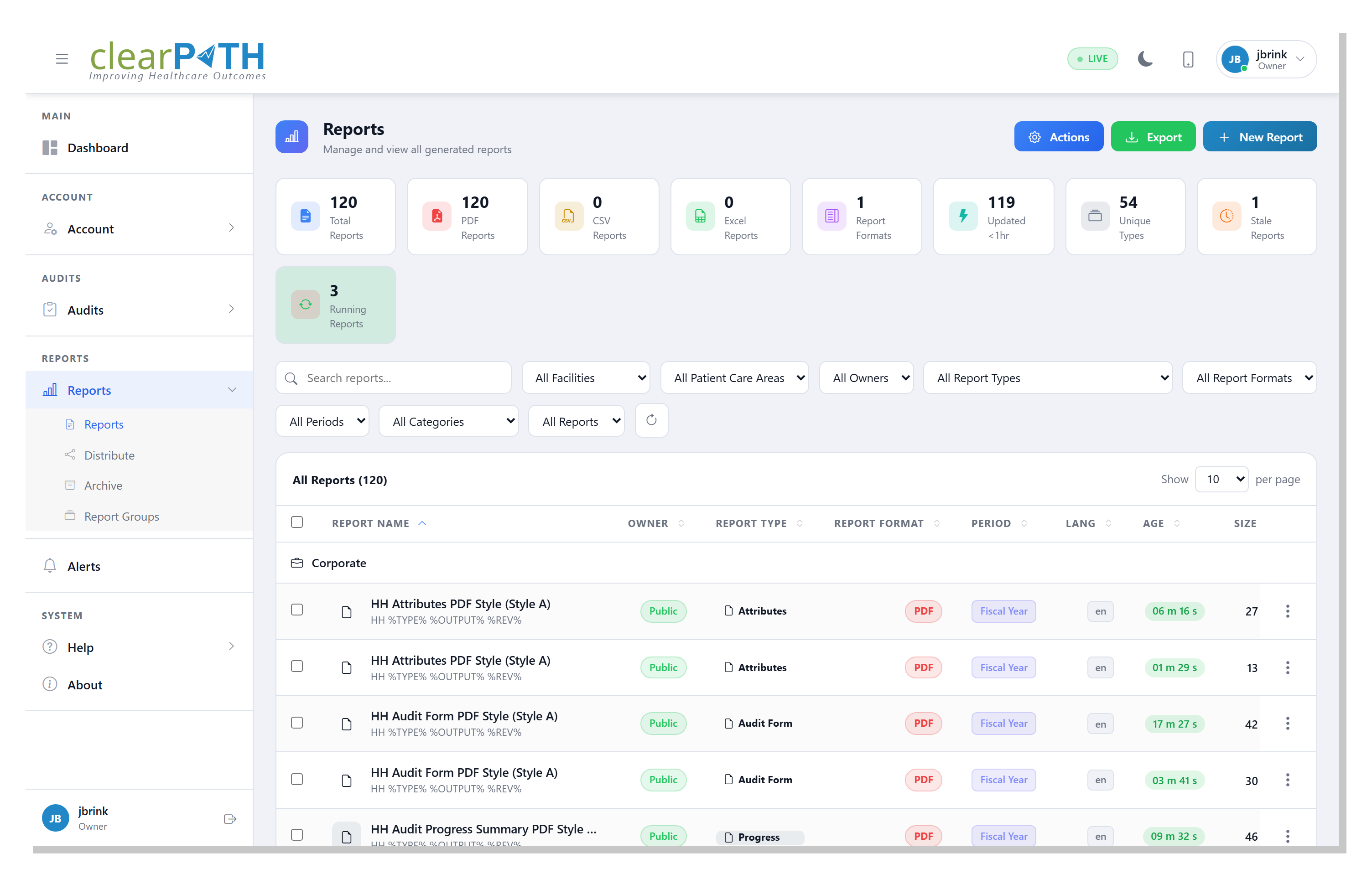

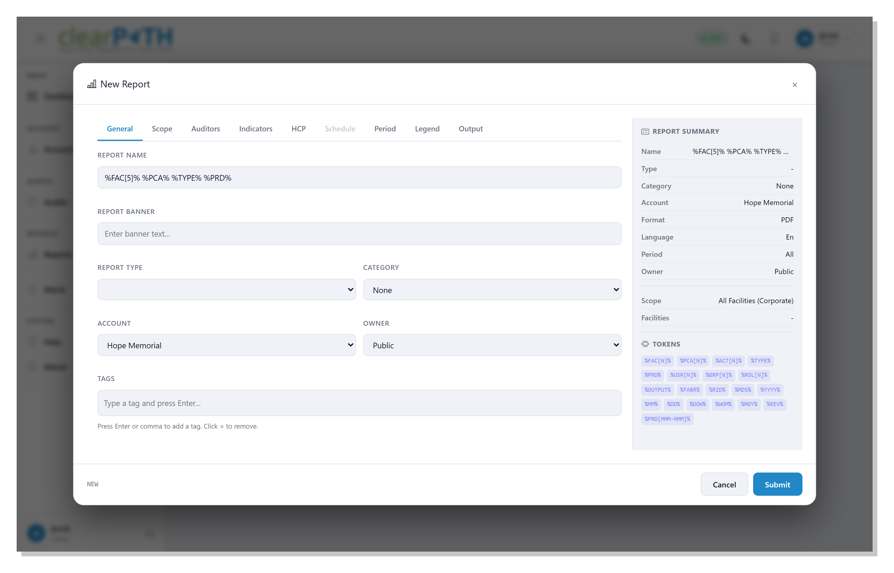
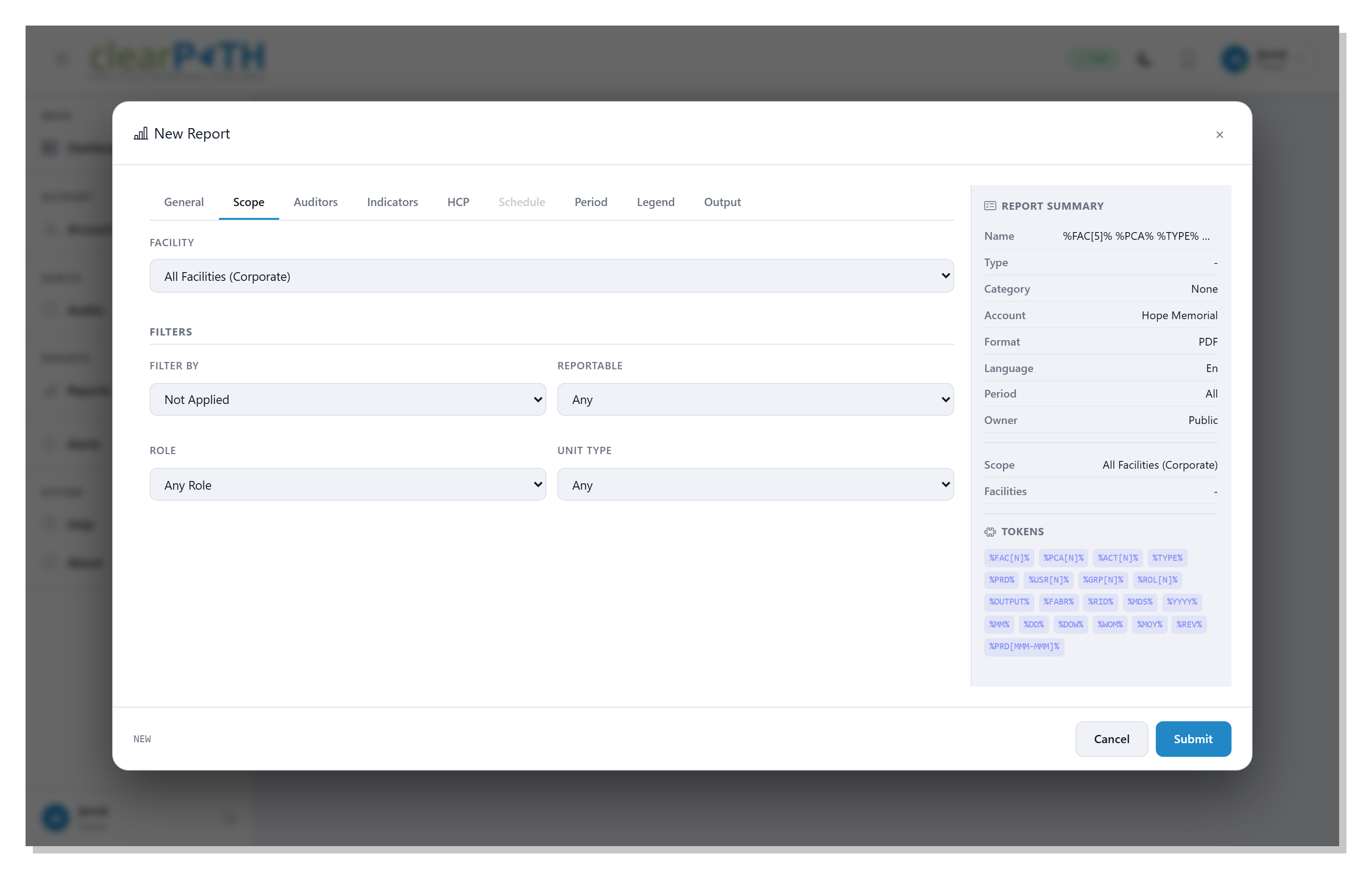
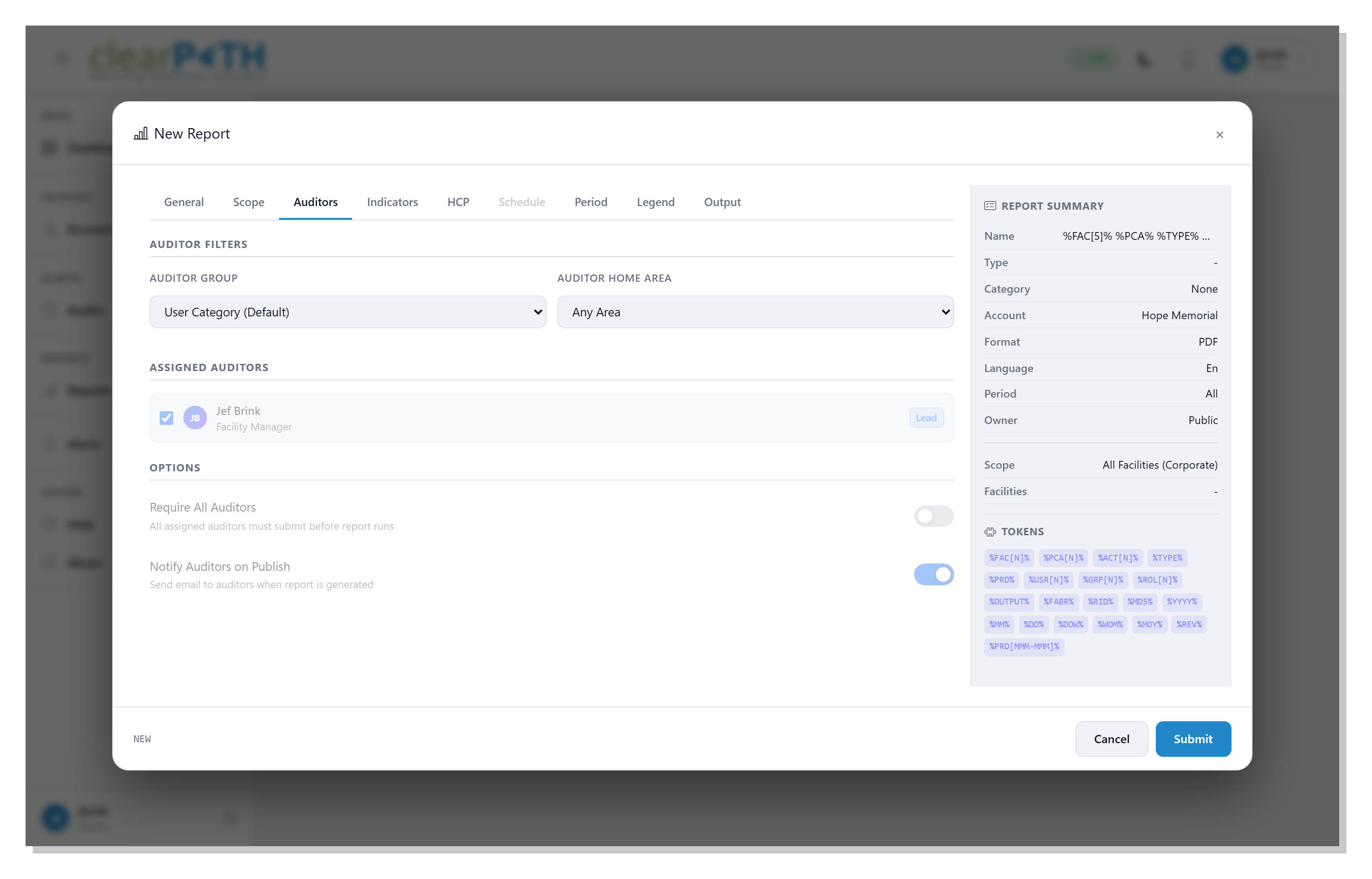
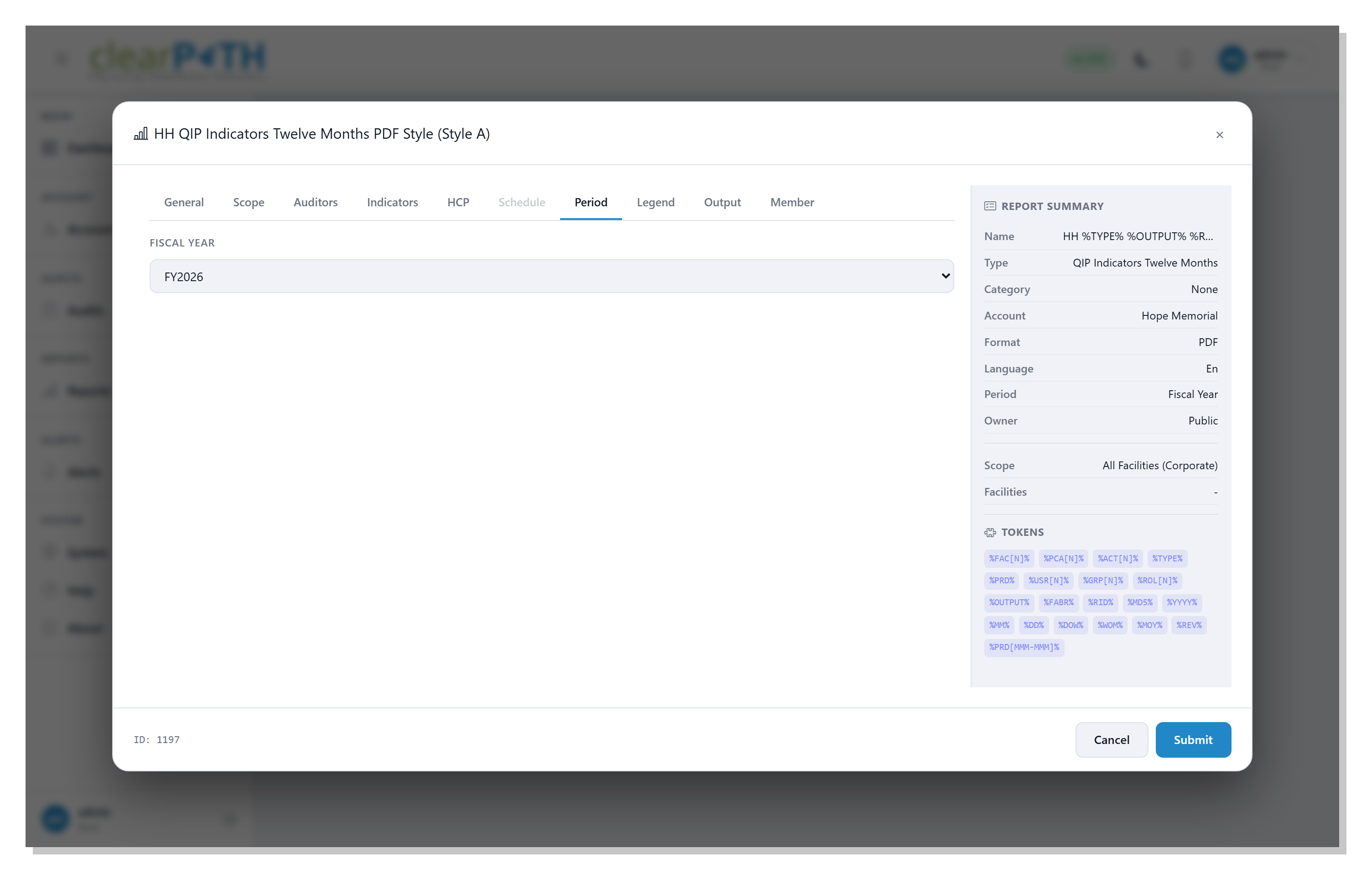


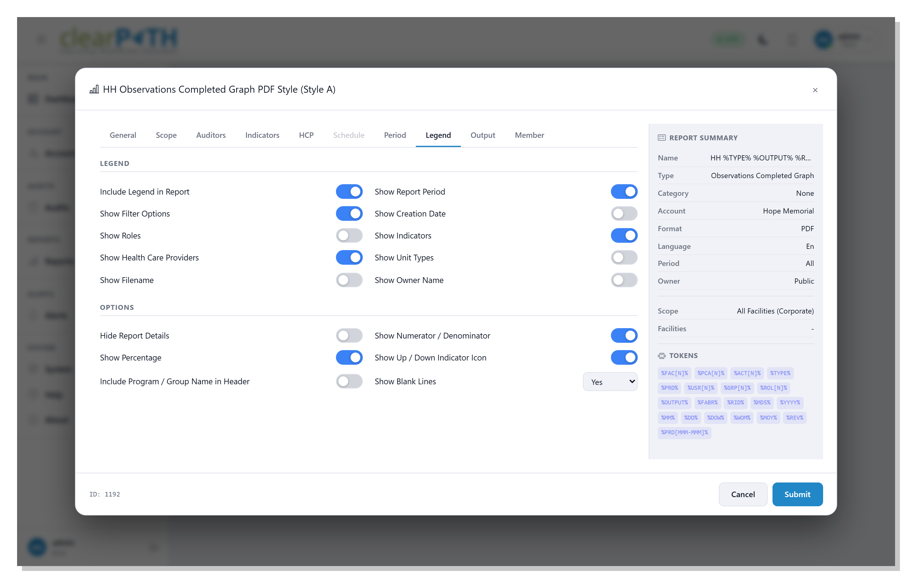
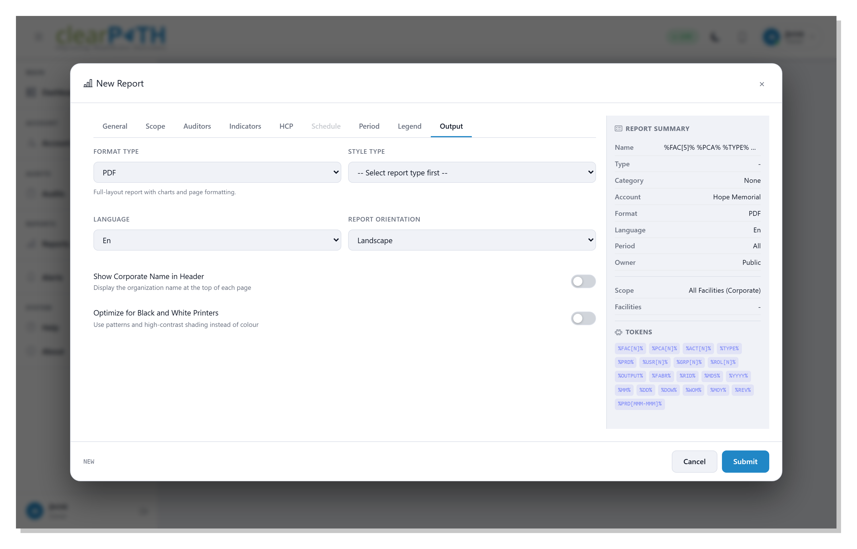
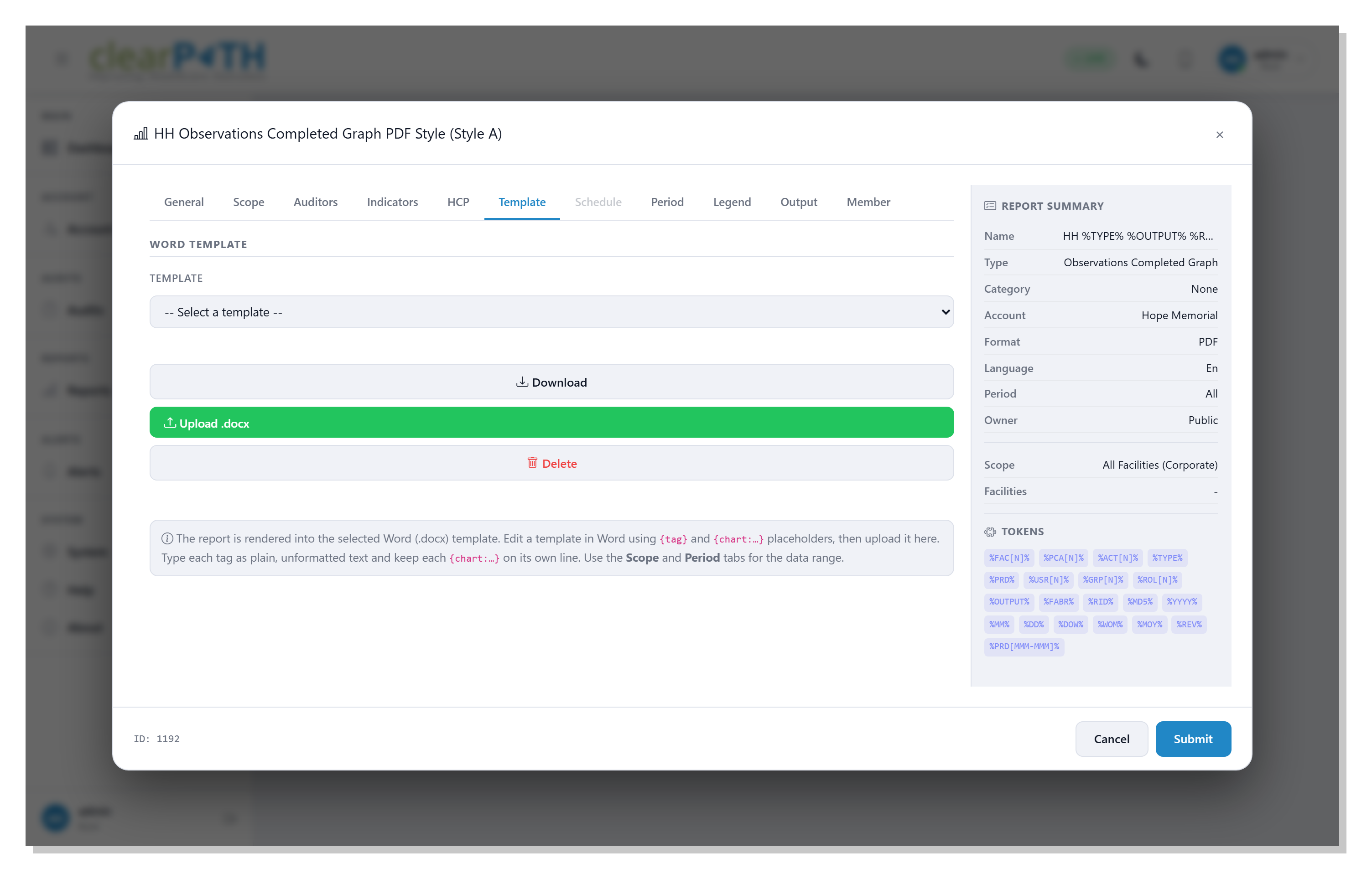
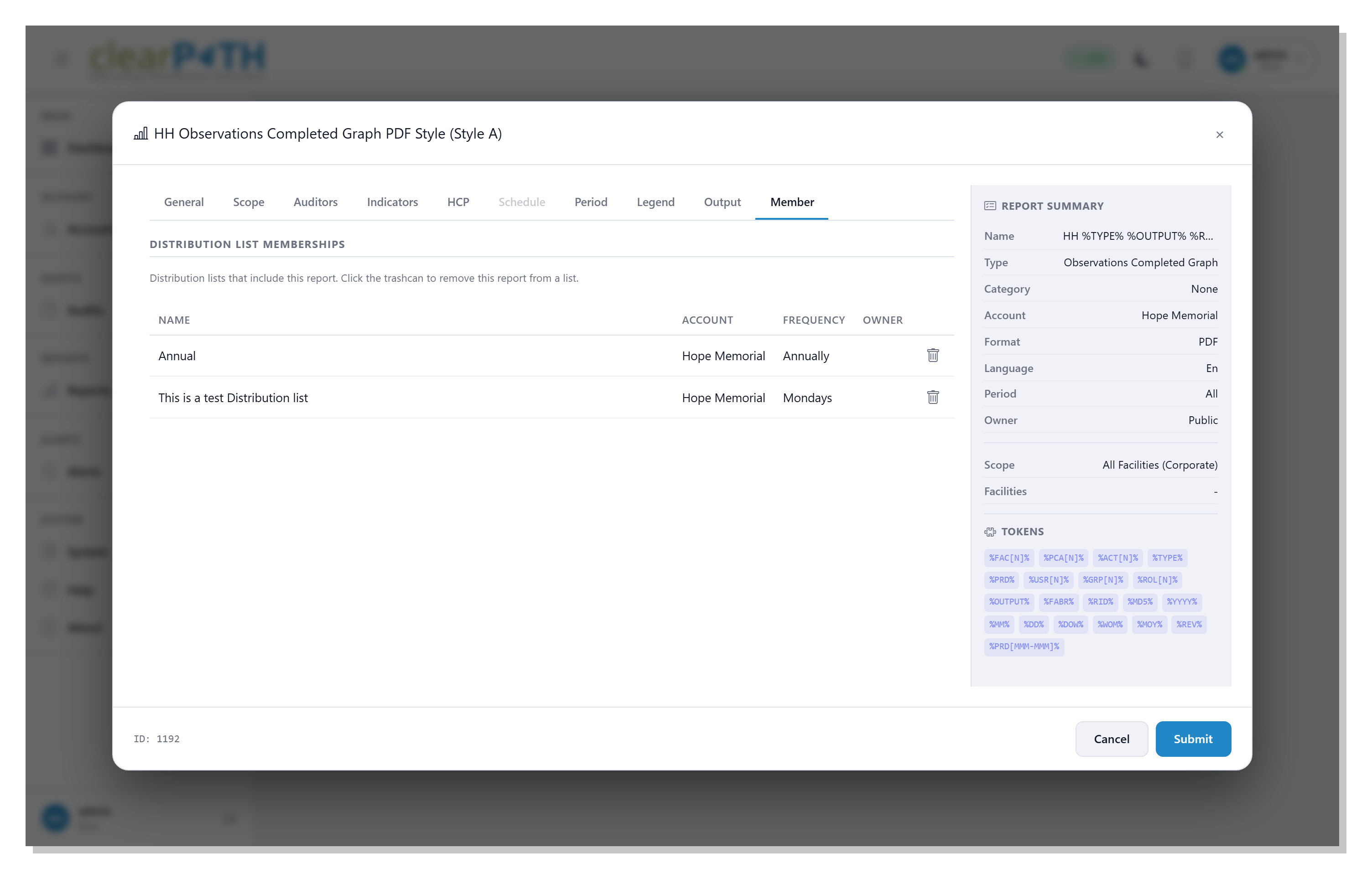
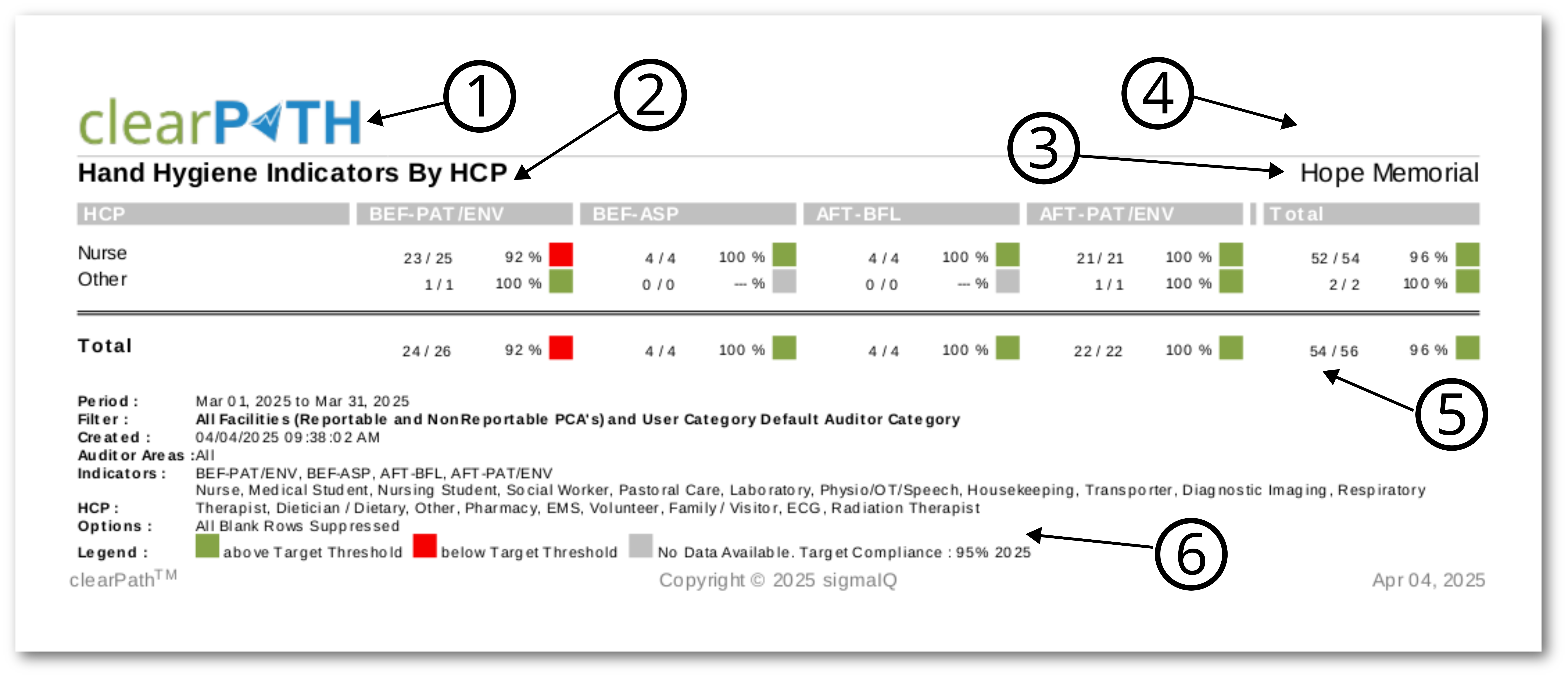
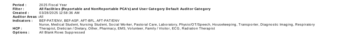


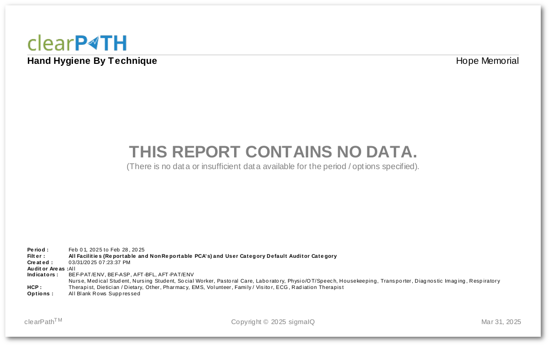
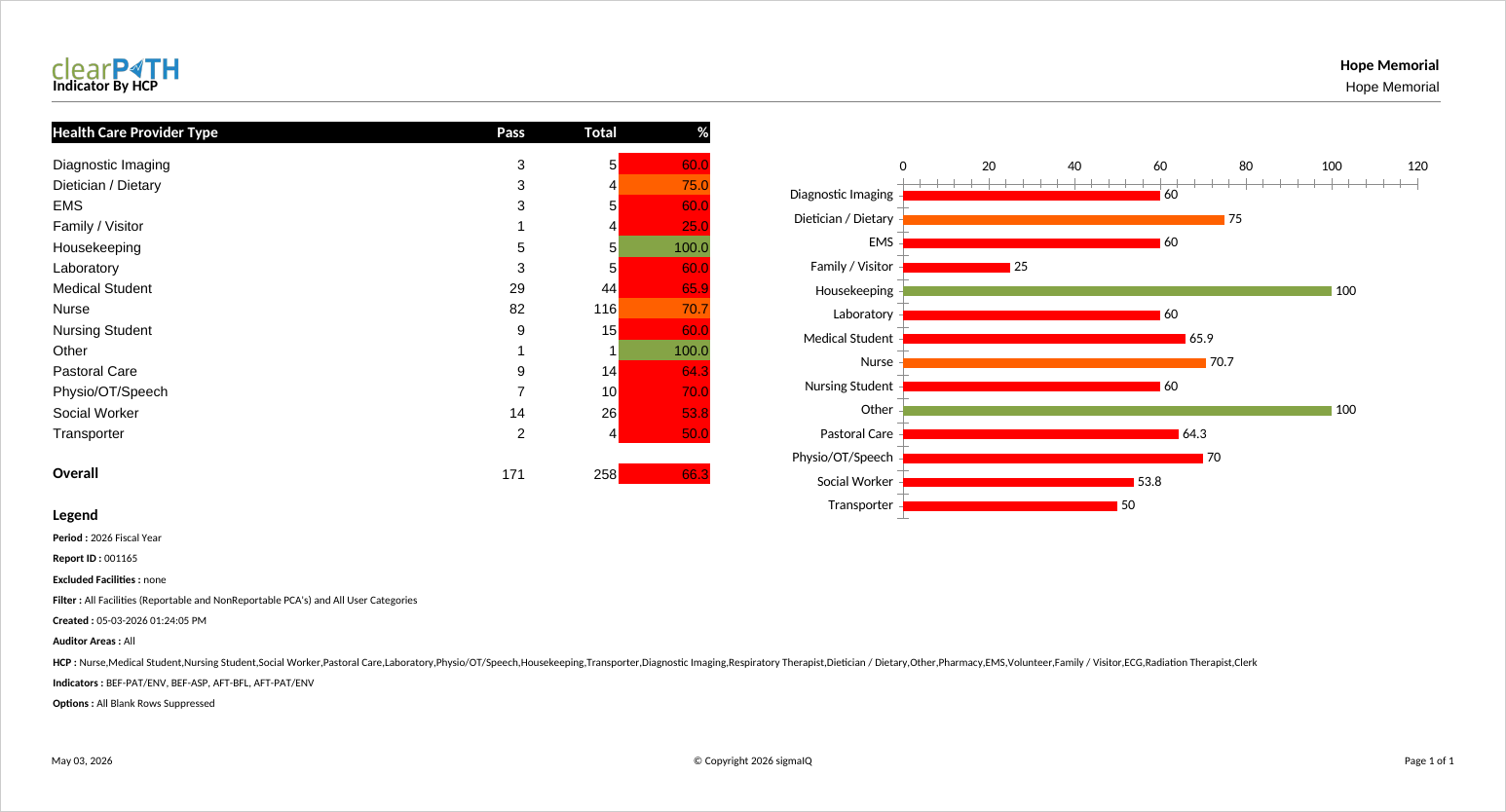
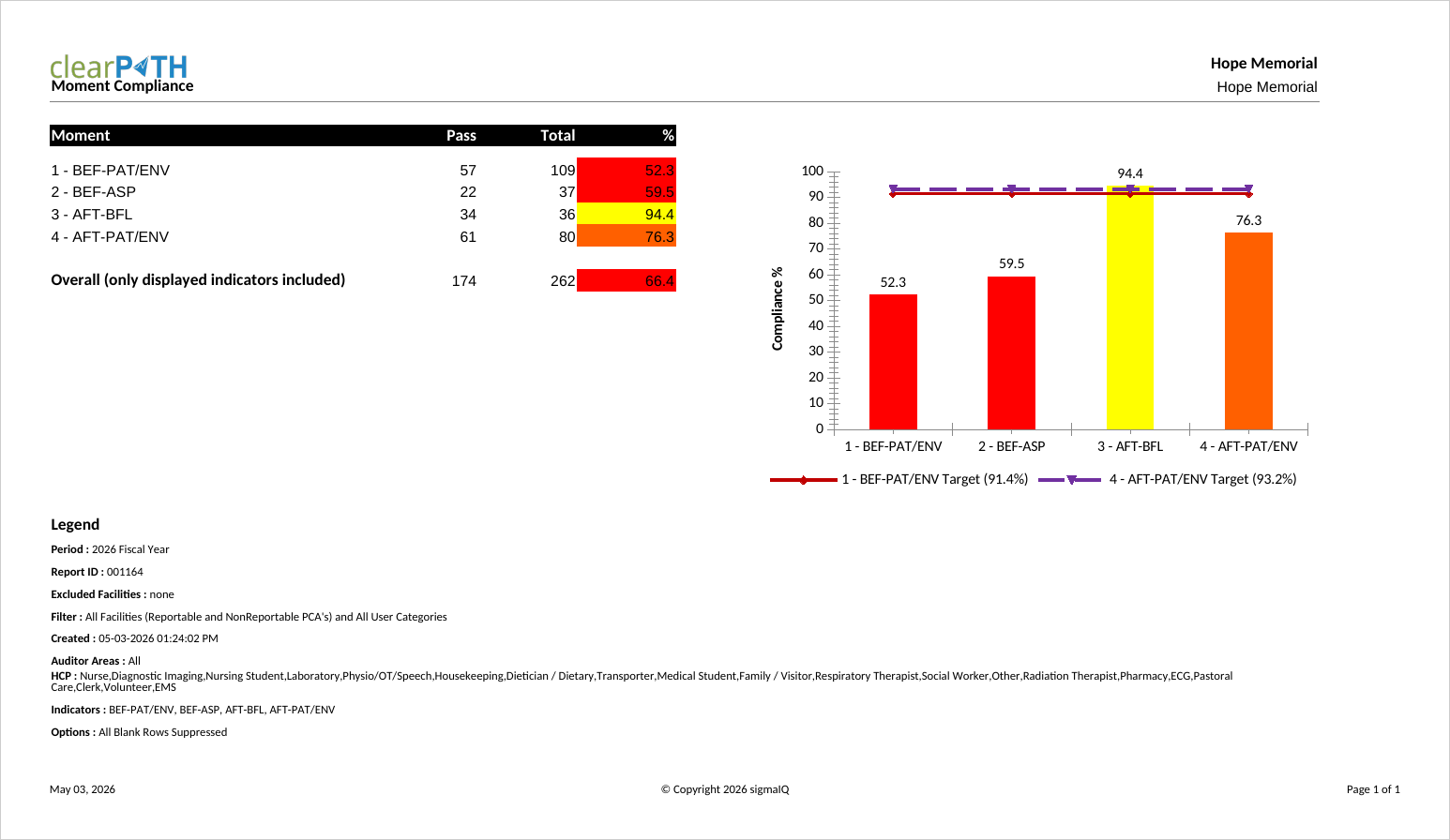
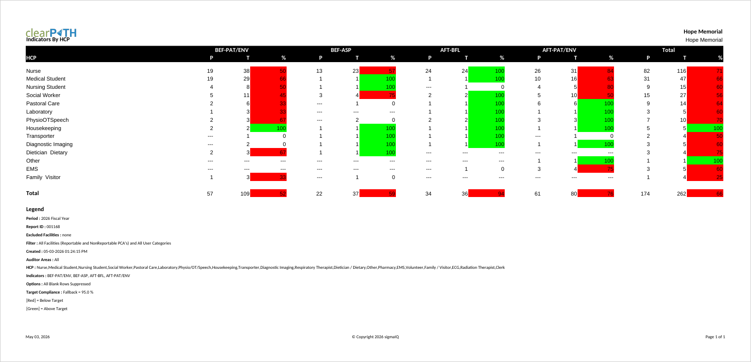
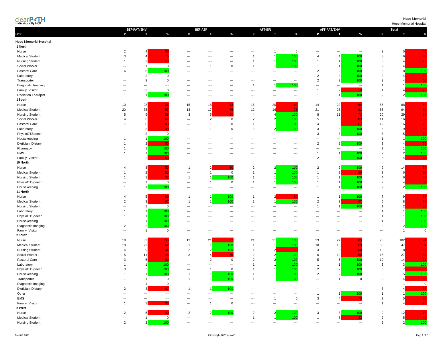
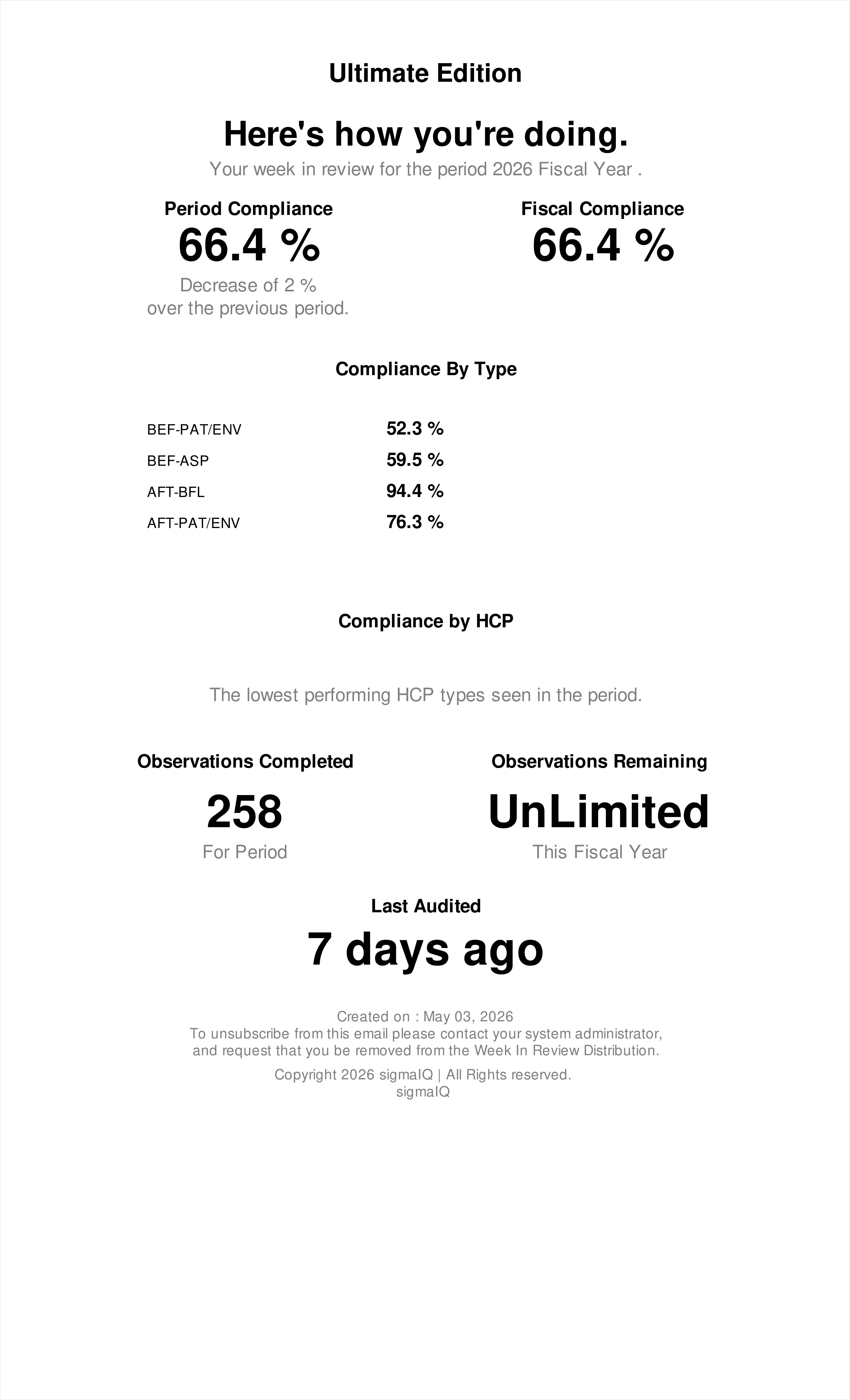
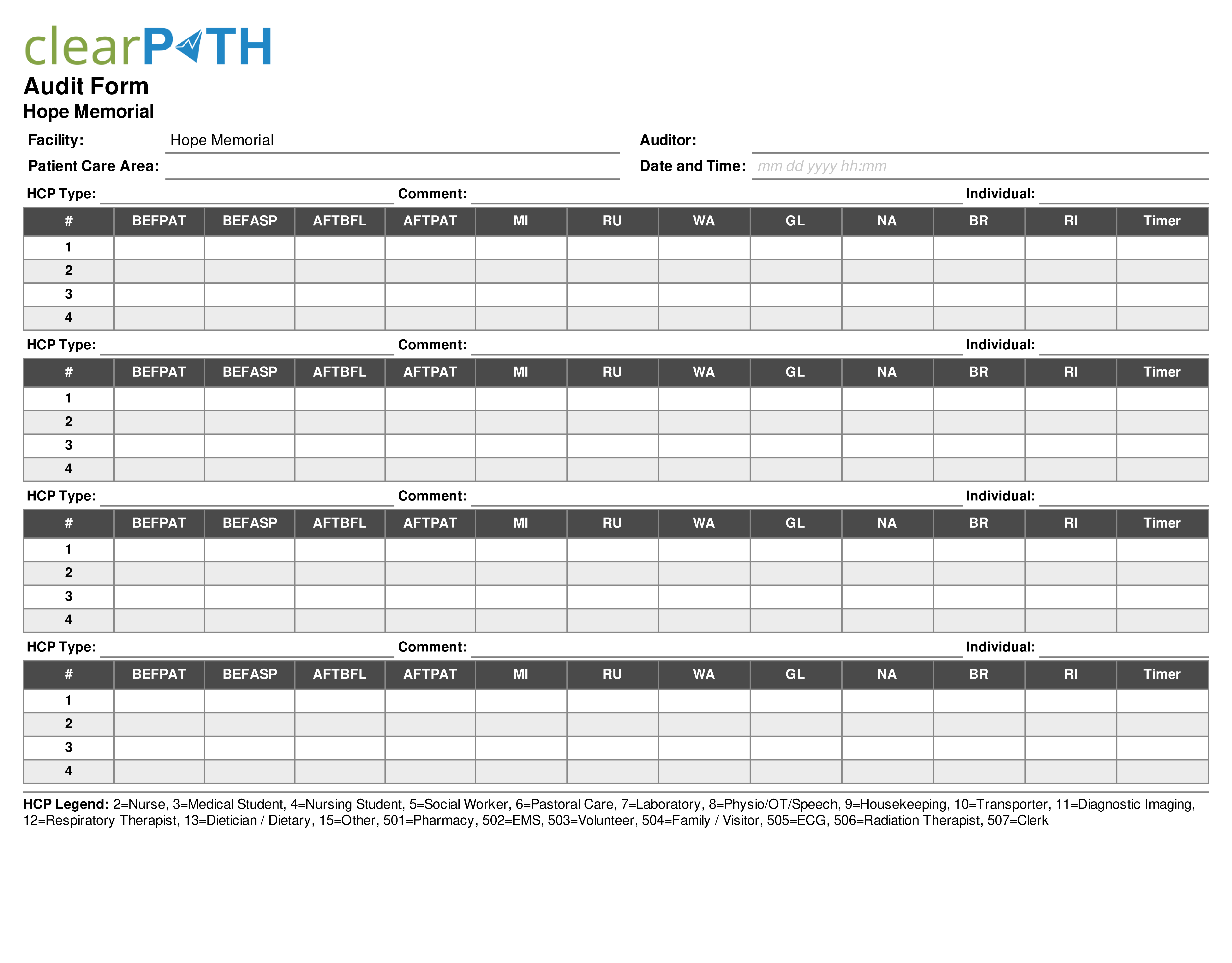
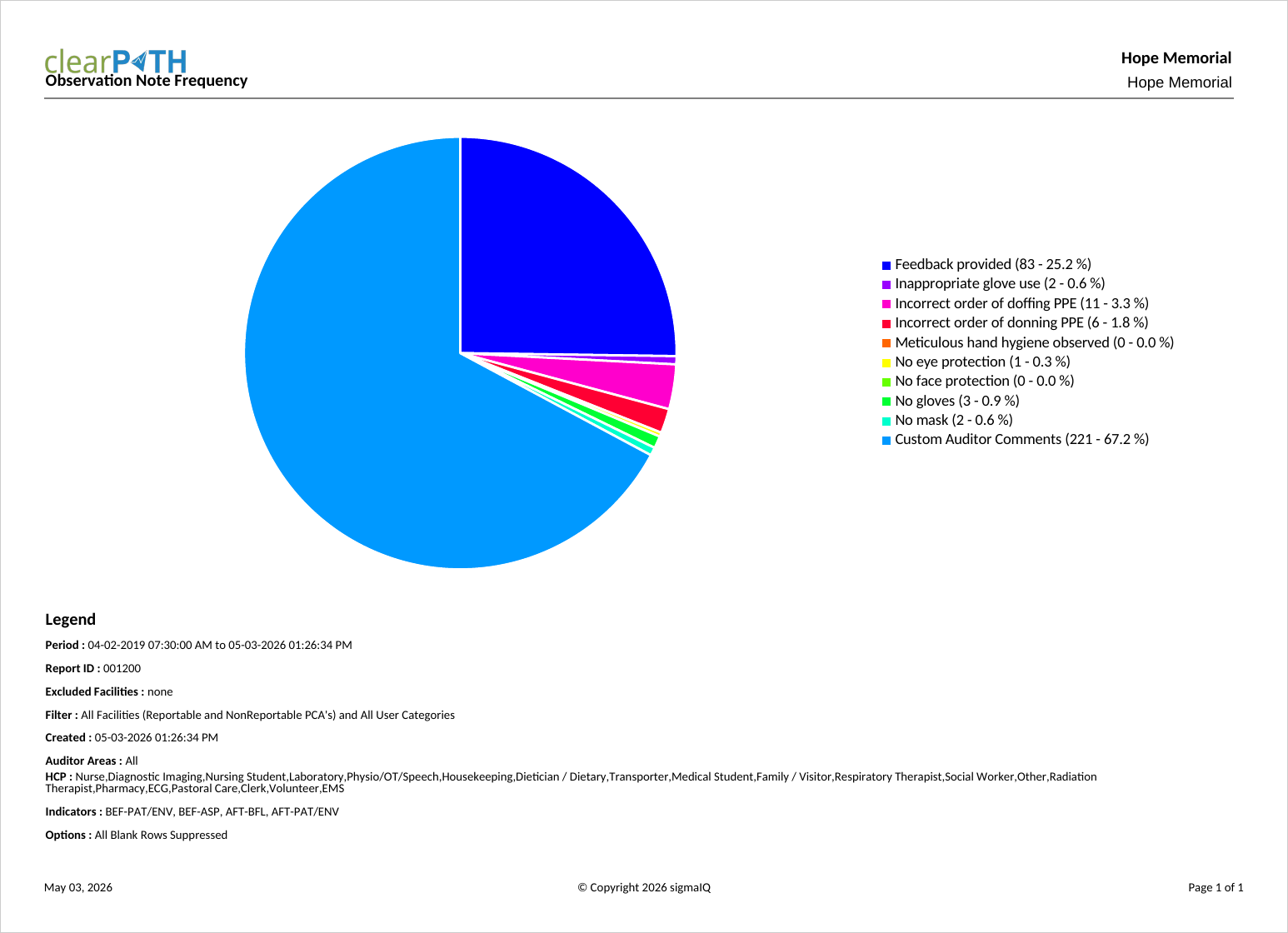
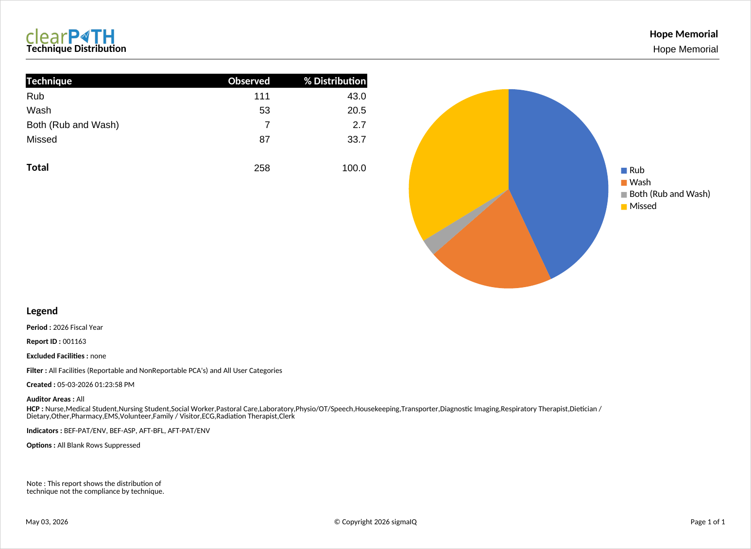
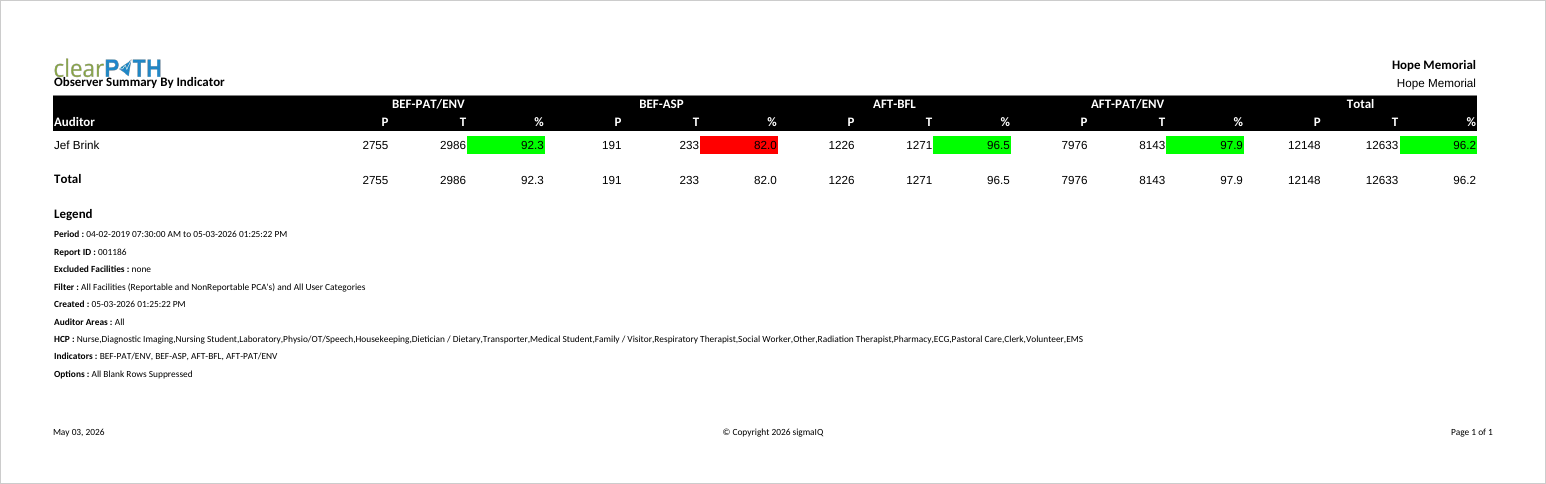

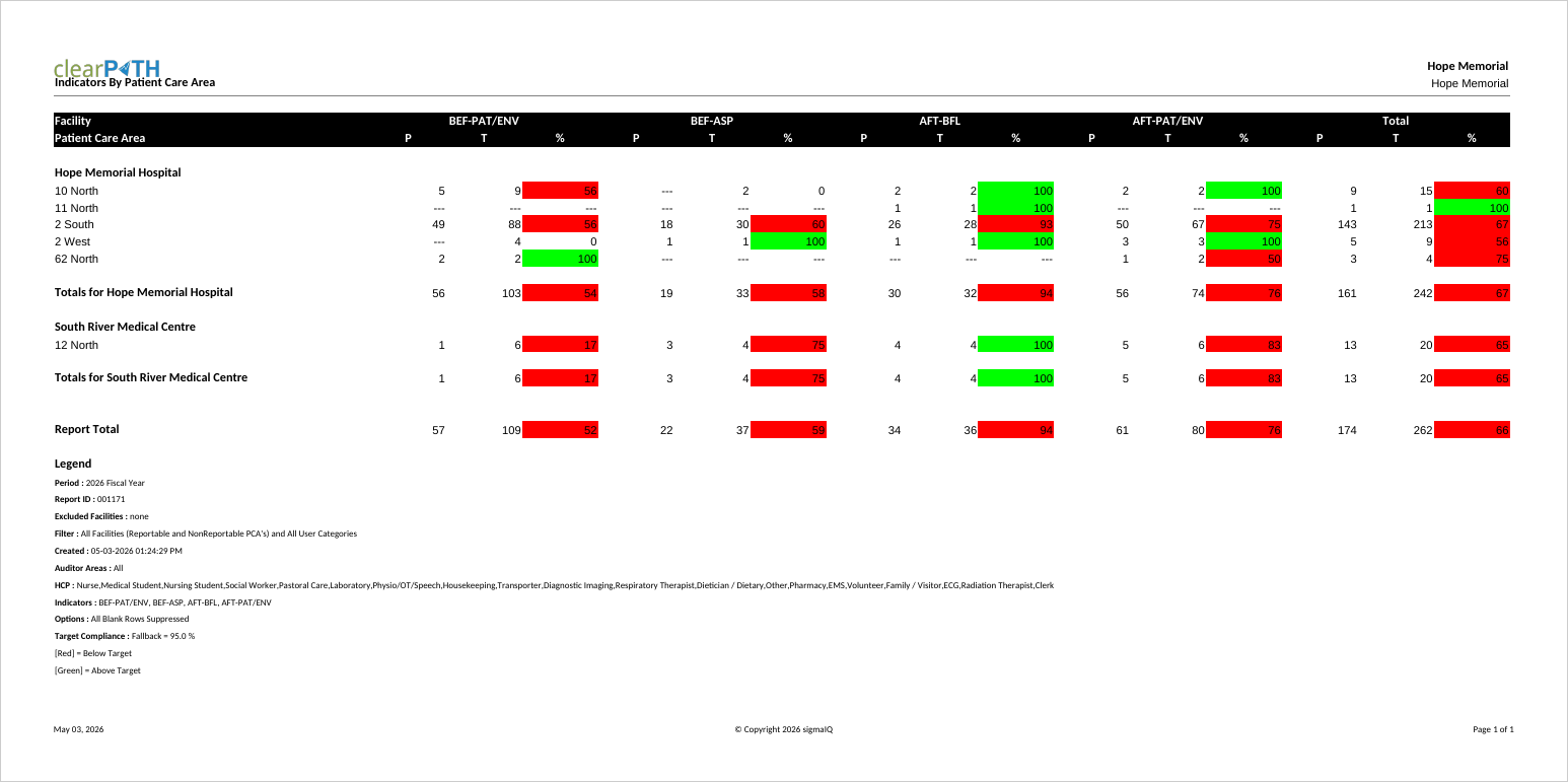
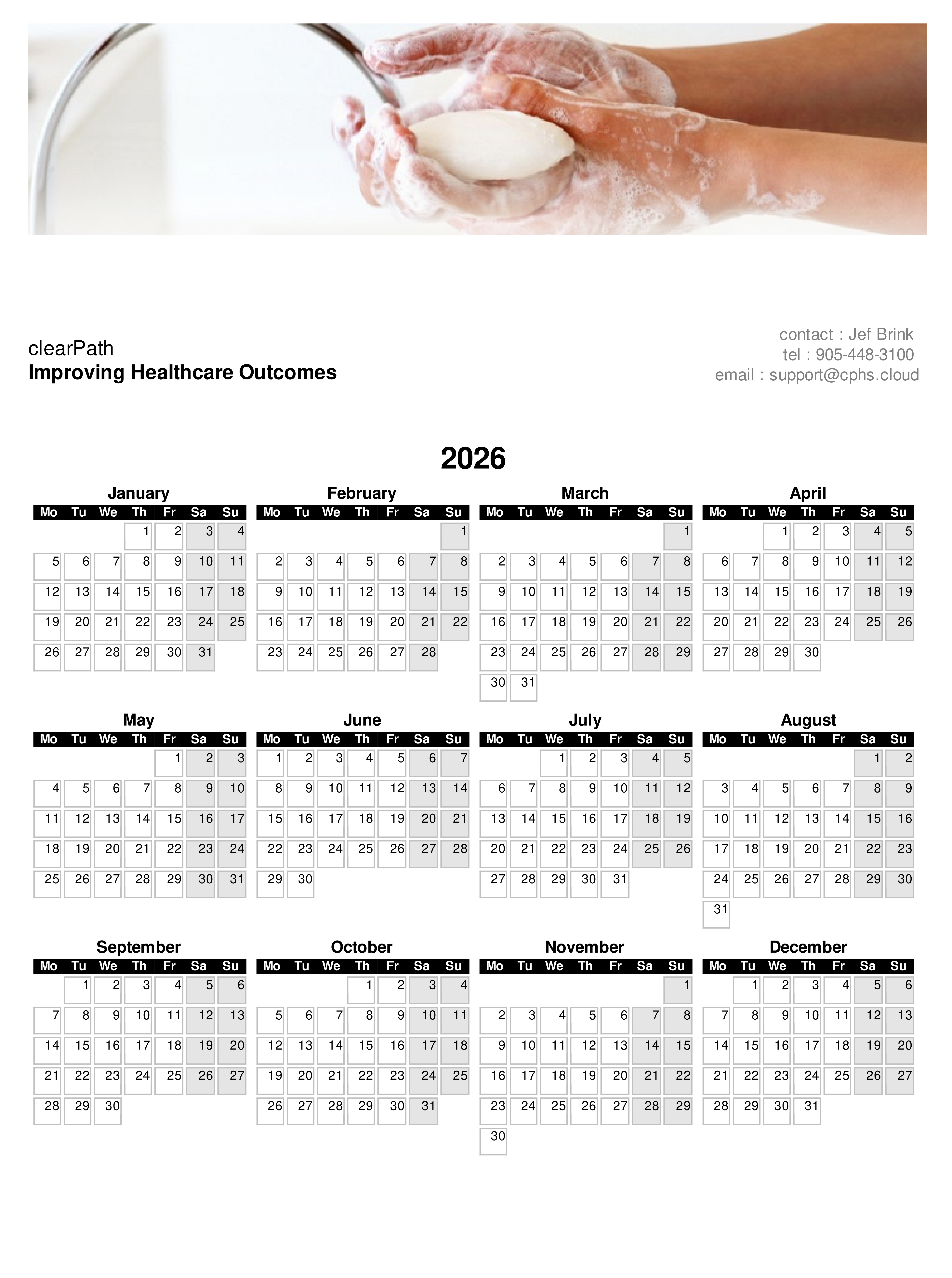
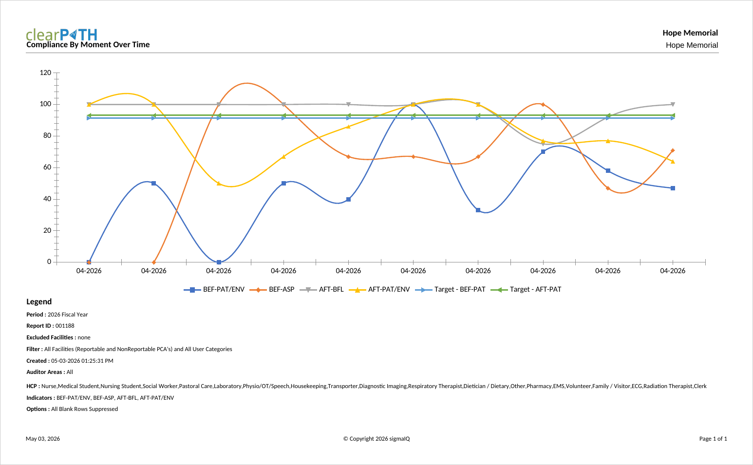
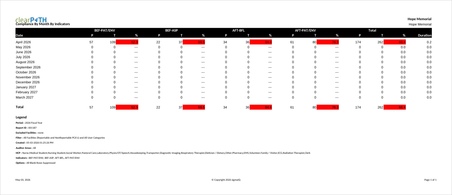
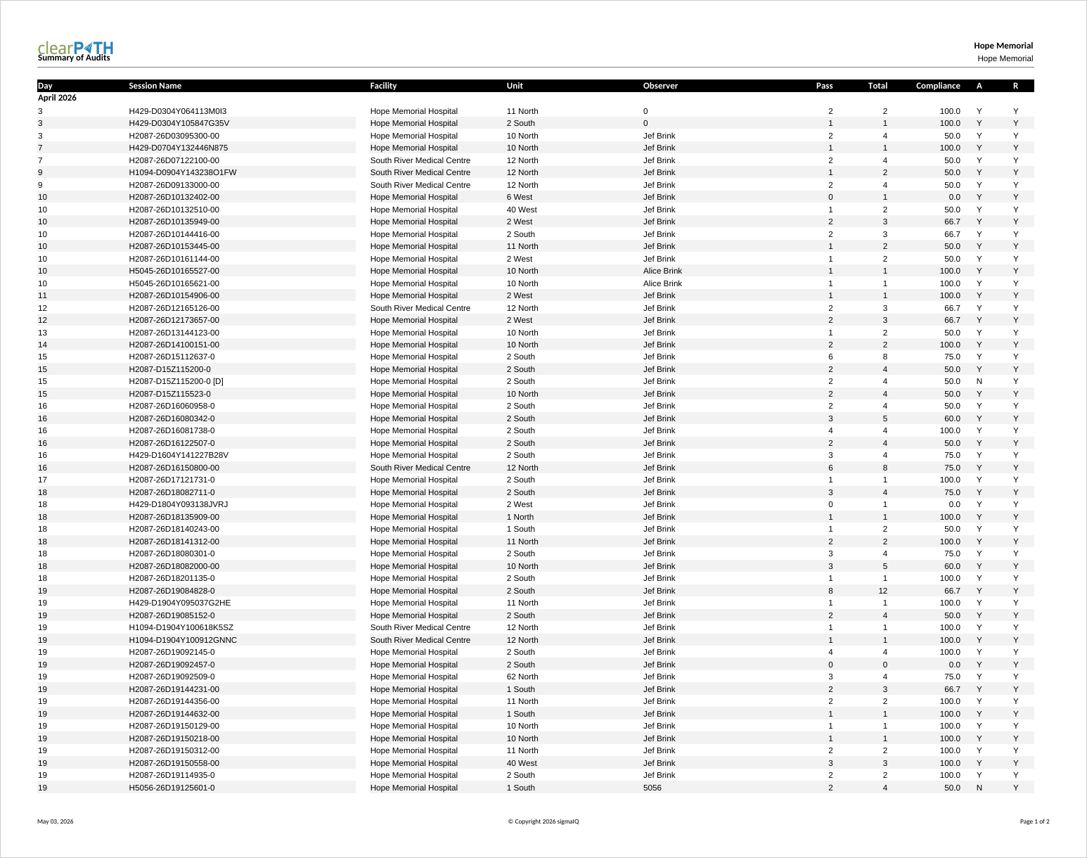
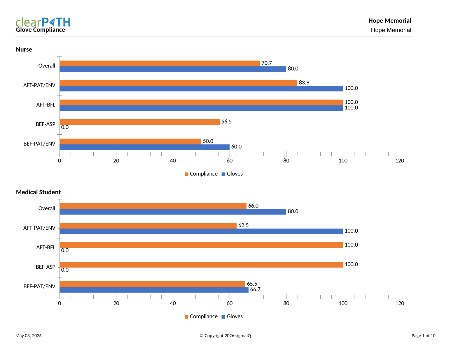
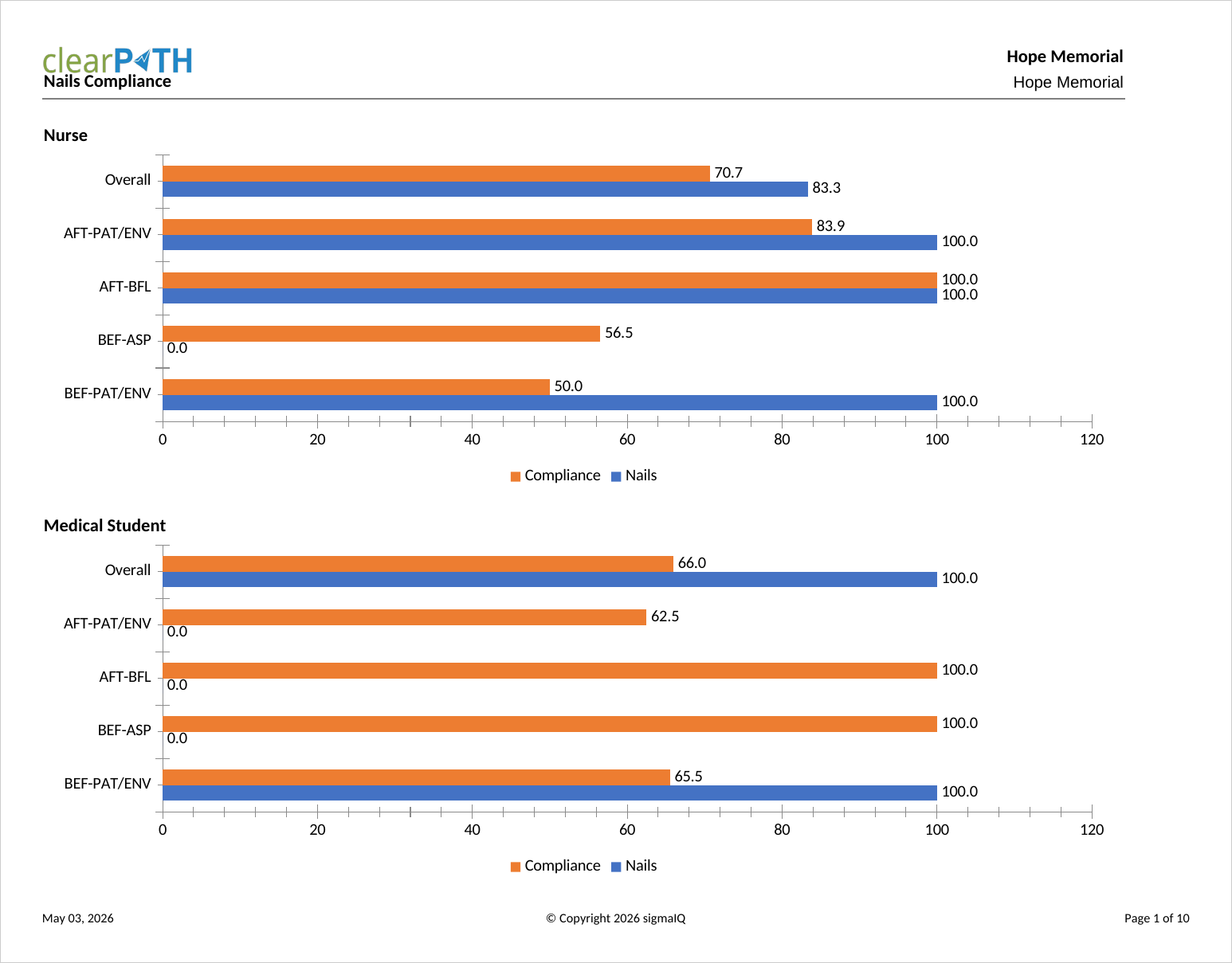
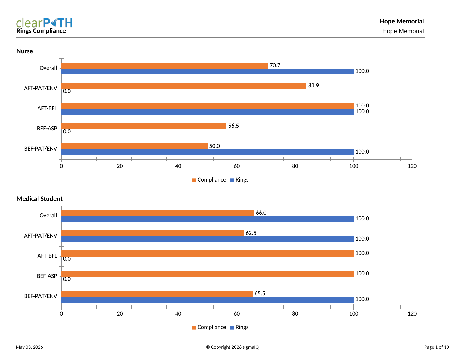
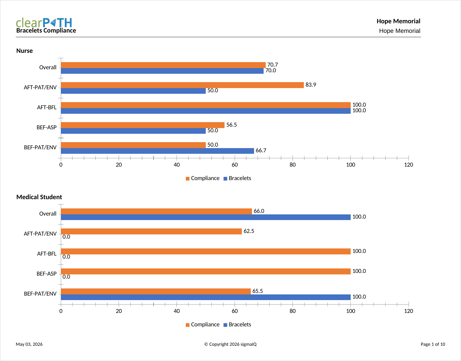
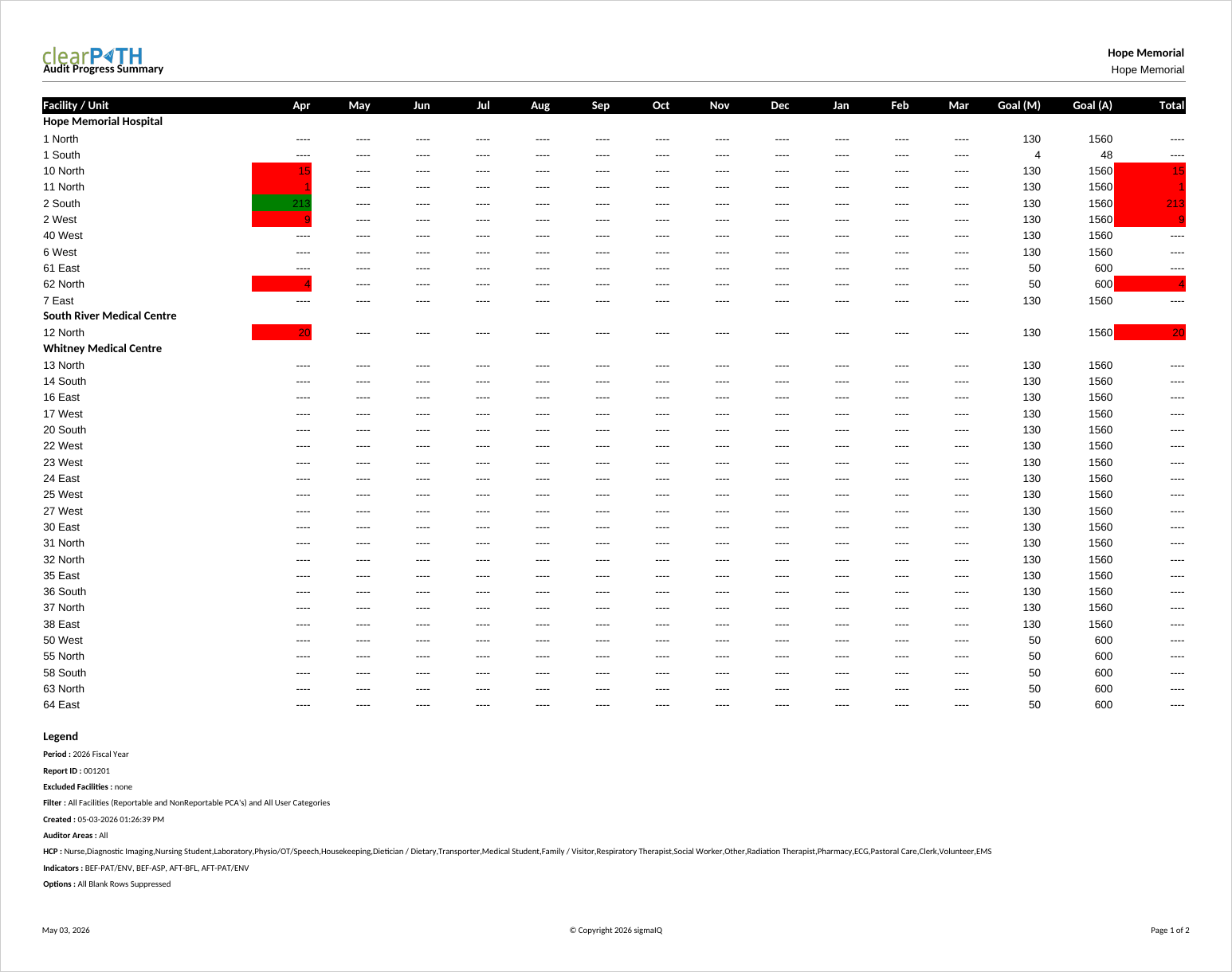
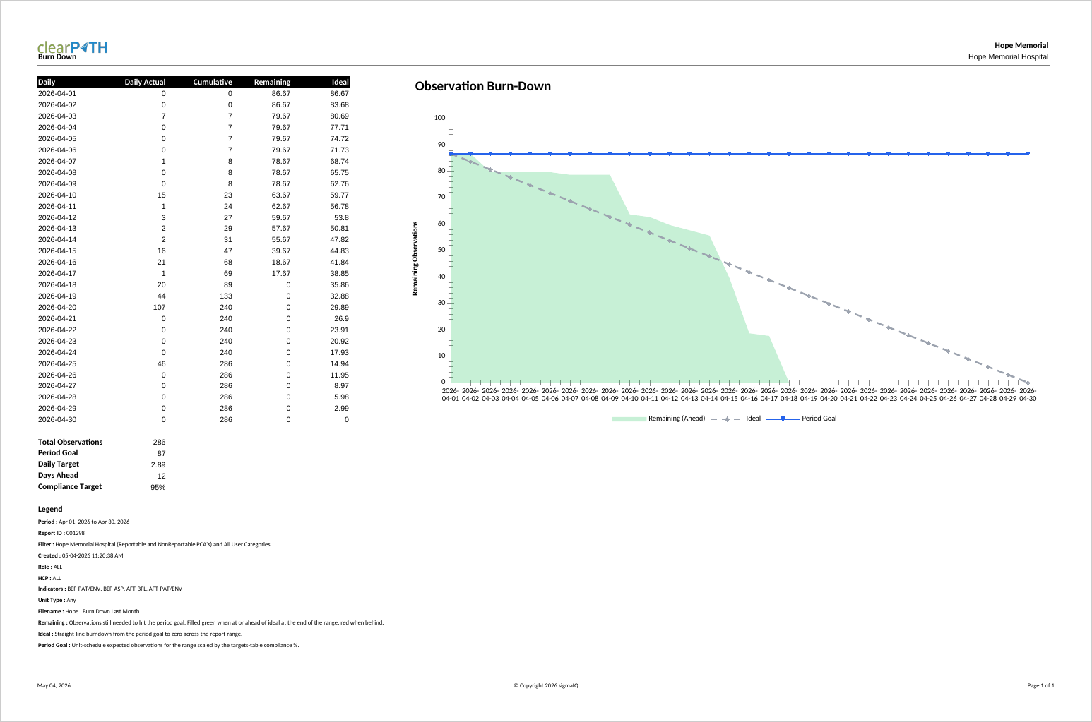

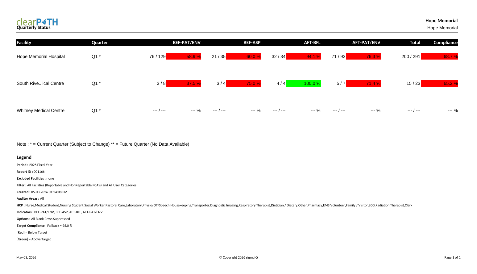
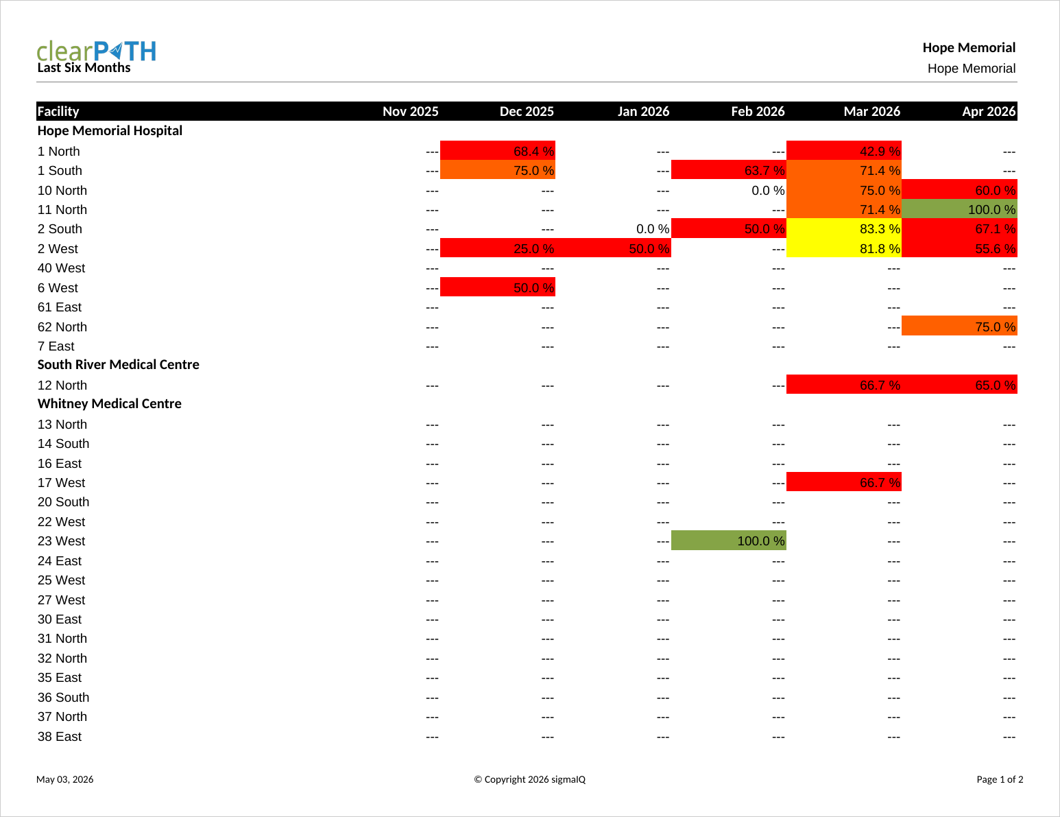
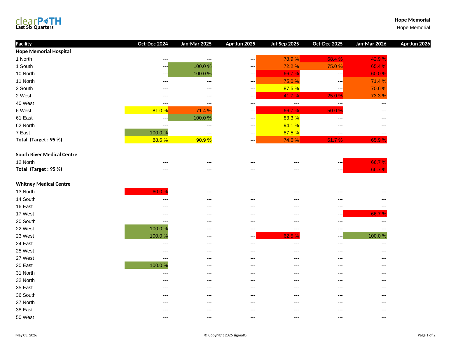
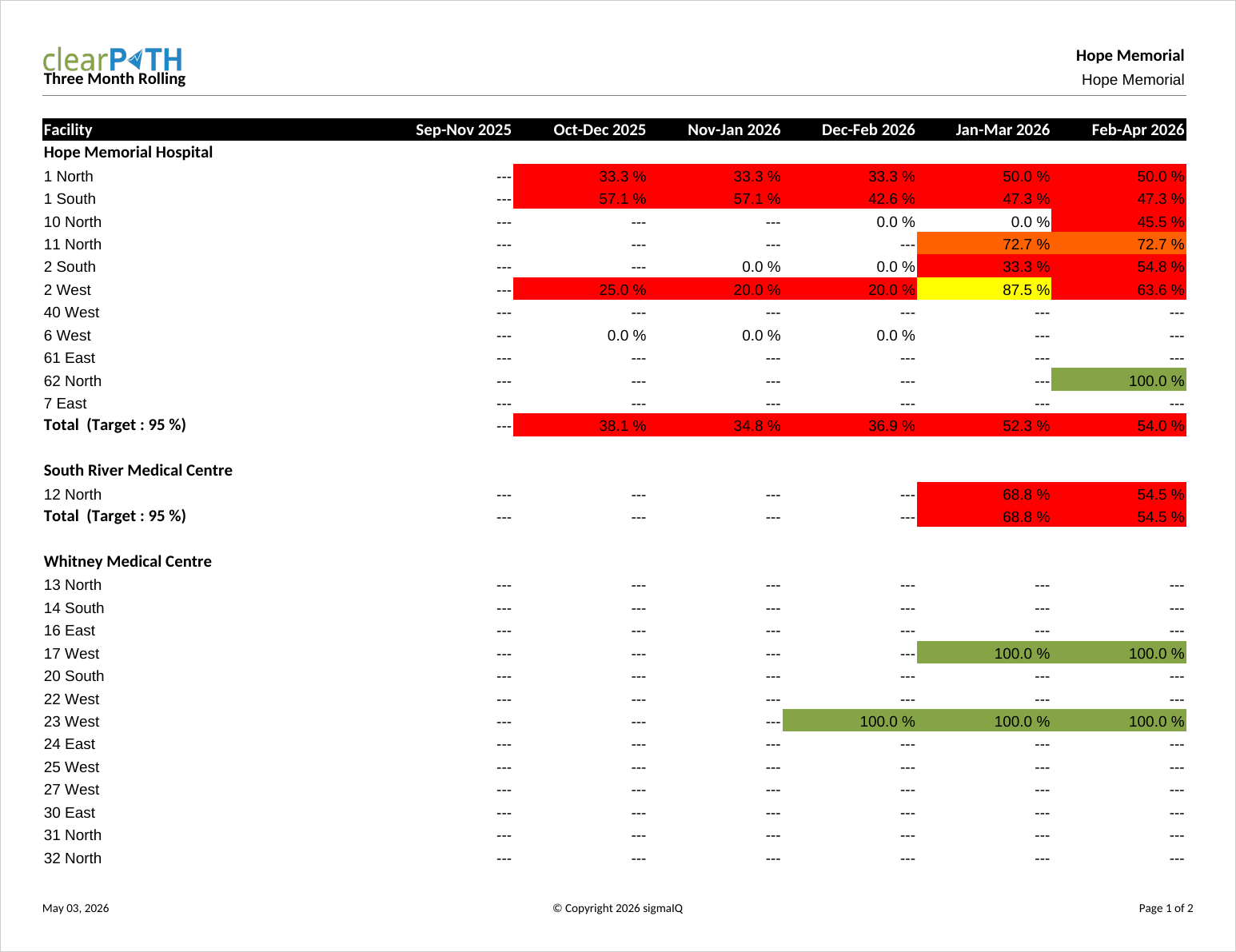
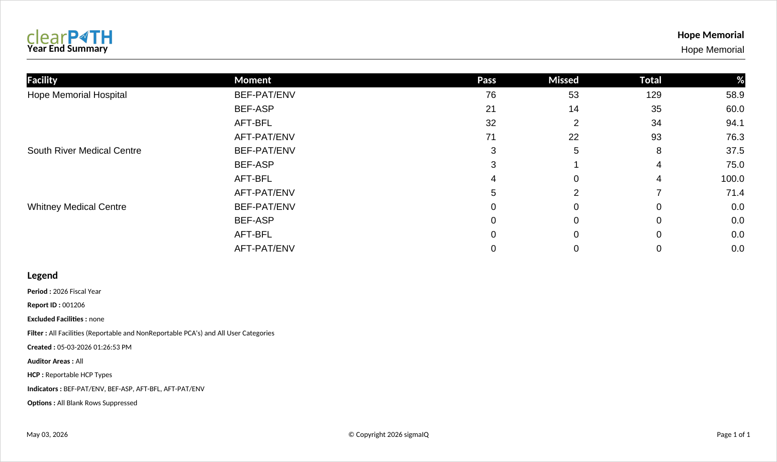
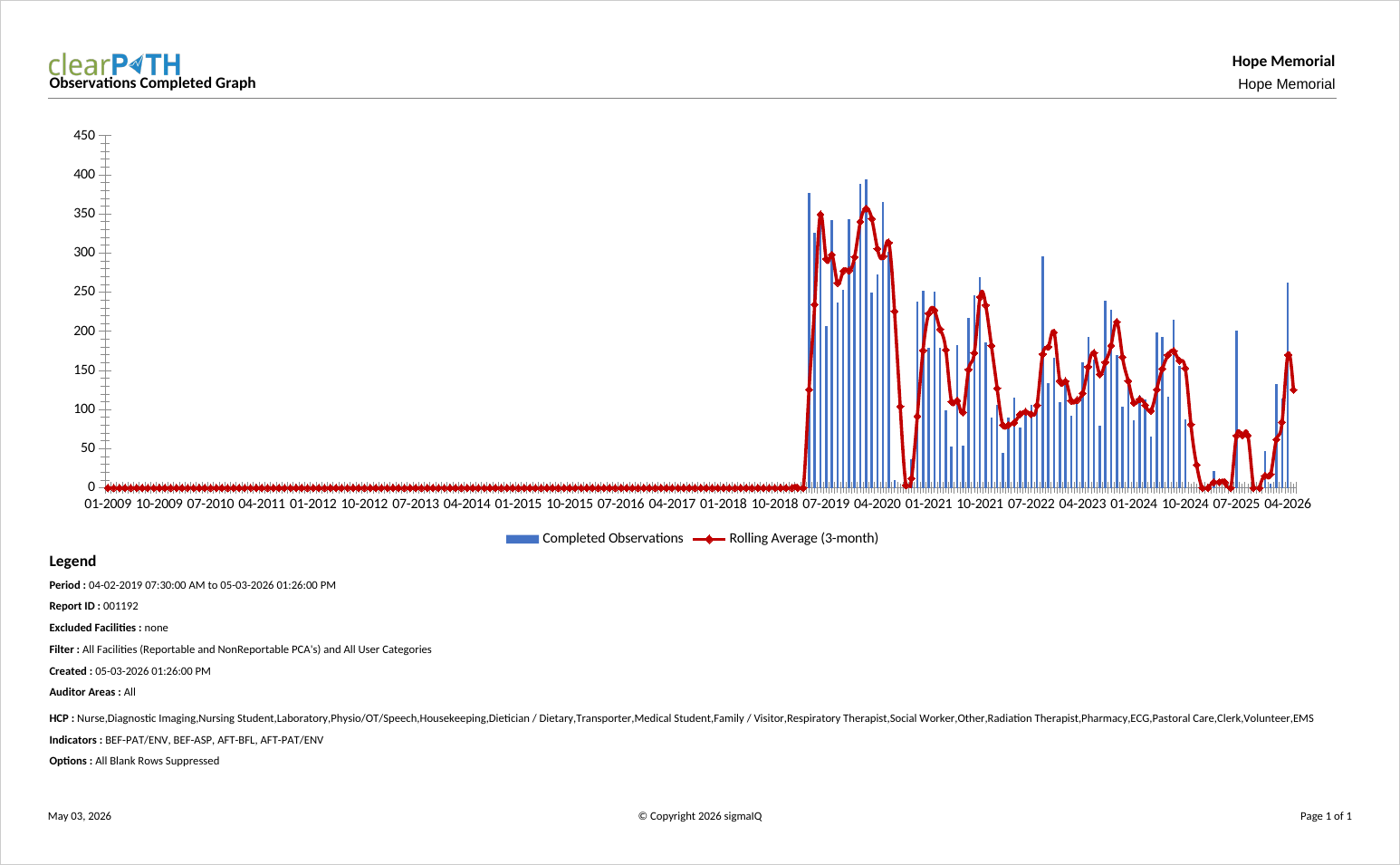
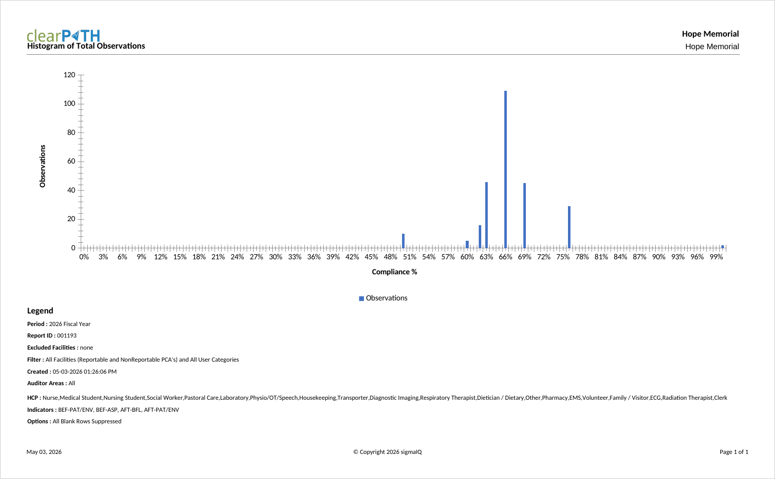
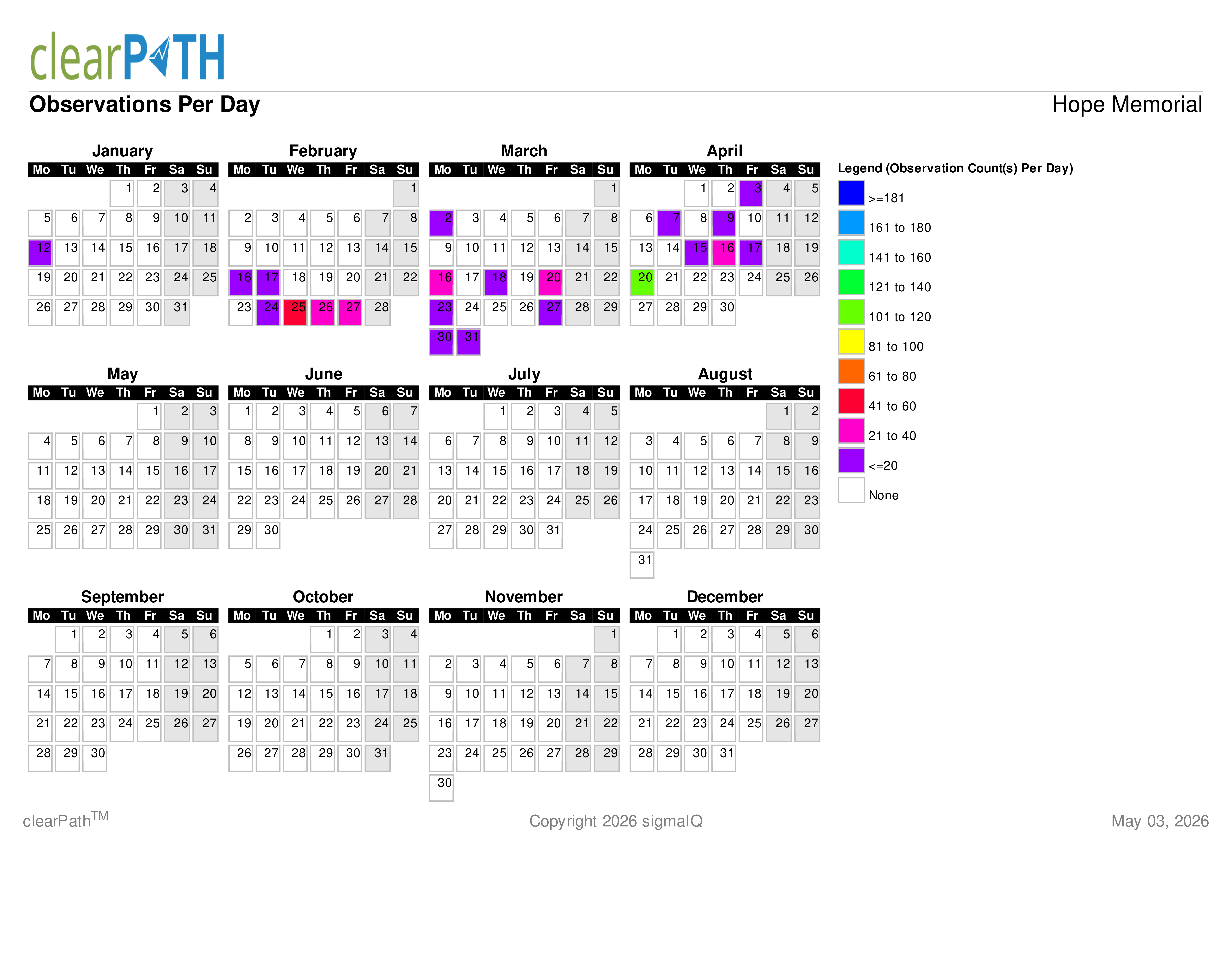
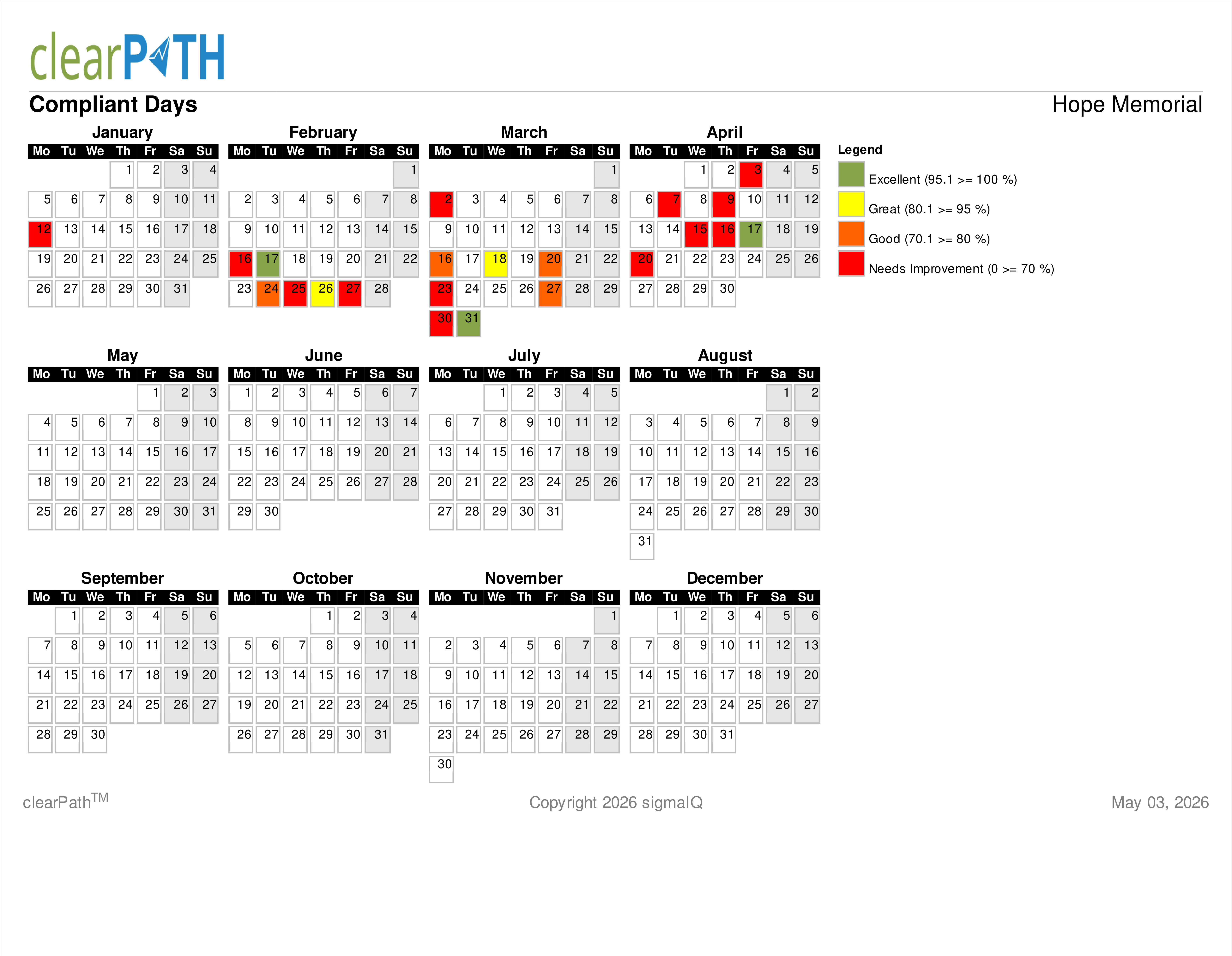
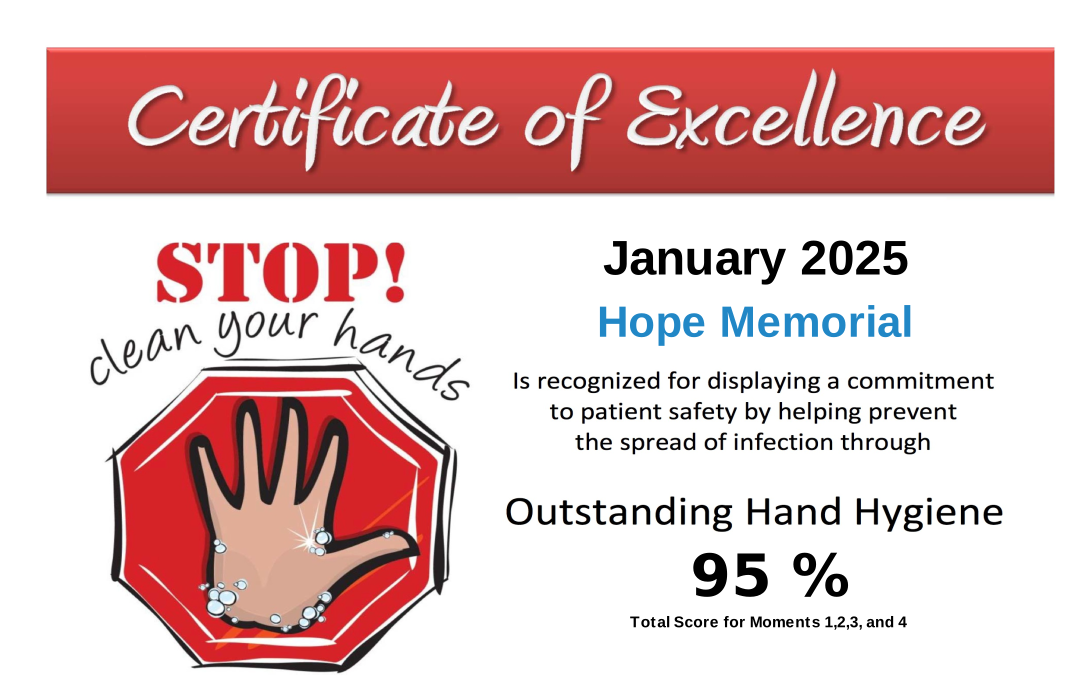

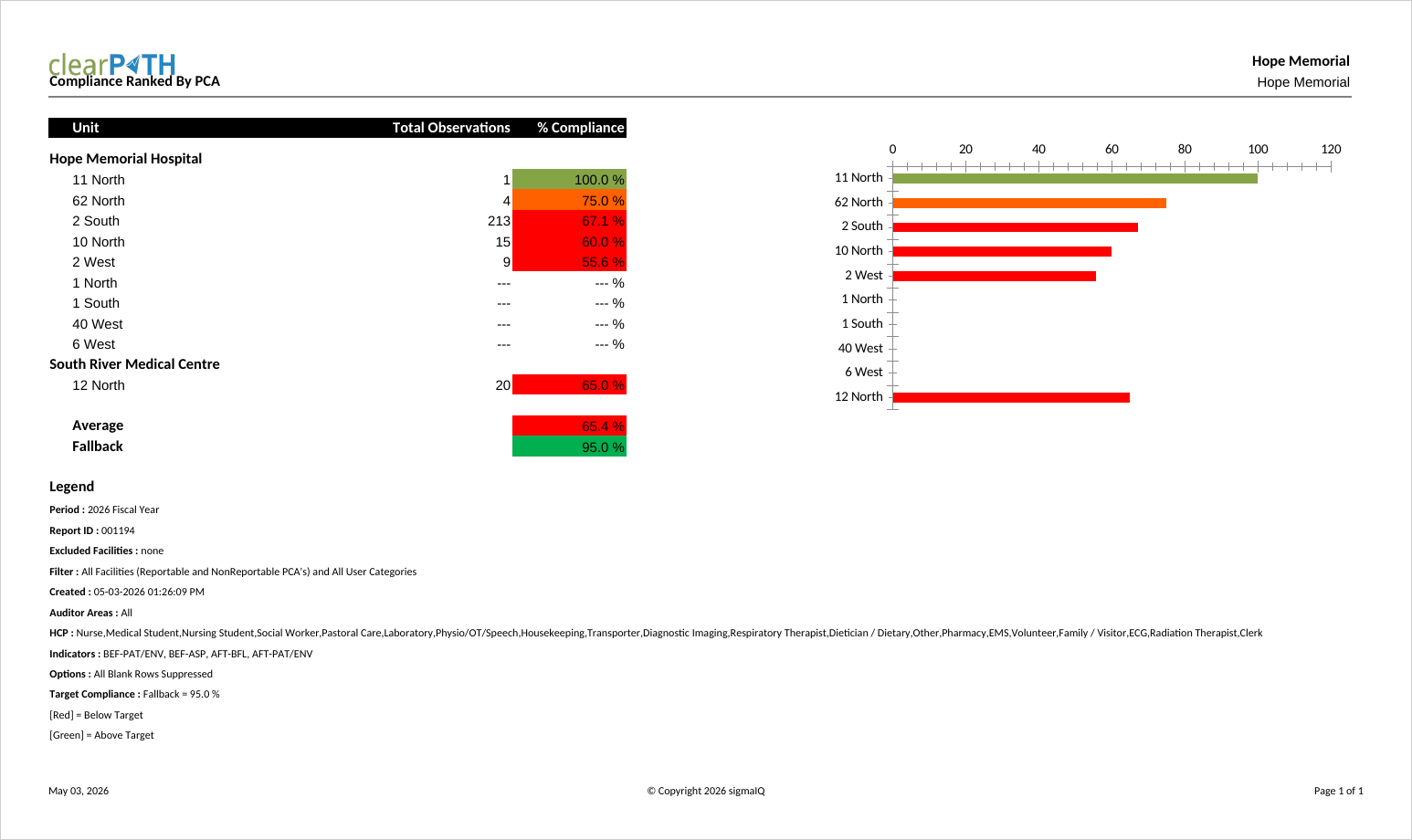
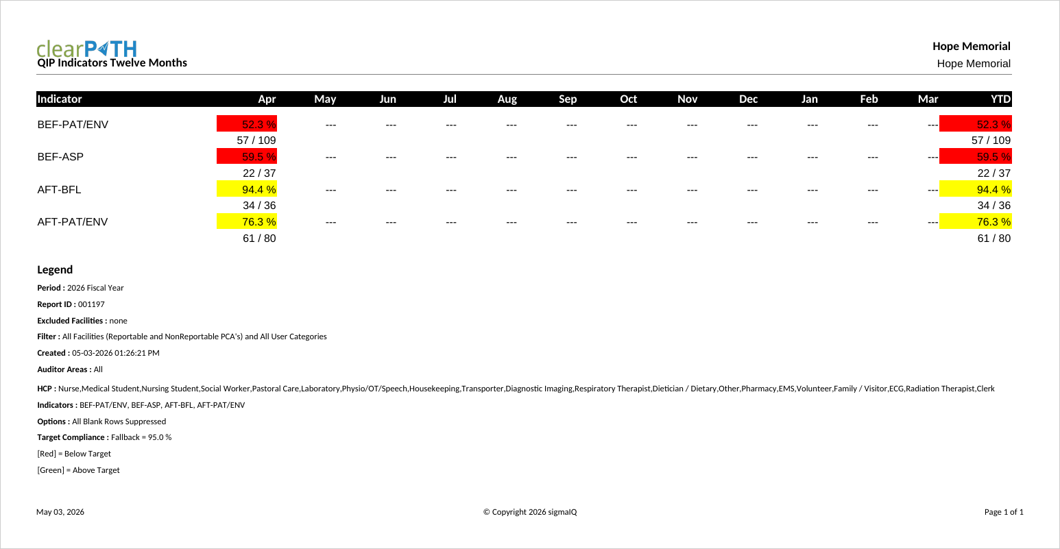


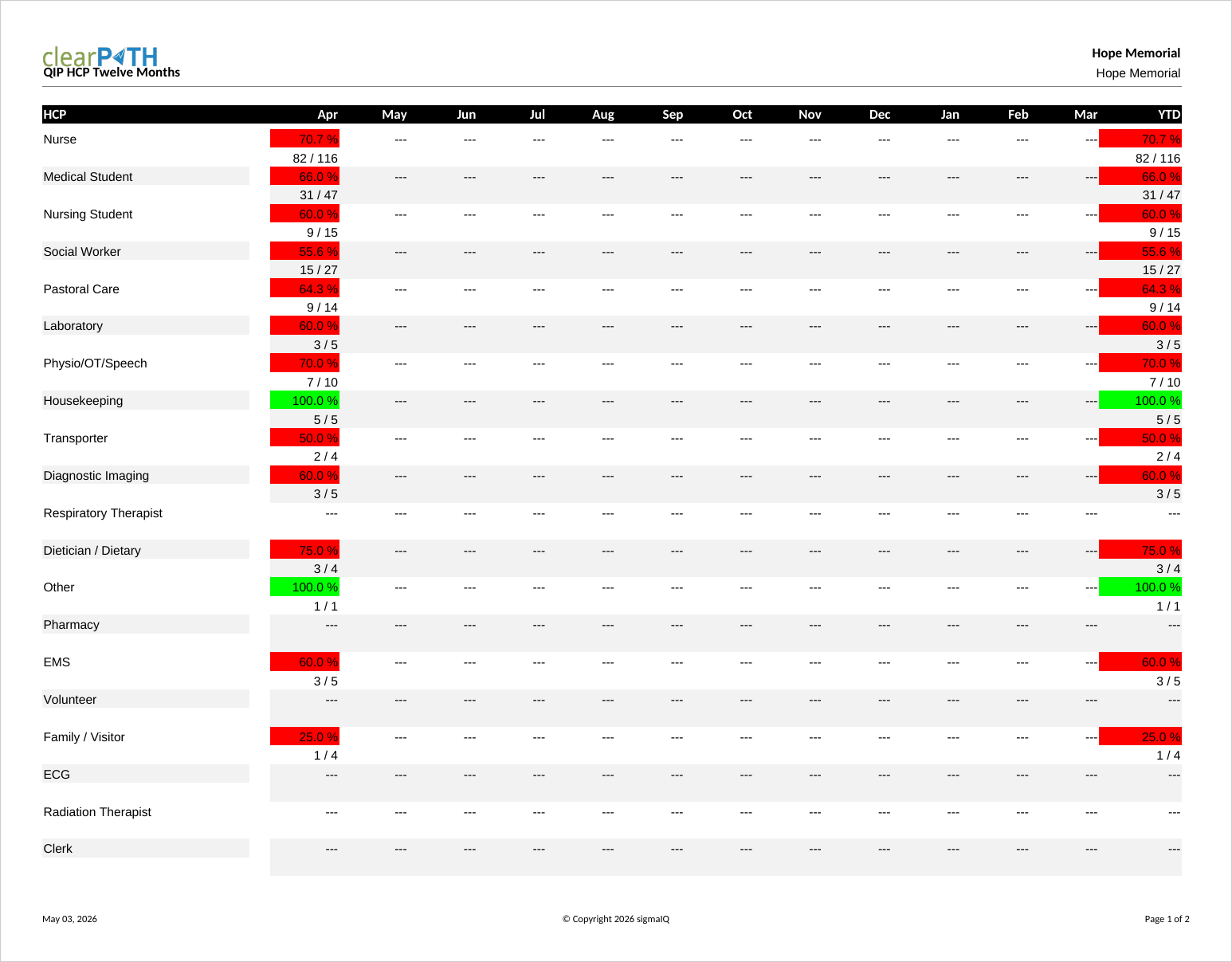
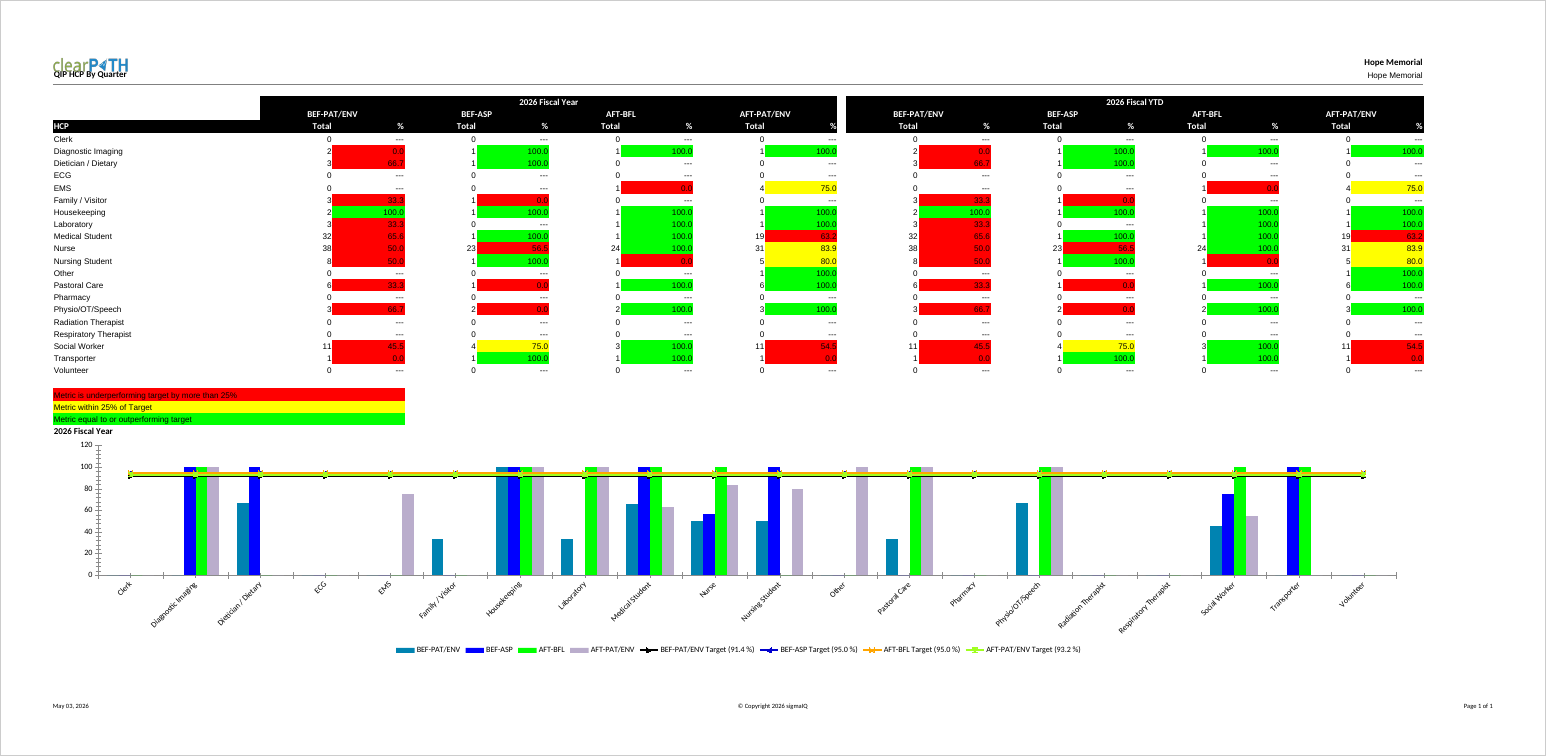
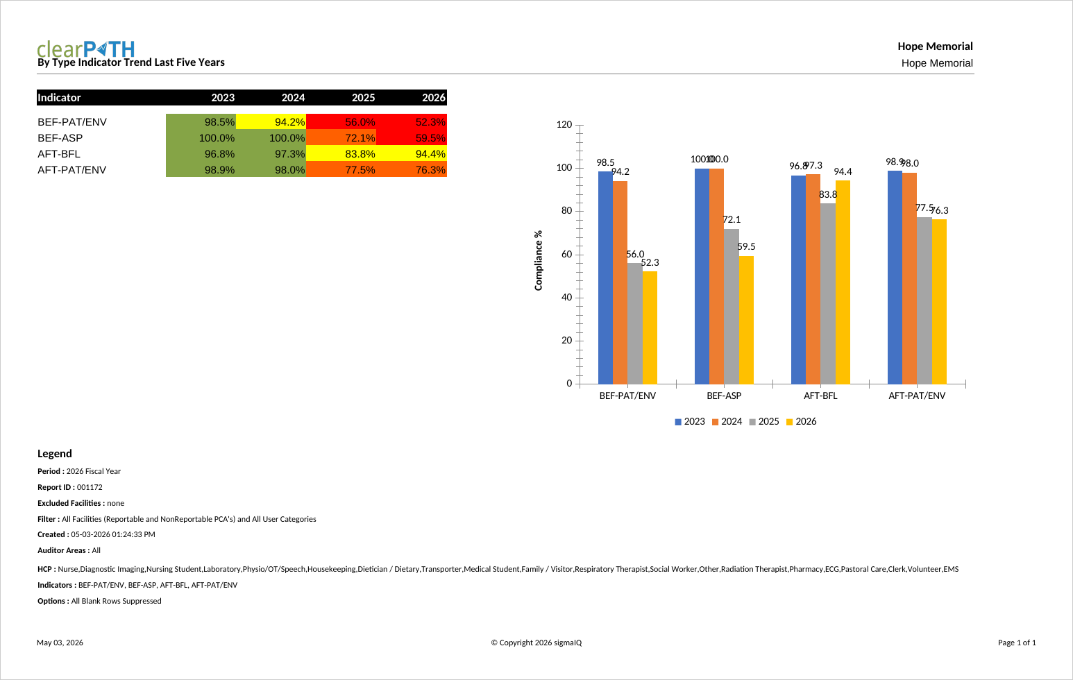
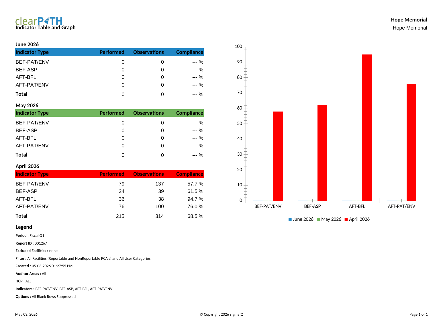
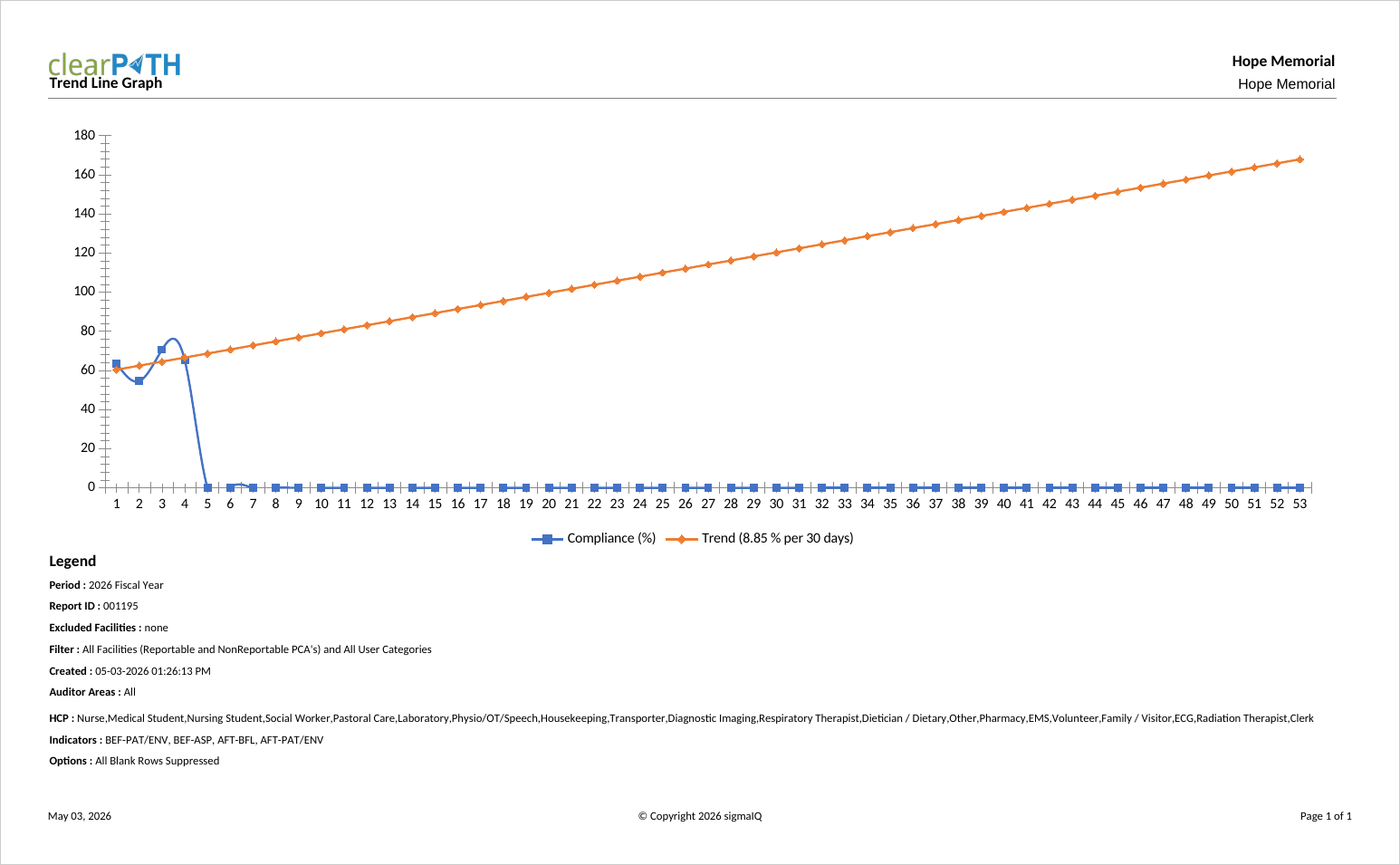
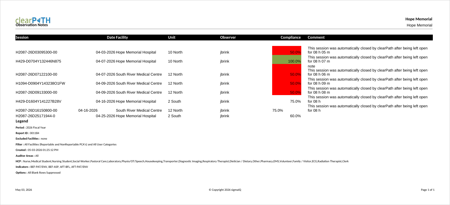
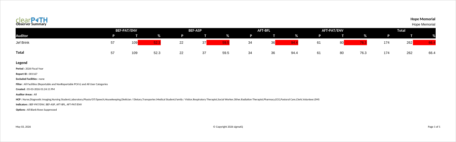
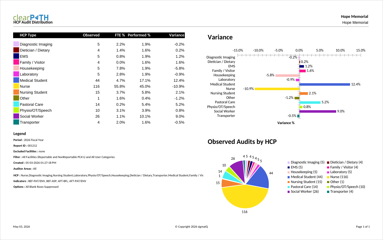
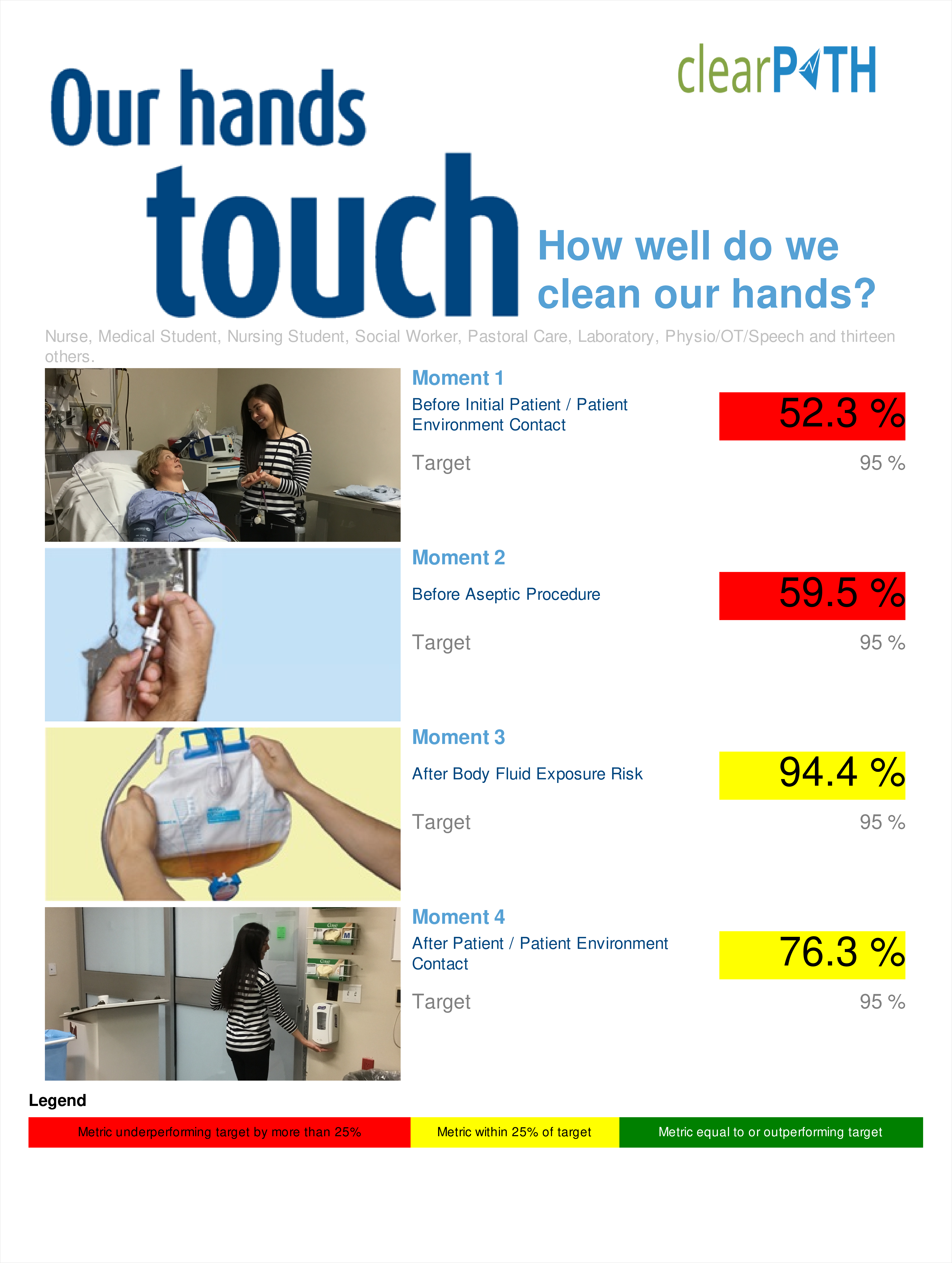
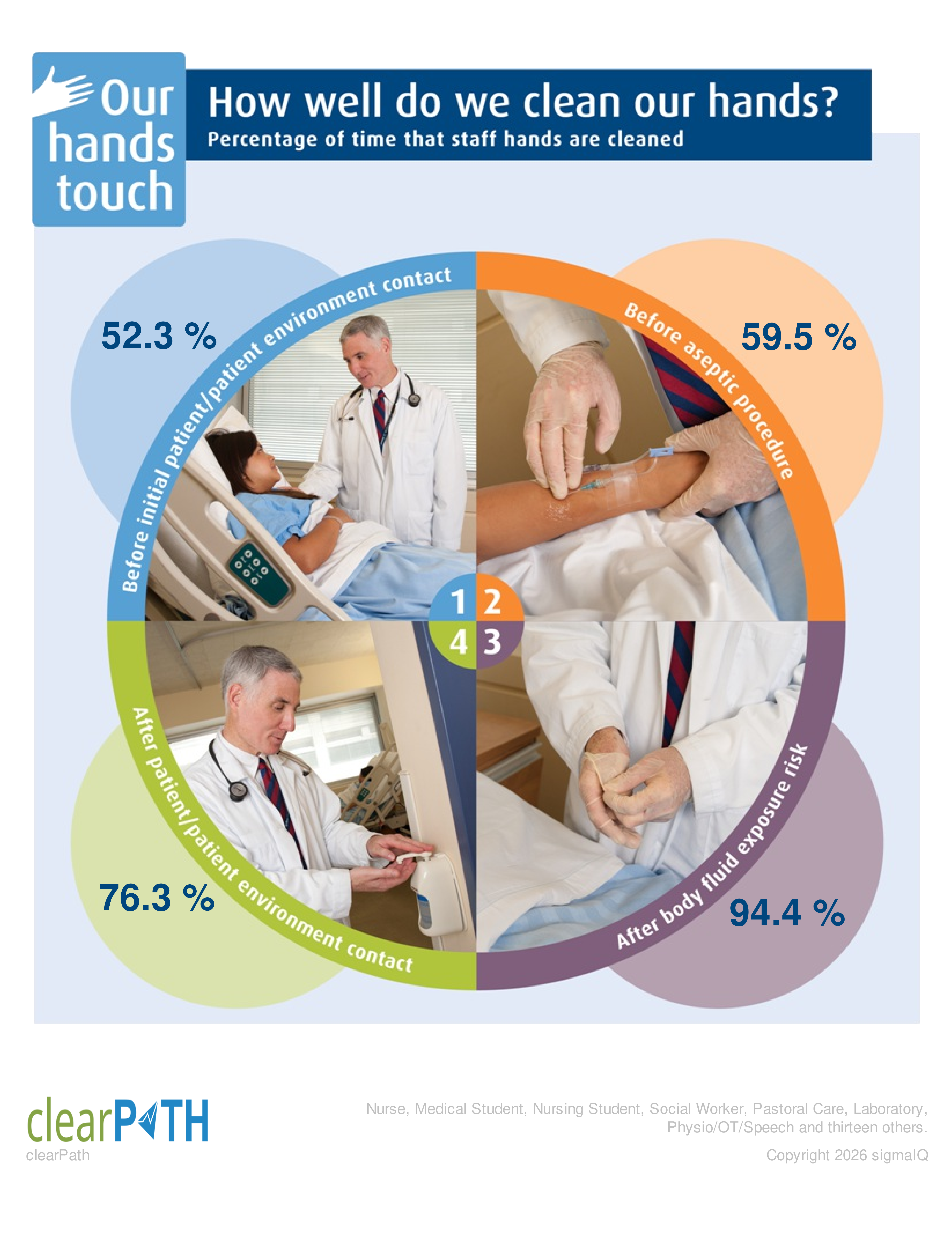
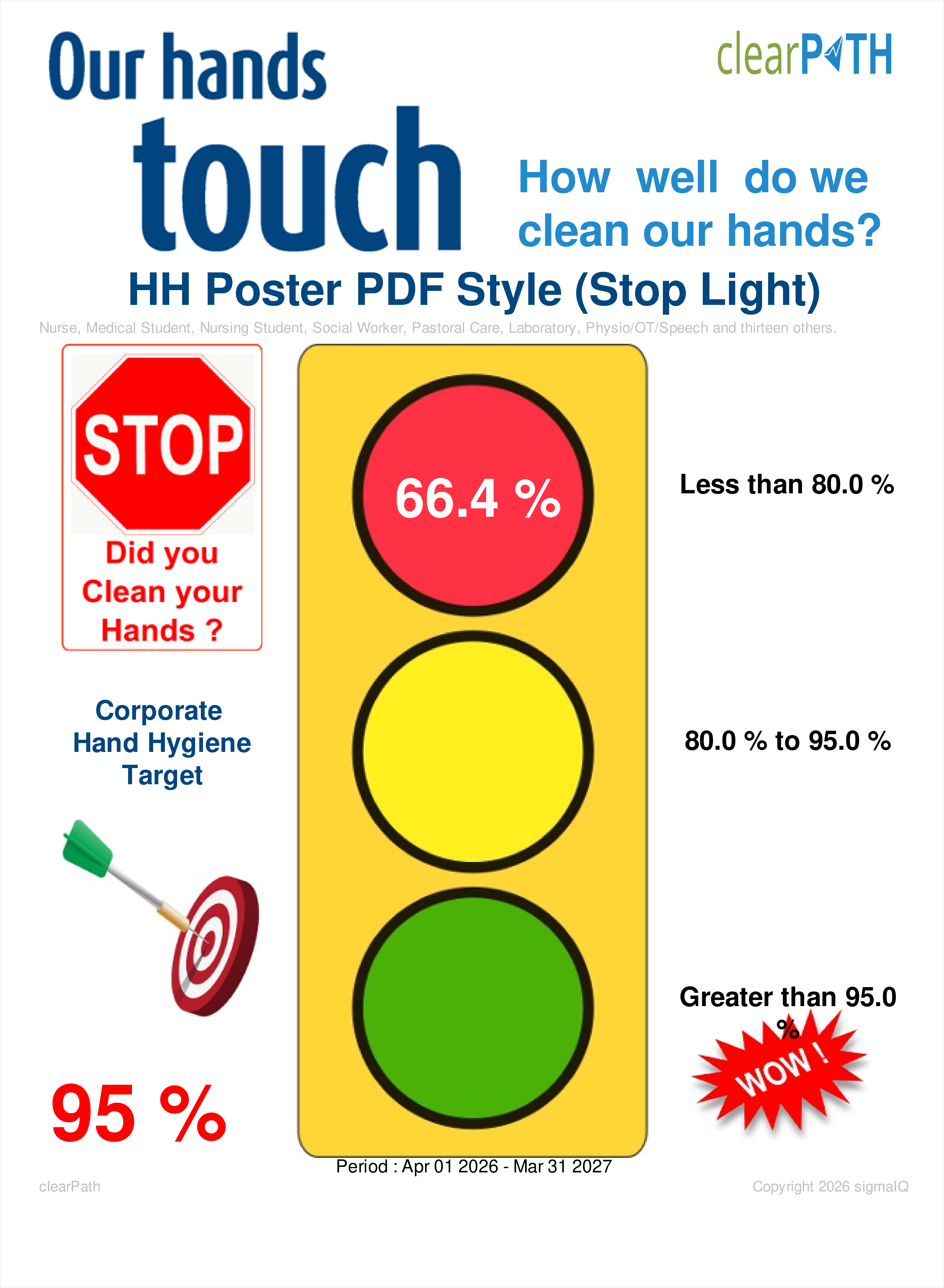
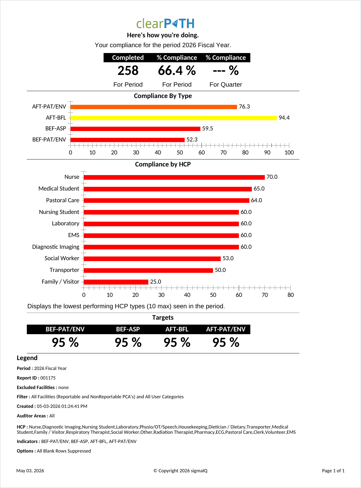
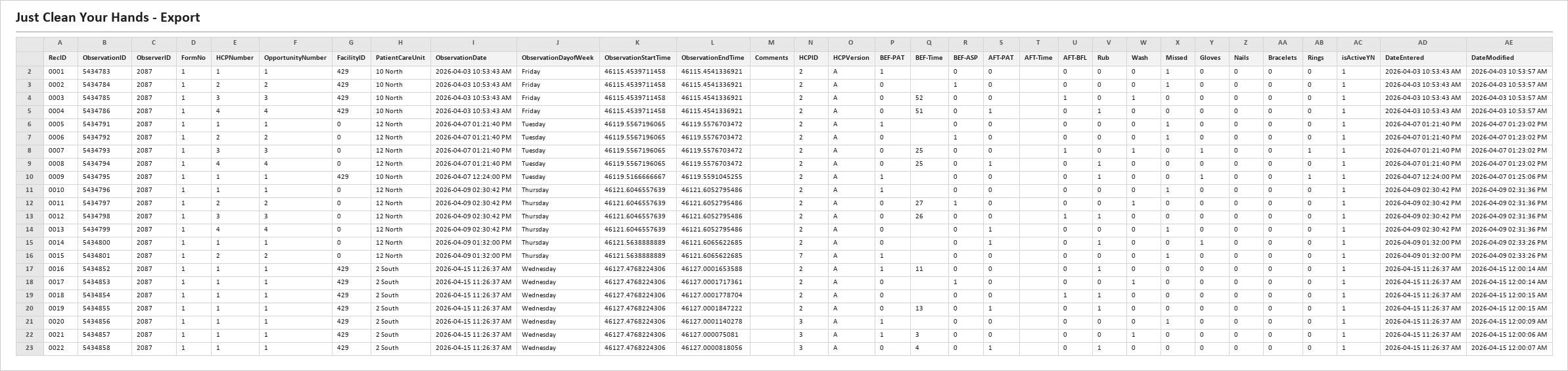
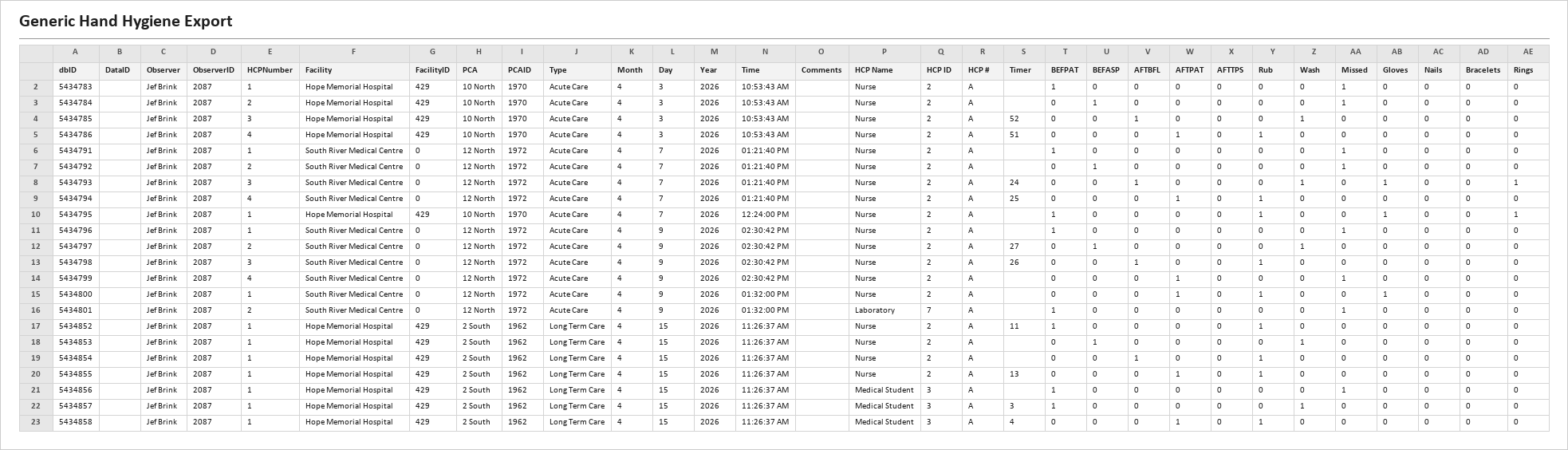
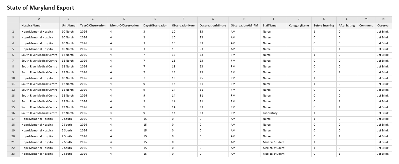
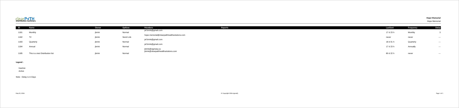
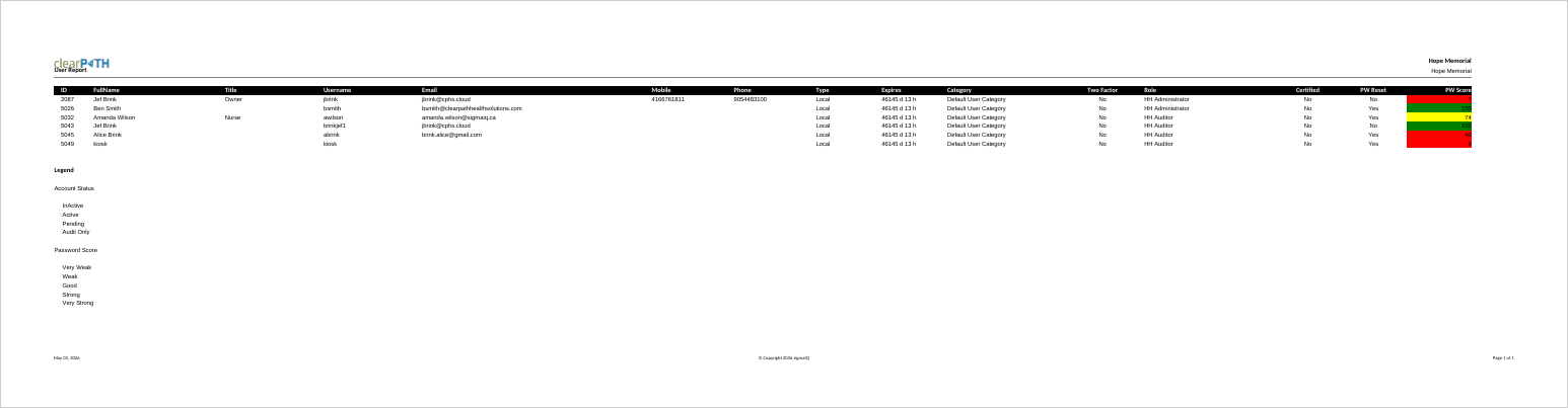
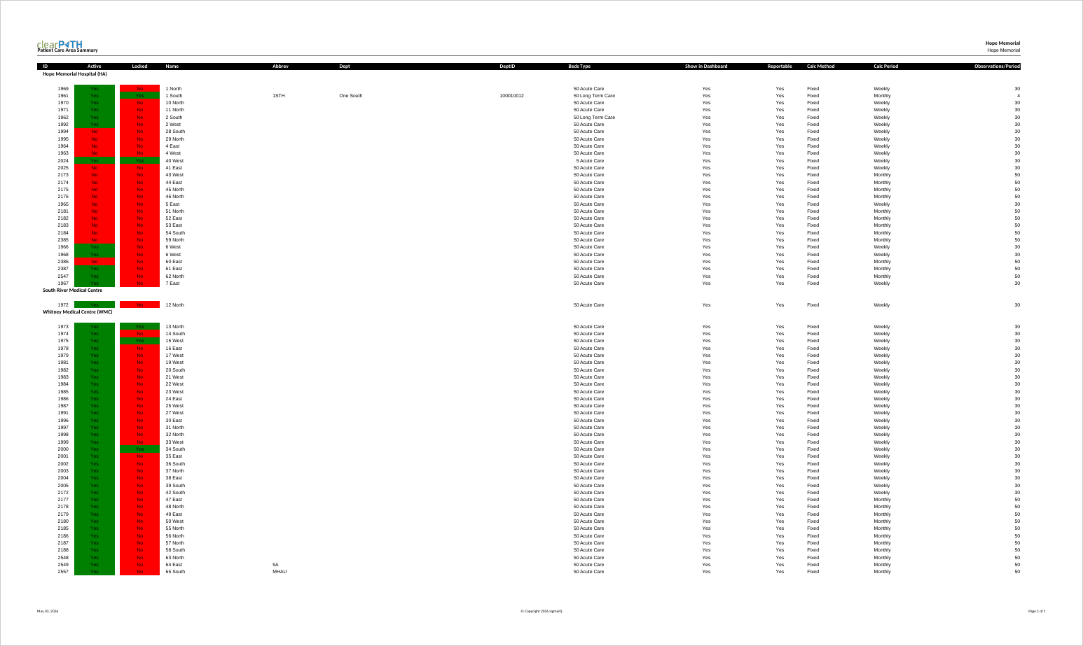
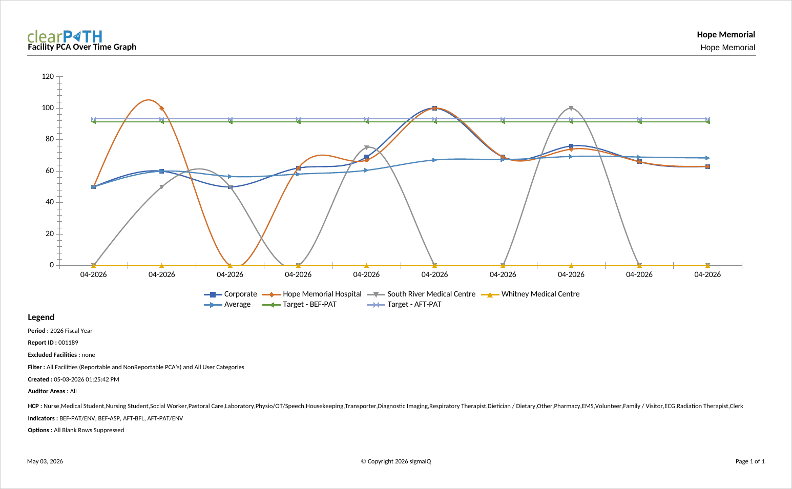
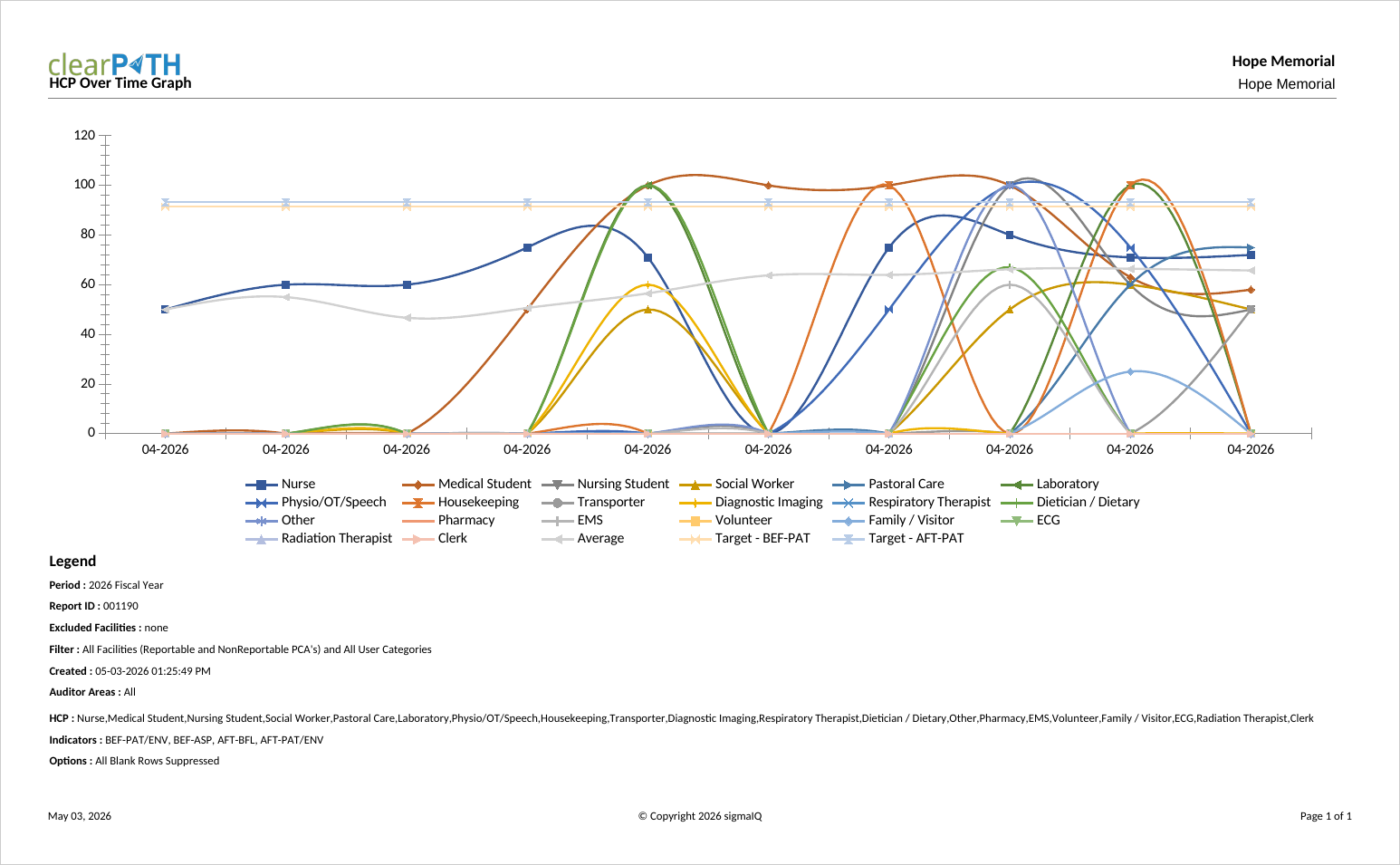
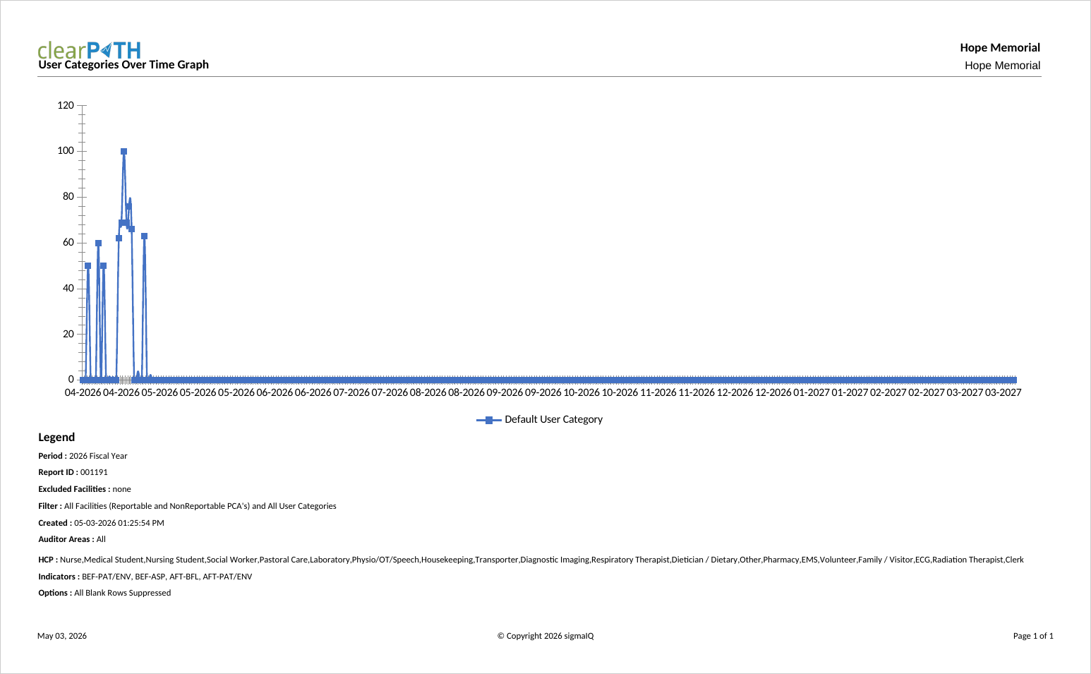
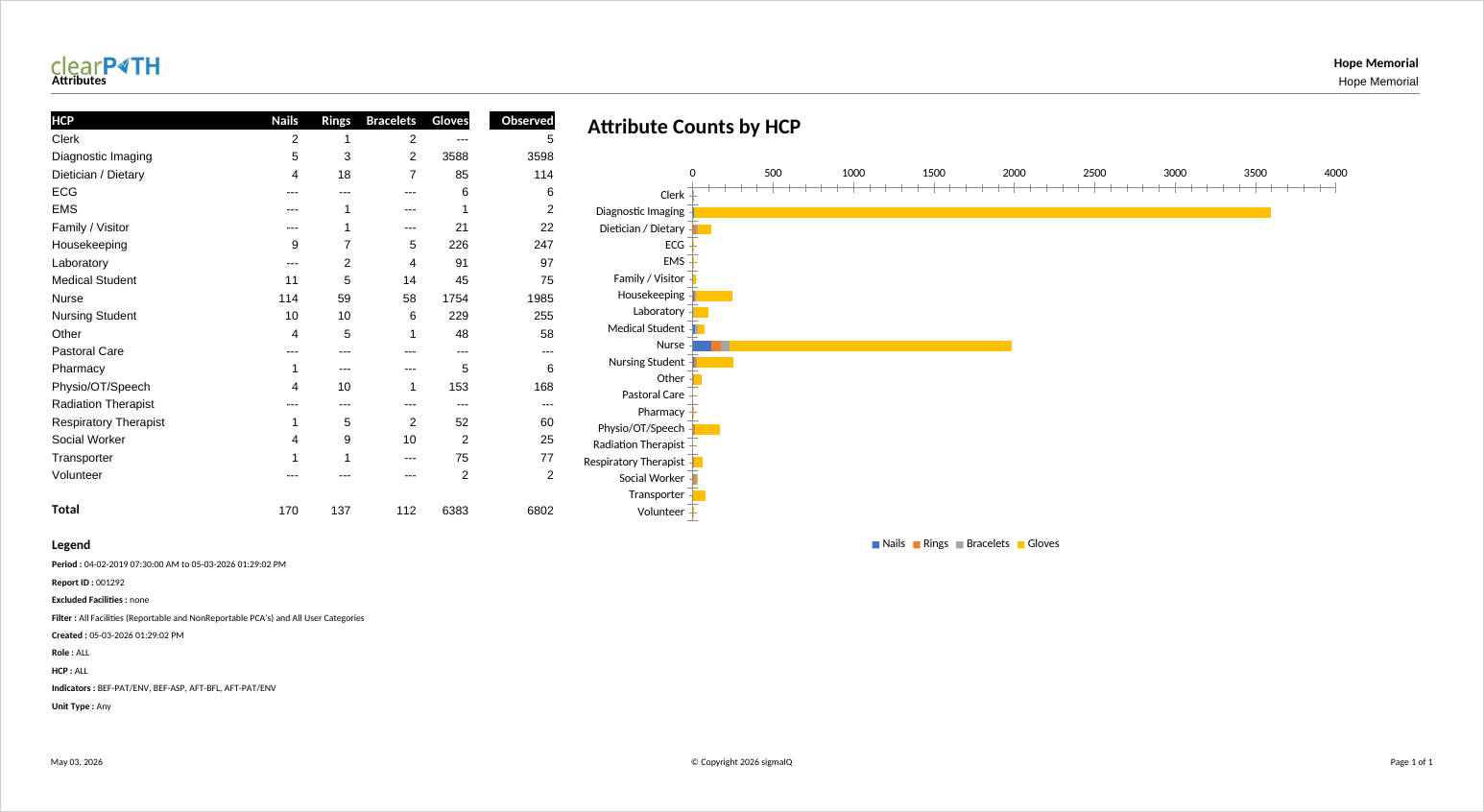
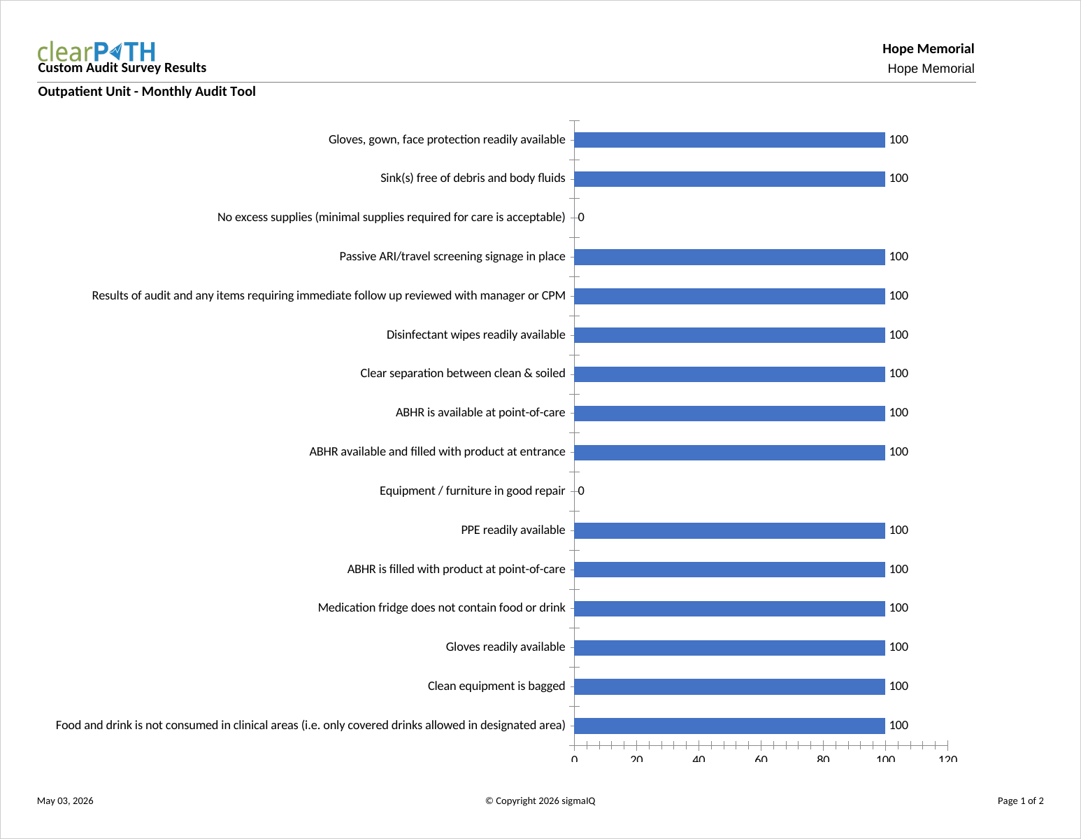
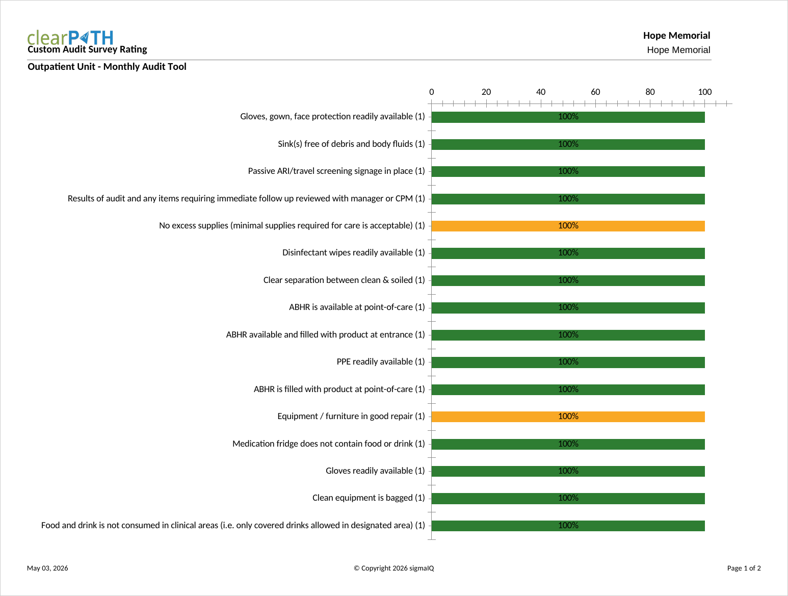
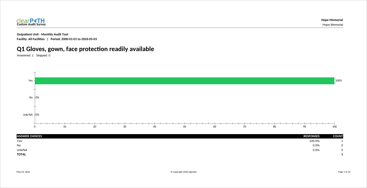

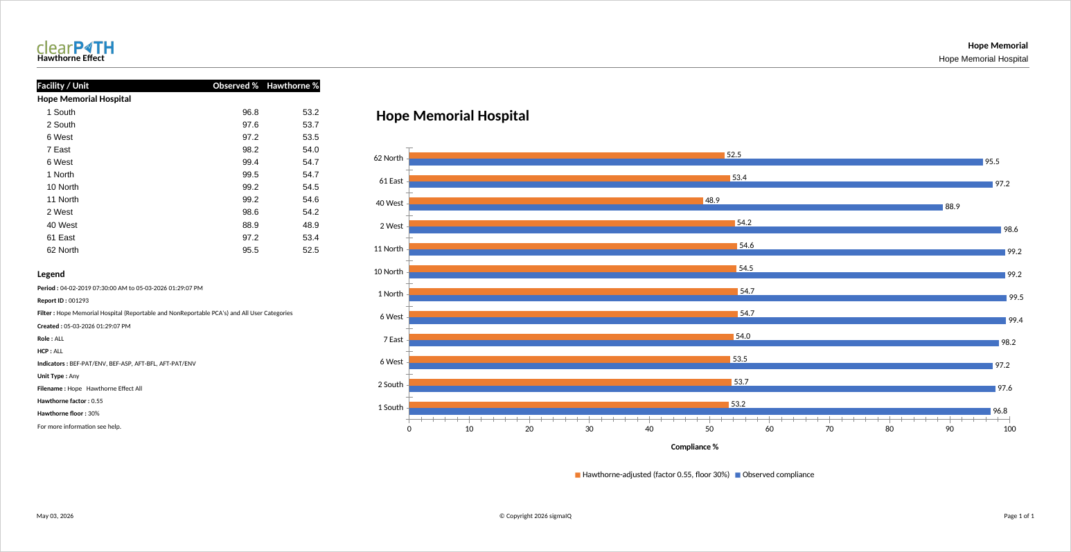
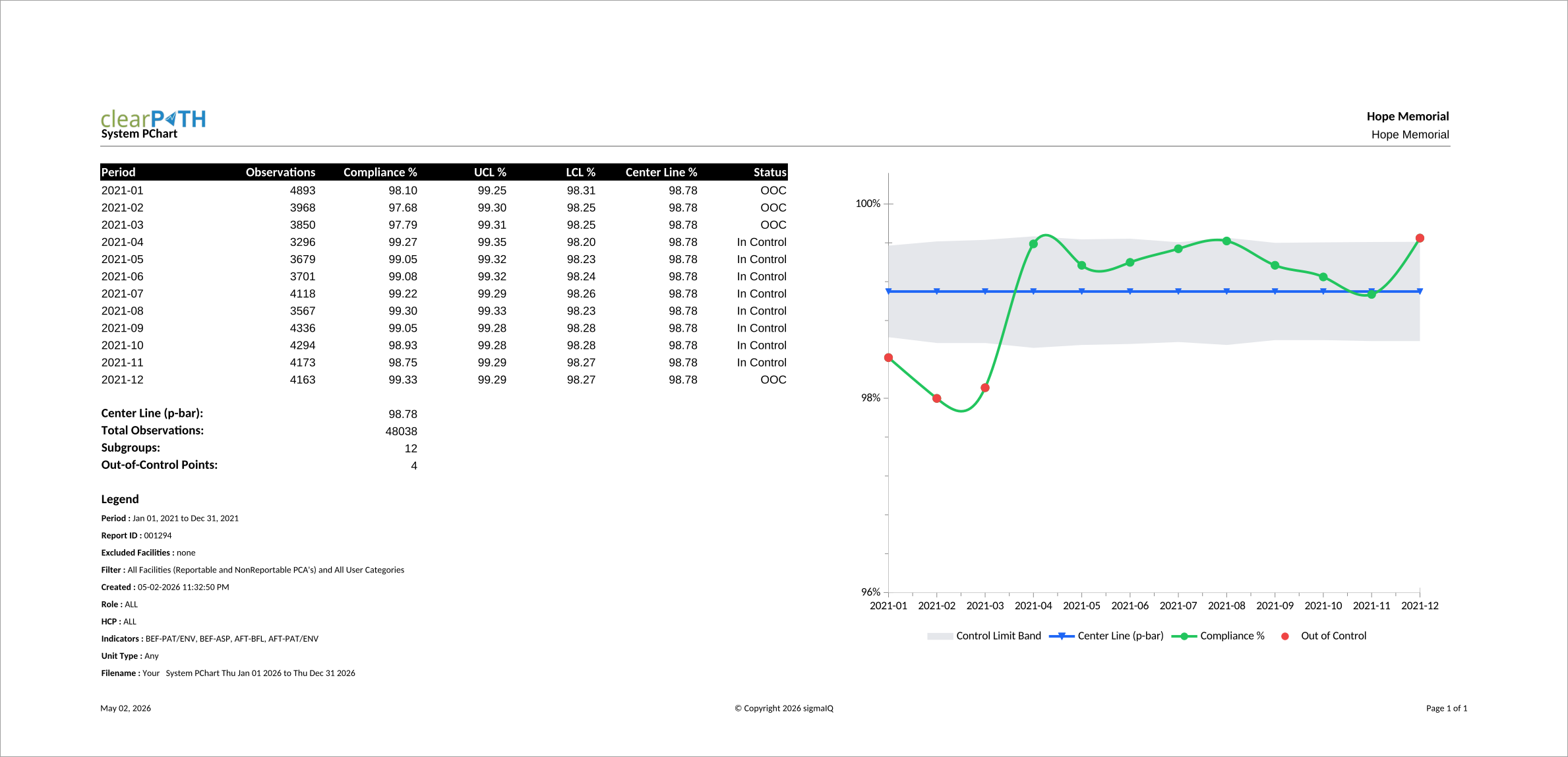
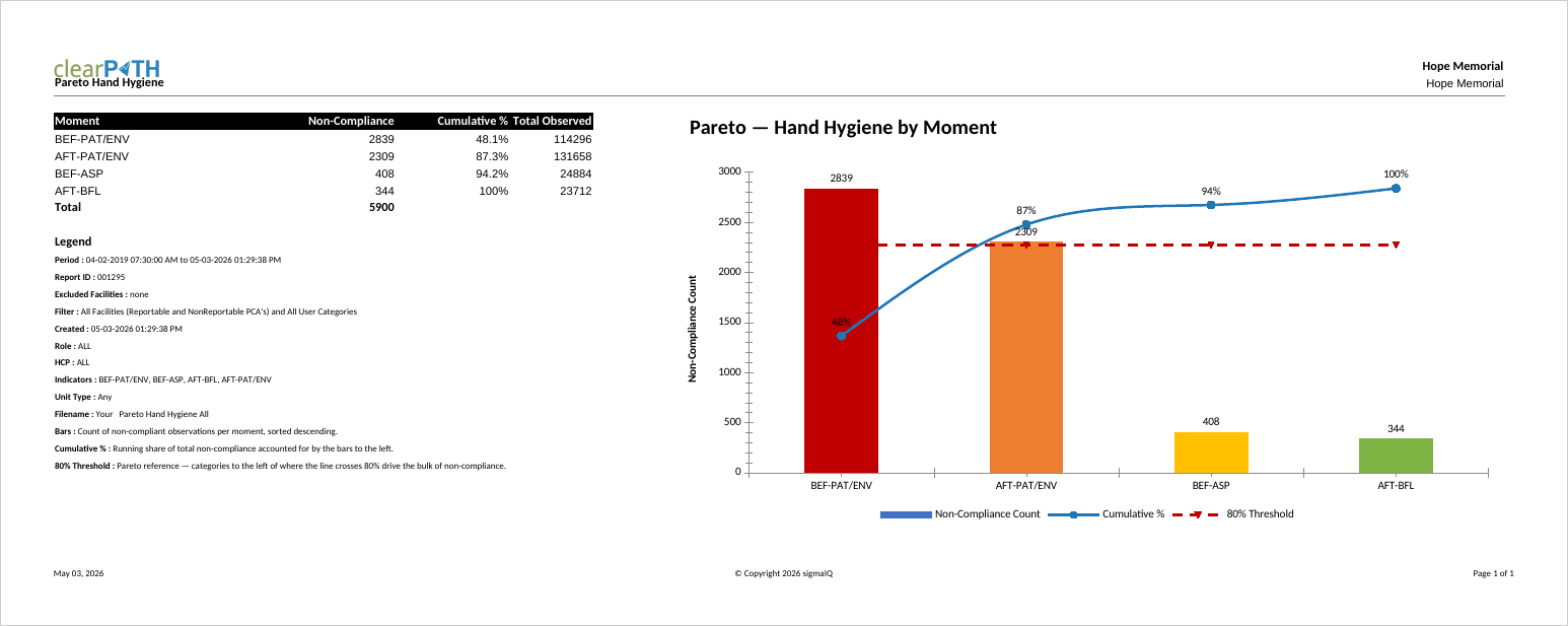
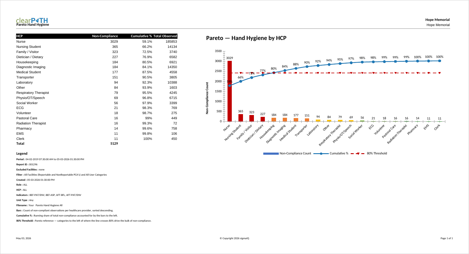
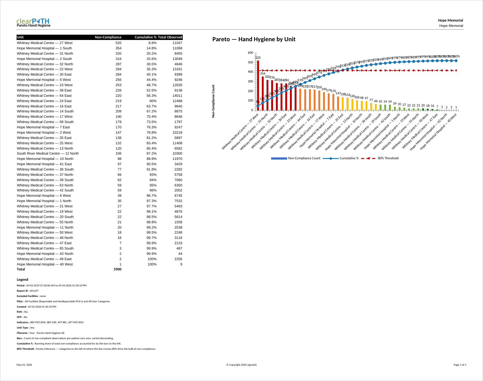
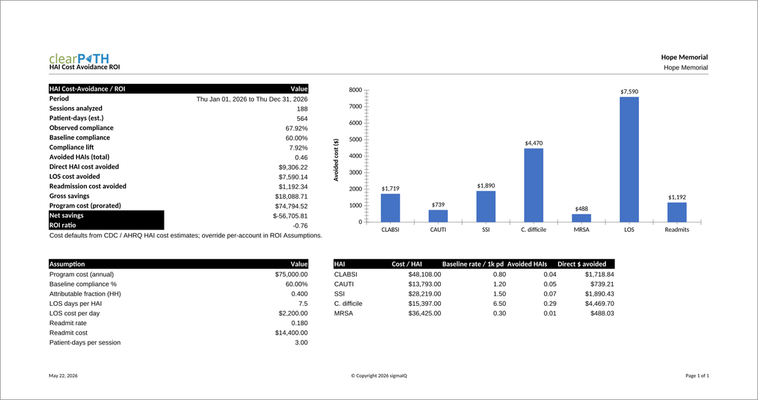
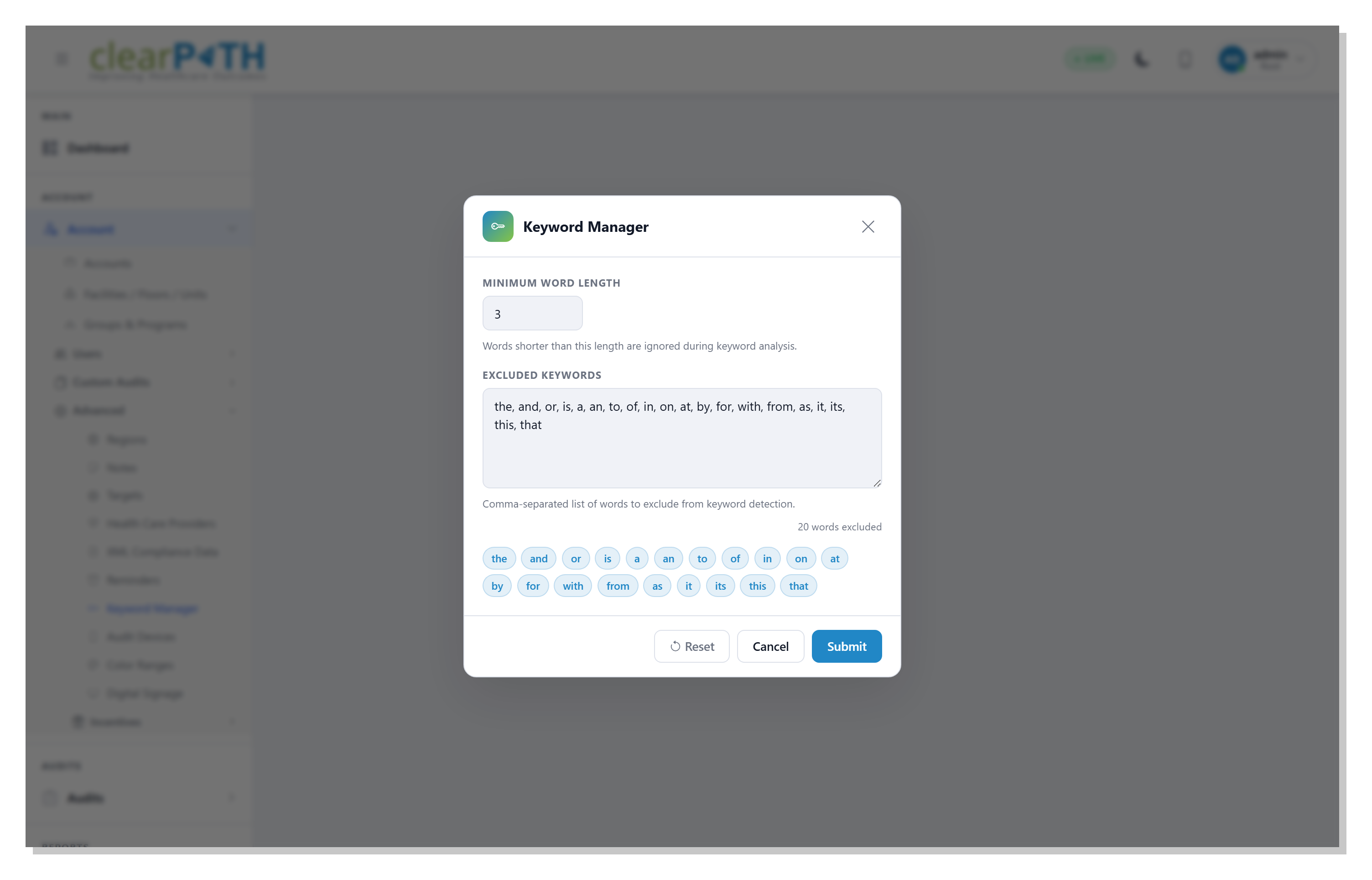
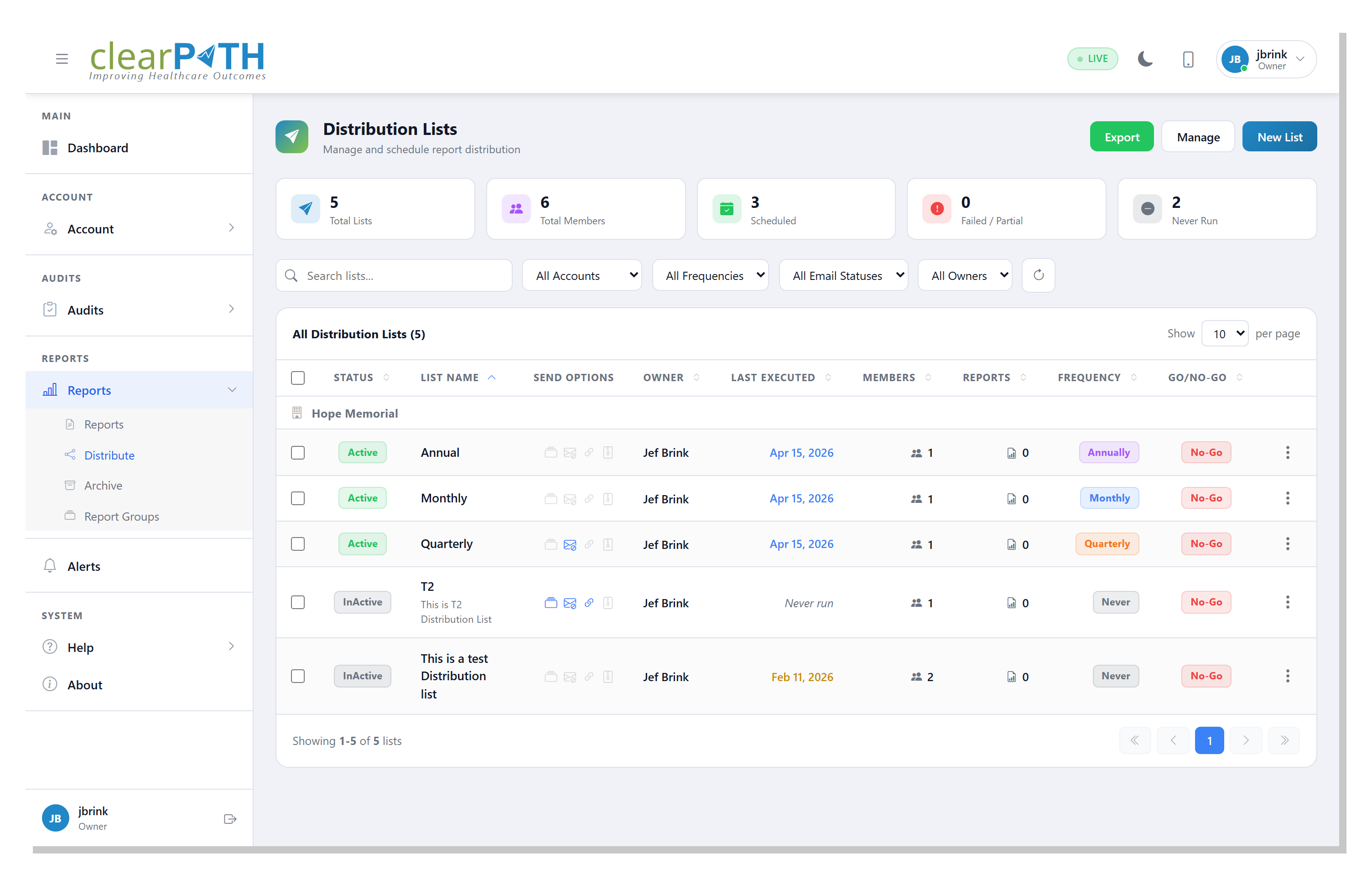
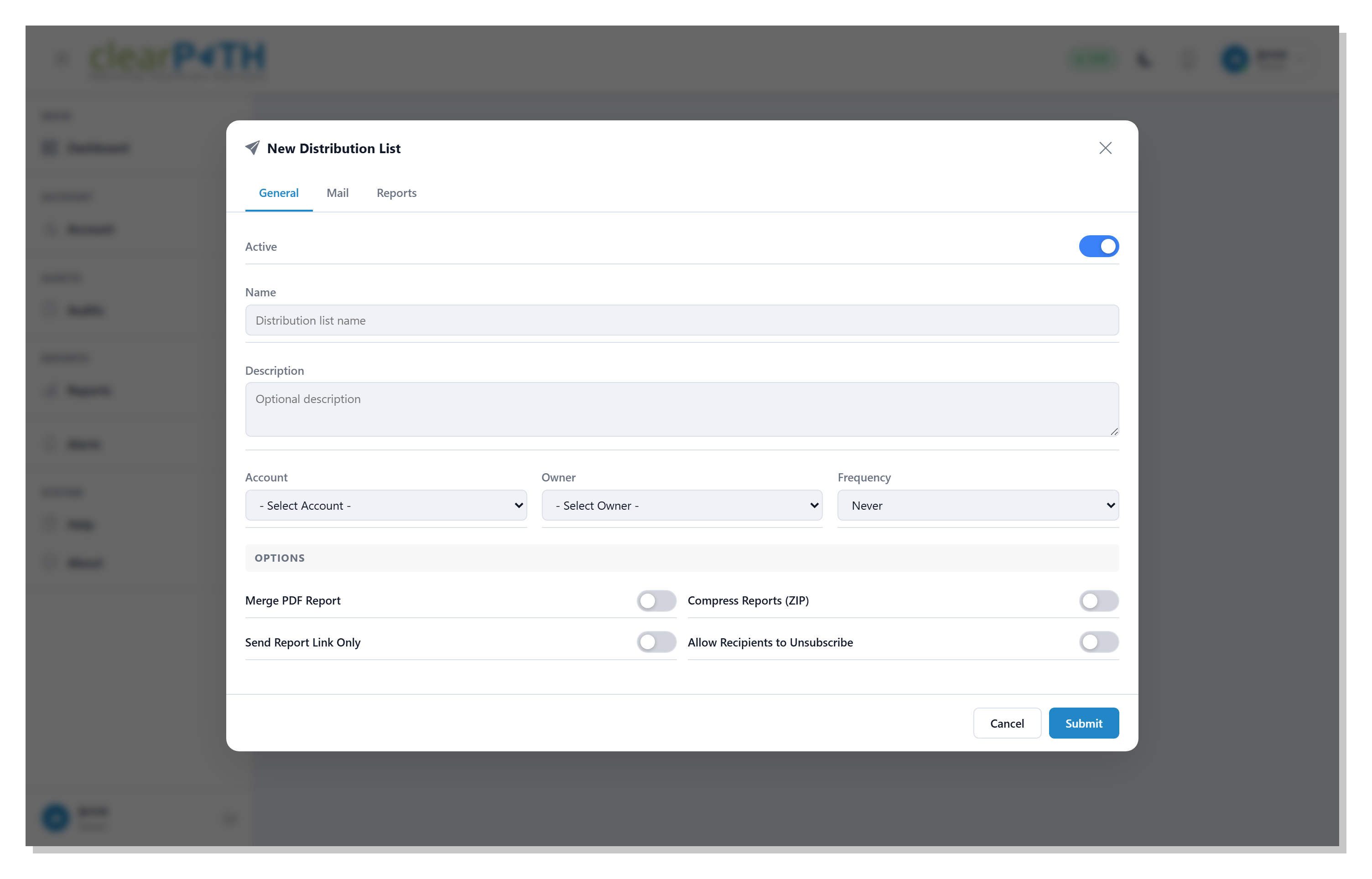
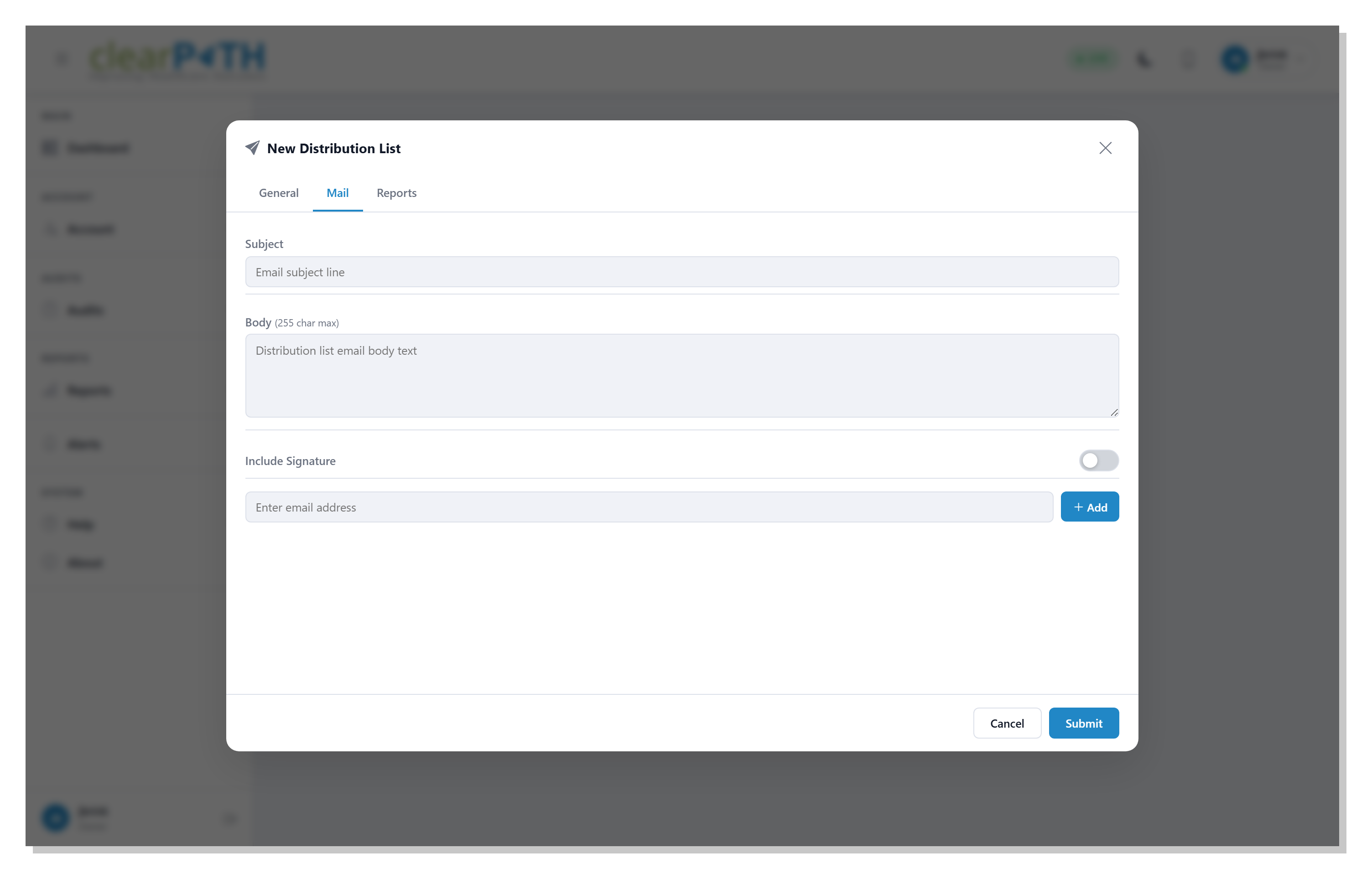
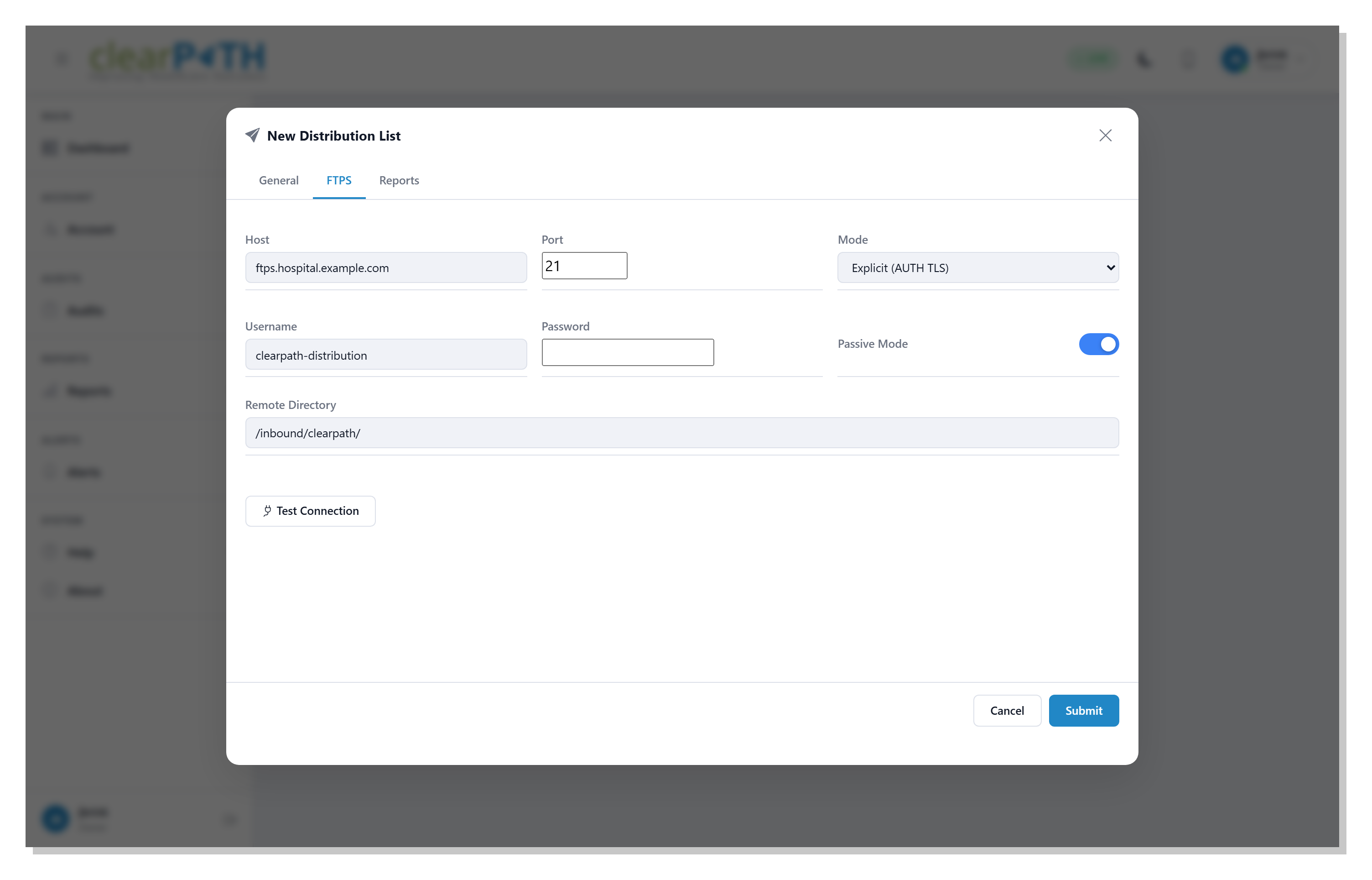
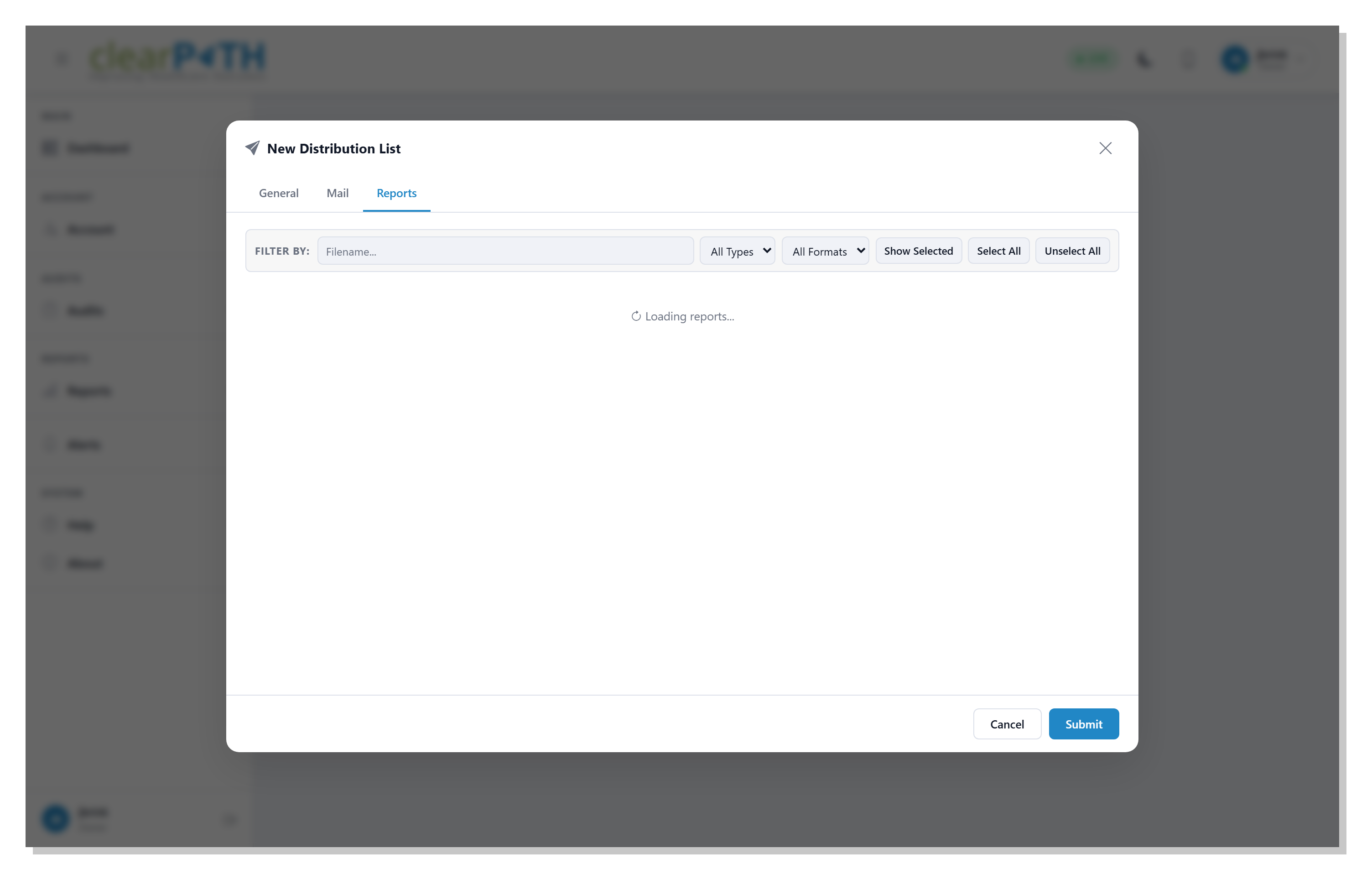
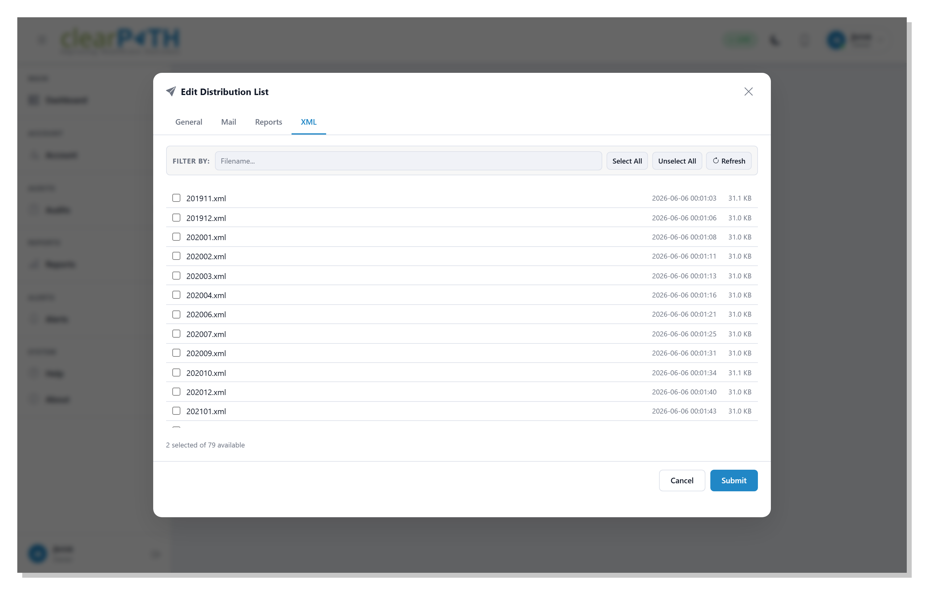
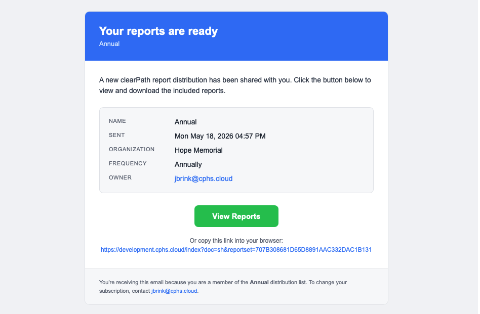
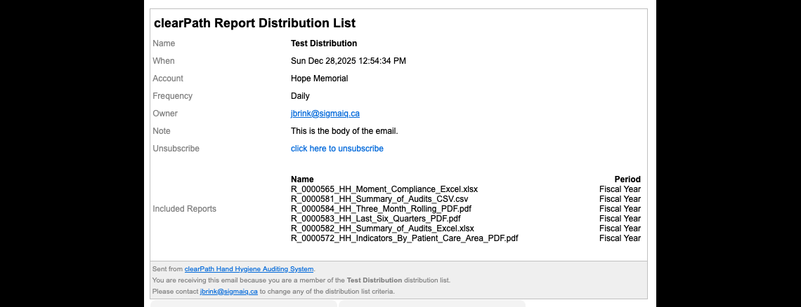
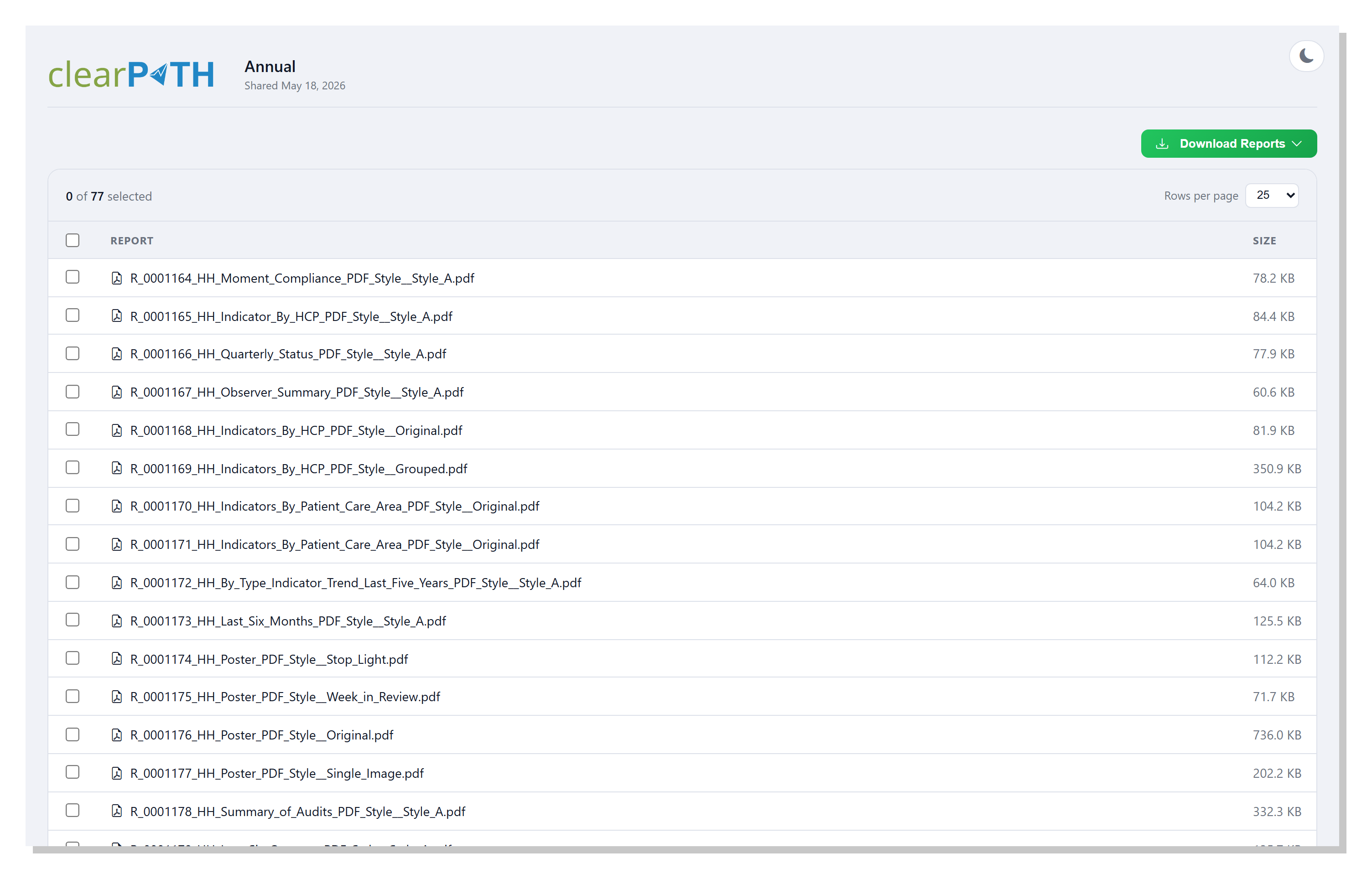
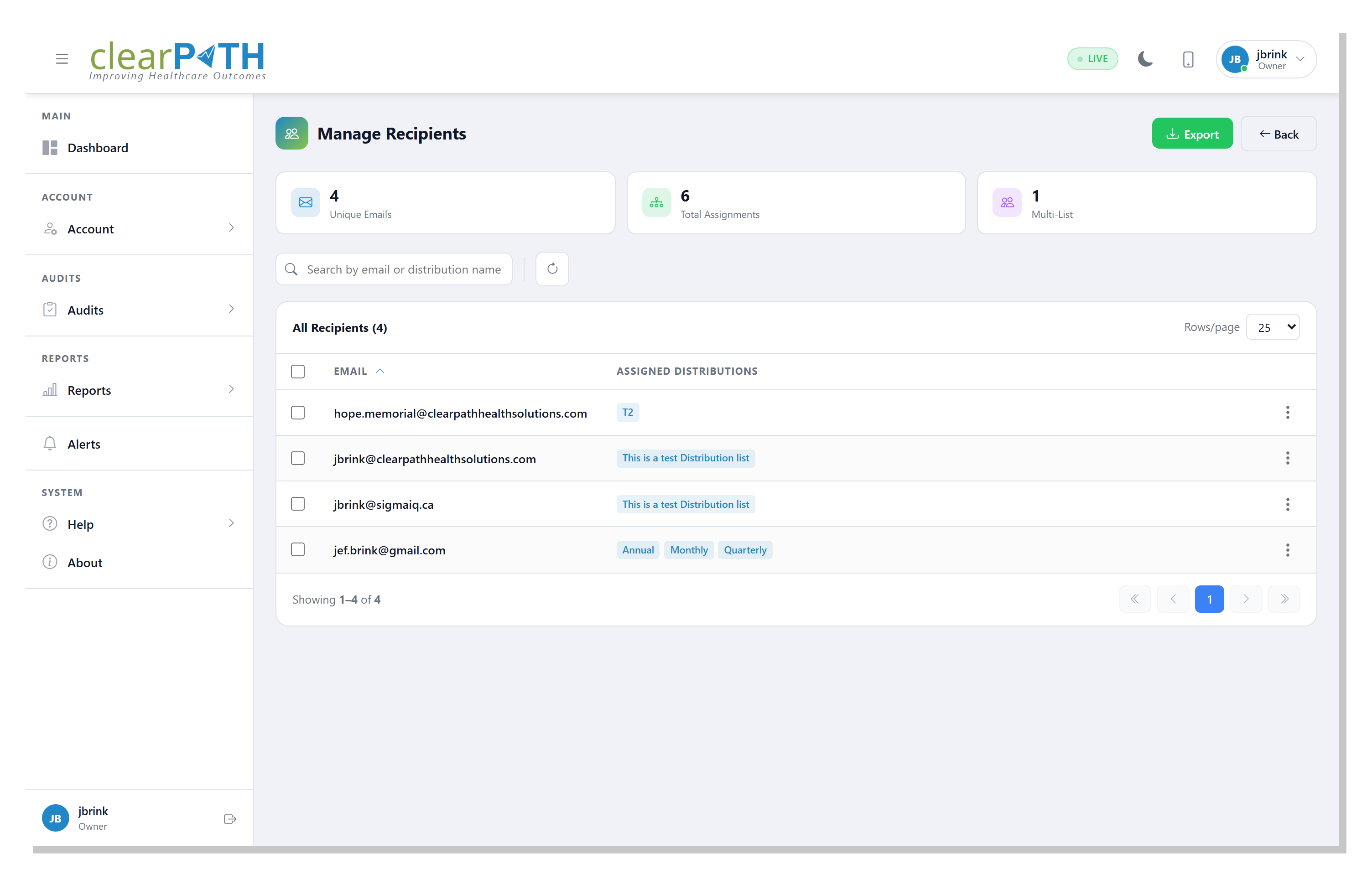
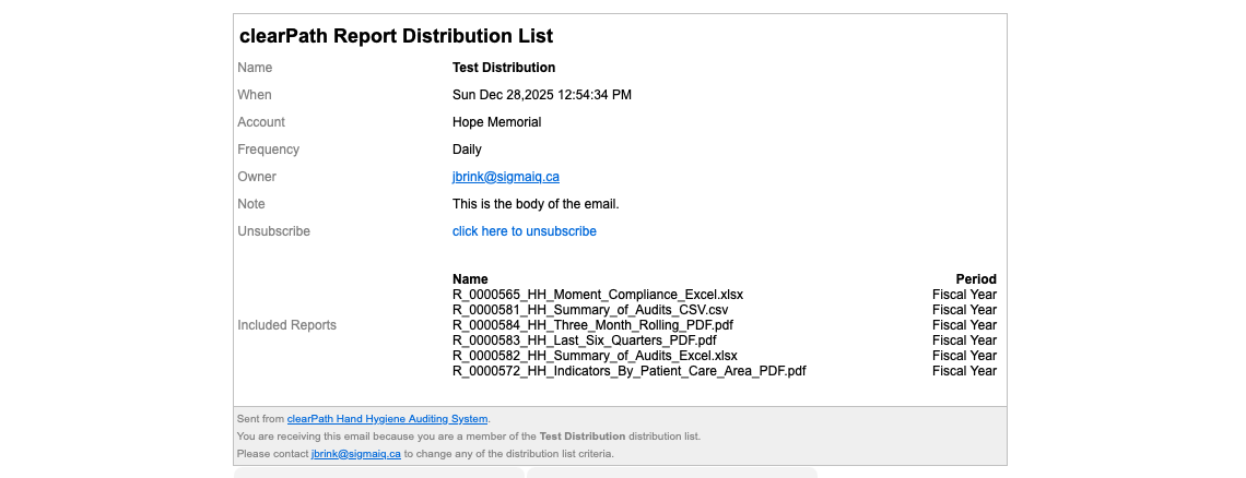
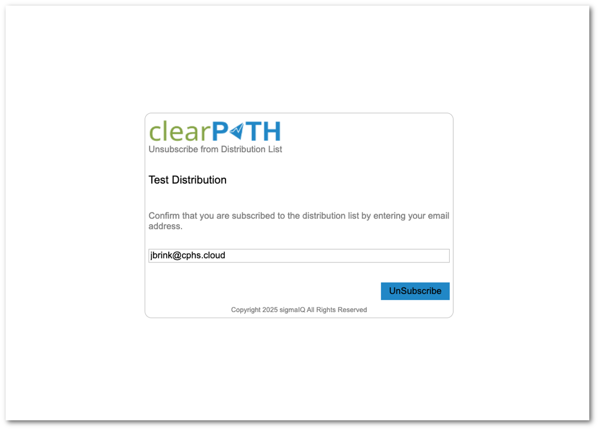
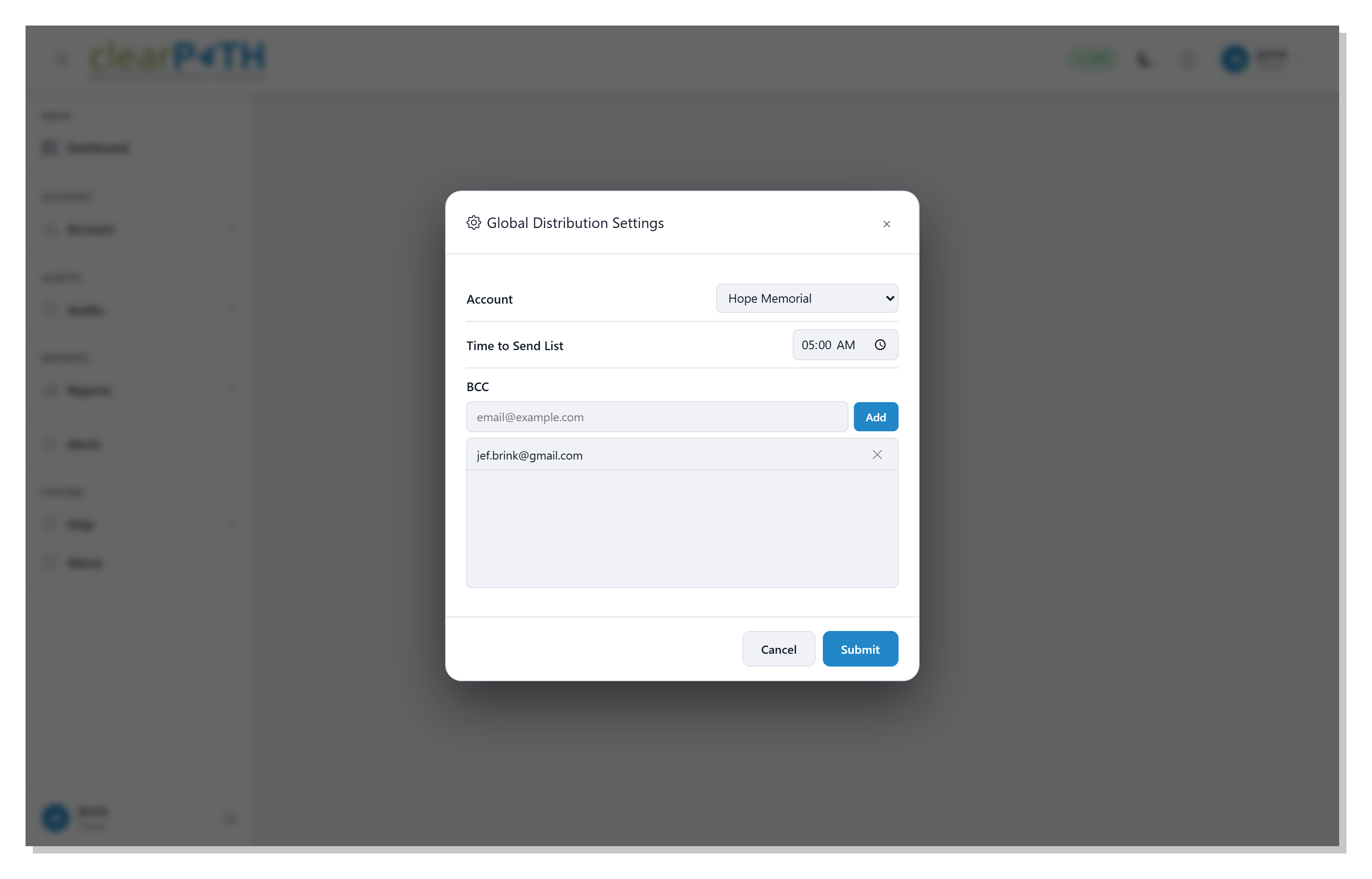


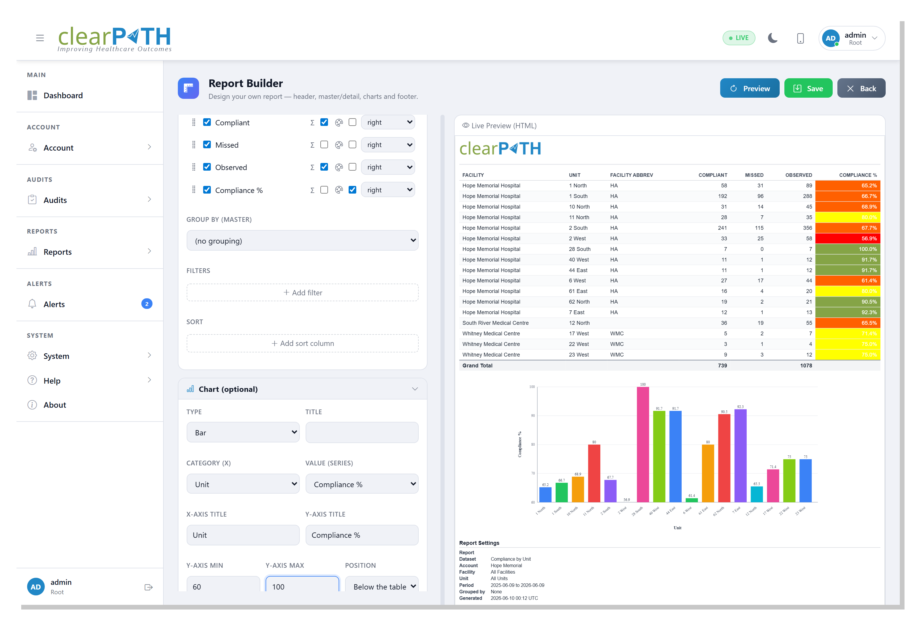
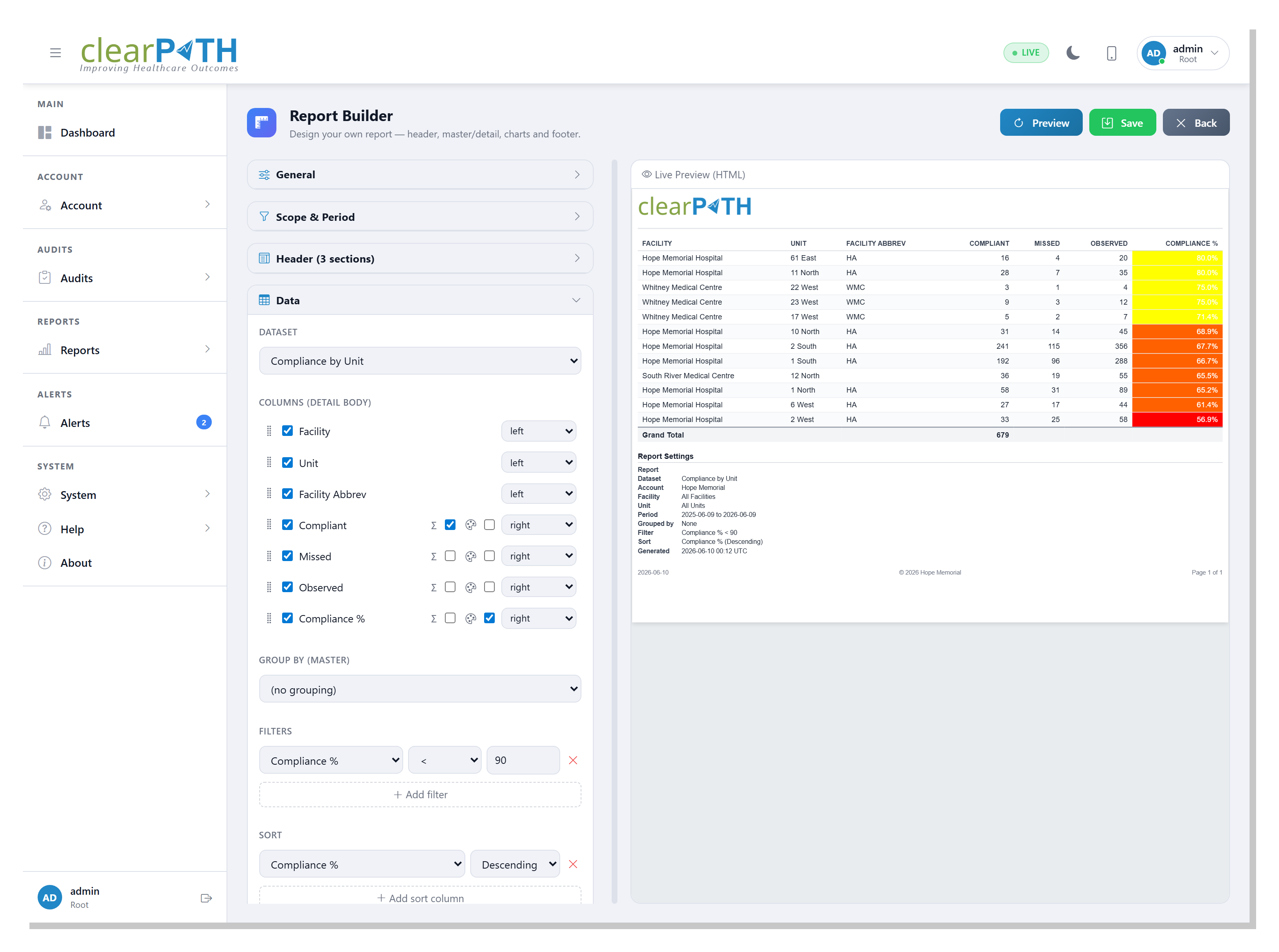
30.5.5. Comment Types
When you choose the Comments & Notes dataset, a Comment Types list of checkboxes appears. Tick or untick each type to control which kinds of comments the report includes:
Observation — comments entered against individual observations.
Scratchpad — free-form scratch-pad notes taken during a session.
Session — notes attached to the audit session itself.